
My HP Photosmart 8250 seems to have given up the ghost. I am unable to get the colors correctly calibrated even with brand new ink. I am in the market for a new printer and I was looking at this online. Your review confirms that it about right for me.
- REVIEWS
Camera Reviews 
More Reviews Mobile Reviews Photography Reviews - GALLERIES
- VIDEOS
- BUYER'S GUIDES
Canon PIXMA iP8720 13x19-Inch Inkjet Printer Review
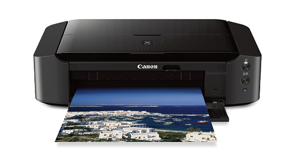
Product shot courtesy of Canon U.S.A., Inc.
For those seeking a larger print size at an affordable price, the Canon PIXMA iP8720 ($299) provides fast output (under two minutes for a 13x19 print) with very good image quality. The unit fits comfortably on a desktop (about 2 feet by 1 feet, given that you need more space for the catcher up front) and at 18 pounds or so, it does not require lifting from the knees, as do some 13x19-inch printers. Canon makes it very clear in their marketing, and in the features the unit has, and in some cases lacks, that this is a consumer-oriented printer. It goes head-to-head in price with the Epson Artisan 1430, and while this is not a comparative review, it’s good to know the competitive landscape for your further investigations.
Setup is easy and guided by an Ikea-like guide, brief but easy to follow. The unit works with both Macs and PCs, both connected and via wireless, plus wireless devices. Take advantage of the User Guide on the accompanying CD and the more extensive online material for details on how to set up wireless, print on CD/DVDs, what papers to use (and that you cannot use), loading, and all the other details to get the most from the unit.

The print dialog box on a Mac. Note the Color Handling drop-down menu, here selected as Printer Manages Colors. Choose this before going to Print Settings.

After selecting paper size drop down to Color Matching and be sure to choose “Canon” to avoid “crosstalk,” meaning color and tonal mismatches with your screen image. (If you choose Photoshop color management these choices will be grayed out and not available.)
Dye Ink Printer
As a consumer device and at that price point, you’d expect this to be a dye ink printer, and you’d be right. It uses ChromaLife 100 dye inks with six wells—one being pigment black and the others being dye black, gray, yellow, cyan, and magenta. The ink carts are easy to load and while I did not test enough to get a sense of throughput per ink load (which is quite image dependent anyway) costs vary according to color and retailer: the average seems to be about $14 per cart, with more for the pigment black. There is always a dispute about the “lifespan” of dye inks, and this, of course, is dependent on display and storage. Canon claims about 30 years without appreciable color fading when protected and about 20 when out in the cruel world (“gassing”) with direct exposure to pollutants and high UV.
I’ll let you do the spec thing on other printer aspects on Canon’s website, but use the space here to talk about my investigations on image quality, procedures, and, along the way, hopefully illuminate the unit’s appeal and perhaps shortcomings.
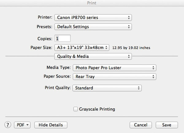
The next step is choosing Quality and Media, where you input the paper choice. There is no flat feed for thick (over 200 gsm) papers, so the source is always rear tray.
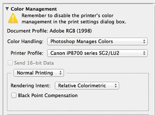
If you choose Photoshop as the color handler then you should choose the printer profile, here LU2 for the Canon Pro Luster. For other papers you should get and load the profile from the vendor website into the appropriate folder (Library>ColorSync>Profiles on the Mac).
Keeping It Simple
As mentioned, this is a consumer-oriented unit, thus Canon has followed the KISS (Keep It Simple Stupid) principle, and while it is just that, there are some matters I think should be pointed out, even to those who want to knock out a very nice result without too much fuss, and they have to do with printer settings.
I worked with Photoshop CS6, a MacBook Pro, and a balanced monitor. And while the driver interface is likely different with other programs and on PCs, I trust this will be generic enough advice for all. I printed on Canon’s Pro Luster LU-101 13x19-inch paper and a third-party matte. Note that there is no feed through for heavier stock and that paper weight should be at or below 200 gsm: this eliminates thicker stock and baryta-type papers from consideration.
Once the image is prepped and the Print command is pressed the usual print dialog box appears. The next stage is important: choose color management first (in this case let’s use Printer controlled) then click on Print Settings in the upper part of the box. The setup box appears. First pick paper size, here 13x19 (A3). Then go to the Layout drop-down menu and first go to Color Matching. On the Mac the default is ColorSync, but avoid this like the plague and choose Canon Color Matching. If you don’t, you’ll get “crosstalk” and, for example, magenta-tinged blues, etc.
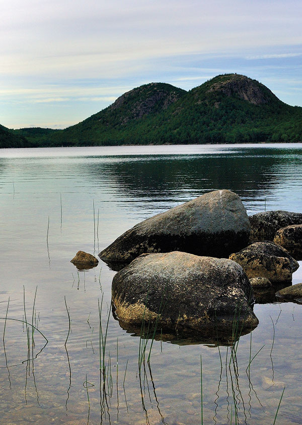
The problem in not setting the appropriate Color Match when using the printer-controlled color became evident when I made the first print of this image with subtle blue and aquamarine hues. The sky went too magenta and the water went a bit flat. Making the correct selection cured that and produced all the soft colors of the original. Photos © George Schaub
Then drop down to Quality & Media and choose the Media type from the fly-out menu and Source (how the paper is loaded) and Quality, which evokes a Standard or Custom. If you choose Custom you have a slider to go up or down: frankly, I didn’t see a great deal of difference, other than print speed, when I slid upward, although this might be effective for images with lots of details. Then drop down to Color Options, and here there are a few presets. Overall, I kept it at the Standard. Portrait adds a touch of pinkishness and warmth, which I would rather set up in processing if I wanted it, and Landscape, which added a bit too much saturation for my taste. Experiment and see what you might like. Once that is done click Save and name the setting and keep it as the default as long as you stick to the same paper; this way you won’t have to go back and redo this dialog every time.
The next matter to consider is color management, which you always choose first before Print Settings, and here’s where a conundrum might set in. You have a choice of Printer- or Photoshop-managed color. In regular use I generally choose Photoshop color management but here I, in the spirit of KISS and other reasons having to do with the stated audience for this printer, suggest going with the Printer option. As long as I did this I got screen-matching prints every time, given that my Print Settings setup was done right. If you choose Photoshop, choose the appropriate profile (for the Canon Pro Luster it’s LU2).
The last stage of Print Settings is Color Options (not shown). There you have two choices: one is a group of presets, including Portrait, or Standard. I printed both Standard and Portrait presets on this shot and while both were fine, side by side the Standard was more true, the Portrait a bit too pinkish and warm for my taste. Similarly, Landscape was a bit too saturated for me, though some might like the vivid colors.
So, why am I recommending Printer management? First off, it worked well. Second, it makes printing easy, and that to me is how this printer is built and aimed. Third, if you want to get into art printing and all that entails, including working with heavier stock, which of course I encourage, then this printer is not really for you. It is for those who want to get into making really nice 13x19 (and of course 4x6 and other cut sheet sizes) prints without too much bother.
By the way, if you want to print with non-Canon papers you should work with Photoshop-managed colors, download the profile from the maker (quite a few, including Red River, have profiles for the printer on their sites), and then choose it in the list. (For comments on various types of print results see illustrations.)
All in all, the PIXMA iP8720 printer is a product on which Canon has certainly done its homework. It’s a printer and software combo that will make it easy for those who want to make attractive 13x19 and smaller size prints with little fuss or bother.

It’s almost unfair to compare monochrome results vs. a printer with numerous shades of gray ink, but try I did. I used every trick I know for getting a neutral gray. Interestingly, in daylight, prints were very close to neutral; under artificial light, both room and halogen, a slight magenta cast crept in. I even tried third-party papers, to no avail. Shades of “metamerism,” I’m afraid, although not egregious, and with “toned” monochromes (light blue and sepia) the colors were true, perhaps showing the effect is slight.
For more information and full specs, visit www.usa.canon.com and go to consumer products/printers.
- Log in or register to post comments

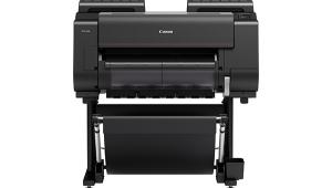
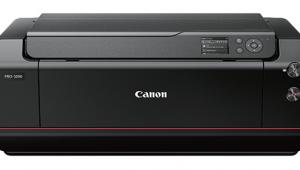


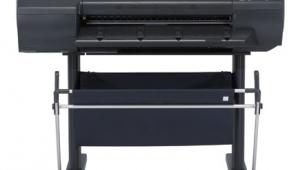


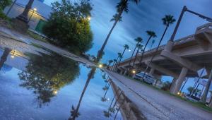


PHOTO OF THE DAY

Today’s photo is My Fair 'Lady' by Hans B. Epp
eNEWSLETTER SIGNUP
![]()
Get the Latest Photo Tips, News & Reviews from Shutterbug!
| Camera Reviews Other Reviews | Mobile Reviews Photography Reviews Columns | News | Features | How-To | Resources |
 © 2024 Shutterbug
AVTech Media Americas Inc., USA
All rights reserved