- REVIEWS
Camera Reviews 
More Reviews Mobile Reviews Photography Reviews - GALLERIES
- VIDEOS
- BUYER'S GUIDES
Perfect B&W: onOne Software’s Monochrome Solution
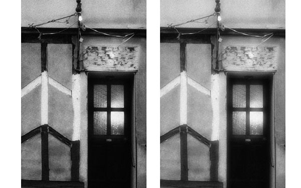
“The initial conversion is on the whole quite good, but of course availing yourself of the many controls is what this program is all about.”
There are many roads to black and white, or monochrome, if you prefer, and attaining the look you want can be arduous or easy, depending on the software used and the methods applied.
One such path is onOne Software’s Perfect B&W, nestled within their Perfect Photo Suite or available as a stand-alone or plug-in for Photoshop, Lightroom, and Aperture. The advantage of using it within the Suite is that you also get access to the other excellent modules within that program. The advantage of the stand-alone is that you get an amazing array of controls for a rather incredible price. The Suite, by the way, offers onOne’s Layers, Mask, Effects, Focus, and Resize programs, all highly regarded, making the options virtually endless. For this review I accessed Perfect B&W from within the Suite.
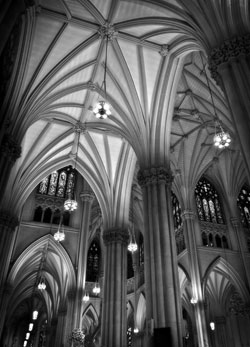
All Photos © George Schaub
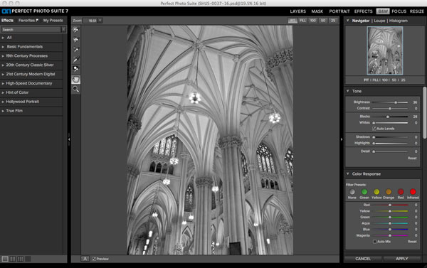
Workspace
When you open the Suite you have a workspace that lists the other programs within. Perfect Layers within the Suite comes with an image/file browser that allows you to navigate to any folder that contains images by clicking on the File/Browse option. To begin work, double-click on the image in that browser. You can also use Bridge or similar browsers by selecting then dragging the image into the workspace. Once an image is open you then select B&W from the modules, where the image conversion is immediately made. The initial conversion is on the whole quite good, but of course availing yourself of the many controls is what this program is all about.
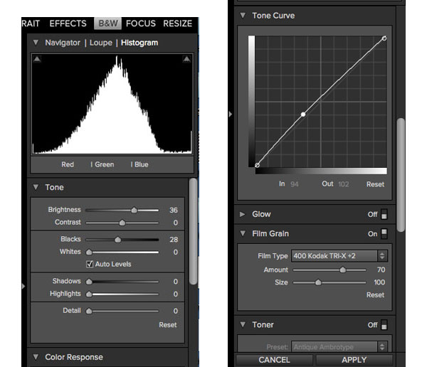
The workspace offers a series of familiar controls on the right-hand side (to those who have worked with ACR, B&W Adjustment Layers, Aperture et al.) that allow you to manipulate the base image. I switch the upper right to a Histogram view from the default view to help with clipping avoidance.
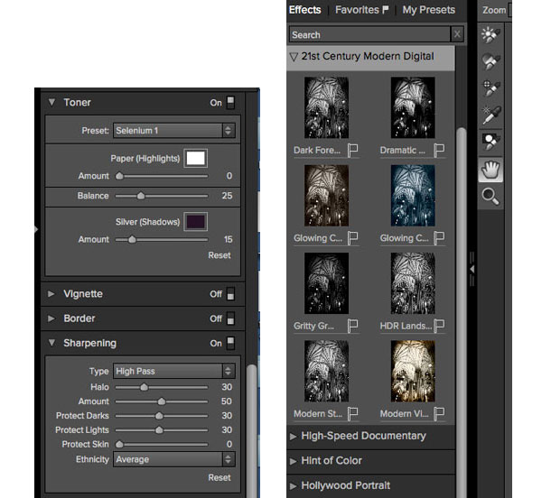
Right below that panel you have a full raft of controls, beginning with Tone (Contrast, Brightness, Shadows, and Highlights) and continuing with Color Response (where you convert hues to grayscale tones with sliders or choose filter presets); Tone Curve (a fairly rudimentary curve control); Glow (mostly for portraits or ethereal mood but I used this more than I first thought I might); Film Grain (with sliders and presets based on film types that will not make sense to those who have not shot film, but toggle through and try them to see the effect); Toner (for emulating chemical tone looks; again, toggle through); Vignette and Border, which are fairly self-evident; Sharpening, with numerous selective options such as “protect skin tone”; and Blending, which is in essence a menu of blending modes which will mix the layer you are creating with the original (or background) image in numerous ways.
Note: Those not familiar with the effect of blending modes when working with Layers should just toggle through and see the effects, but do check it out as this is a powerful and useful aspect of the controls here. In effect a blending mode is how you tell the layers to play together.
Saving Sets
That’s enough to keep you busy exploring the options for many hours (days?), but the beauty is that you will eventually hit upon a look or style that you want with a few of the options, or sets of options, that nail the feel of the images you aim to create. There are two major pluses here. You can save the mix for use on other images and that set will reside in the left-hand panel for use later. This allows you to produce a consistent look for a portfolio of images, for example. Also, every time you pick an option the image in the workspace immediately responds to the selection and changes to allow you to say yea or nay to what you’ve picked.

Single Layer
As you work on the right side panel you create a layer of the effects you have chosen, and this is where I pick my first, though not minor, nit. Regardless of how many changes you make it all goes into one layer. I assume this is probably to simplify matters for those petrified of layers, but I’d at least like to have the option of creating a new layer, and naming it, as I work. As built it’s as if you are flattening all the work layers as you go into one layer, rather than creating multilayers that can be modified individually later.
Yes, when you save the image and move it to another program for editing you will have two layers—or more if you start with a preset, which then makes another layer—the background image on one and the work layer in another, but this goes against what I am used to, which is making changes on separate, named layers and then going back through to consider opacity and other options later on. This will bother some folks and perhaps be a relief to others.
Suite Interaction
Which brings us to Suite interaction. If you click on the Layers module in the Suite workspace after you’ve done your black-and-white work it will take the image over and show you the layers, which you can then do selective work on, and that’s a good thing. But once you’ve done that and want to swap it back into the B&W workspace for perhaps further work, it reprocesses the image and reverts it back to the original, rendering it as if you are moving back to square one.
My advice? Stay within the B&W workspace and go from say fine-tuning (the right workspace) to the presets (the left workspace). Individual layers of both workspaces will then be saved. But once you leave the B&W panel to go elsewhere consider the B&W panel aspect of the work done and finalized. The best course is to do the other options in the Suite first, do a Save As, and then open in the B&W panel.
Presets
On the left side of the workspace there are numerous presets to choose from, and these run the gamut from what is dubbed Basic Fundamentals (color contrast filter effects, expanded tonal values) to “19th Century” effects (everything from cyanotypes to ambrotypes) to 20th Century “classic silver,” poetically named with such titles as “urban,” “gritty,” and, my favorite (title at least), “Ansel in the Valley.”
Then there’s a “21st Century Modern Digital”; “High-Speed Documentary” (with one called “paparazzi,” I suppose intended for news and commentary work); “Hint of Color” (kind of a duotone effect, some with “glow”); “Hollywood Portrait” (see George Hurrell); and “True Film,” a mix of options that use the same base conversions as the Film Grain options in the right side control panel. Thisis where you’ll also see your own mixes, if you’ve done and saved them with your own title, mentioned earlier.

Note: You can choose a preset and then swing over to the right side for further enhancement or modification, which makes for more options than you can imagine. In all there are enough presets and custom sets to keep even the keenest explorers busy.
Formats
You can save the image in a number of formats, including Photoshop (.psd, TIFF, JPEG, and .png) plus something called “Photoshop Large Document” (.psb) which I am told is used whenever a Photoshop doc exceeds 30k x 30k pixels. Photoshop docs will retain layers; JPEG by design flattens them on the Save but saving as a TIFF will flatten as well, not the usual course, and JPEG saves only give you a percentage, not a file size or sense of compression that the percentage represents, but in all every type of save retains the overall look you have created.
Note: If you open the finished work in Photoshop the background image layer is turned off. The rationale behind this, according to the folks at onOne, is that the program makes a copy of the original layer and that is what it applies yours to, and that because the original layer could be set to less than 100 percent opacity, or when using a blending mode, they turn it off so that the preview in each module looks correct. They told me that they are the only company that previews multilayered files correctly inside of plug-ins to honor these settings. So, if you want to get back to your original, simply turn the underlying layer back on. I suggest you do so and make it a practice to do so.


Selective Tools
Keep in mind that changes selected in B&W are “global,” which means it affects the entire image, but there are some selective control options, a kind of adjustment brush, that I found to be very appealing and very useful. You can modify the brushes by changing the opacity, feathering (pixel width of the blend), and size, as well as fine-tune with a Paint In and Paint Out option (kind of like using black or white foreground color on a neutral gray New Layer/Overlay burn/dodge).
Use these tools to affect local contrast, brightness, and detail, as well as a selective color brush that in essence allows you to cut down to the original color layer, something that will be very popular with those who like to play with the color in black and white or a low saturation look. The brush options are what make this set of tools versatile and for me an essential part of the appeal; working with opacity, for example, really allows for very precise work. I would suggest a tablet and stylus for the best control, but those versatile enough with a mouse are not left out of the fun.
Recommendations and Conclusions
Overall, I definitely had fun with the program and as a monochrome fan will enjoy it as part of my palette. I would like to see the ability to do a Save As mid-work, but here you have to Apply the effect prior to having any kind of Save access at all. Even a History panel would be fine. You can back out of a piece of work with Undo, but I like to Save As during work progression.
Is Perfect B&W perfect? Perhaps not, but it certainly gives you enough options to allow you to create monochrome images that might be just perfect for you. And for the price of the individual program, the value can’t be beat.
For more information and full specs, contact onOne Software at www.ononesoftware.com.
Prices
Perfect Photo Suite 7:
Various versions. All can work as a stand-alone.
Premium Edition (Photoshop, Lightroom, Aperture plug-in): $299
Lightroom & Aperture plug-in Edition: $129
Stand-alone: $79
Perfect B&W:
Premium Edition (Photoshop, Lightroom, Aperture): $99
Stand-alone: $29
Free trials of both programs are available. Check computer specs required on onOne’s website to see if it is compatible.
- Log in or register to post comments


![]()
Get the Latest Photo Tips, News & Reviews from Shutterbug!
| Camera Reviews Other Reviews | Mobile Reviews Photography Reviews Columns | News | Features | How-To | Resources |
 © 2025 Shutterbug
AVTech Media Americas Inc., USA
All rights reserved