Canvas-Plus: An Old Craft Made New: Adding Oil Paints To Inkjet Prints
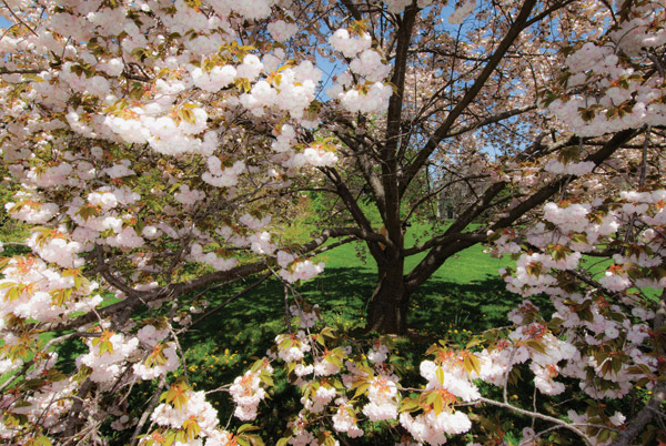
All Photos © George Schaub
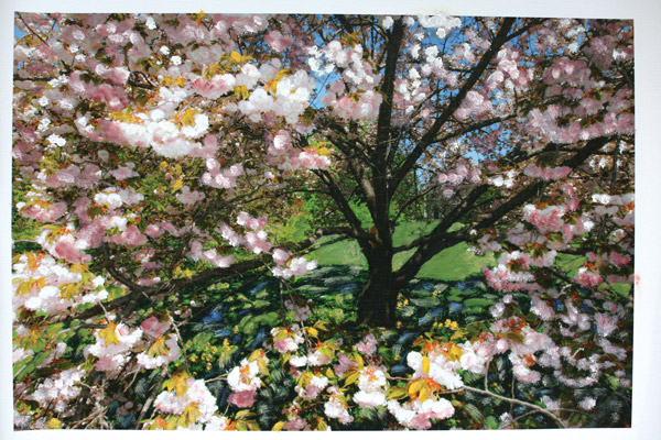
My question was whether or not canvas is a viable medium for photographs other than portraiture. I decided that rather than send out a bunch of images to a lab for the work I’d take it on myself, both to get a bit more intimate with the medium and to judge it’s capabilities and pitfalls.
As background, I once was very much involved with “handcoloring” silver prints, using Marshall’s Oils (a transparent oil paint medium specifically made for photographs) and various types of pencils, dyes and inks. I exhibited and sold work in various galleries and group shows, and thoroughly enjoyed working with the medium. When I stopped working with silver paper (mainly due to a desire to get out of the chemical darkroom and my discovery of the controls offered by digital printing) I pretty much gave up using oils and other media on photographs. The paper surfaces would not accept the oil properly, the inks were soluble and would dissolve the image when using certain media and the surfaces were not amenable to color pencils, even with great care in application. I could get a hand color effect using software, but it lacked both the presence of handcoloring techniques as well as the fun of “working” the print.
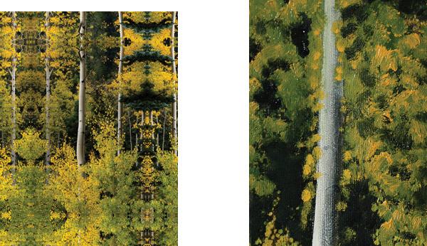
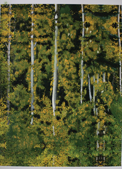
The idea of working with oils and other media on digital inkjet media came from working with a roll capable printer and the availability of canvas inkjet media. I never could work with canvas in “sheet” form due to transport problems and having to adjust the platen gap differently for every media with which I worked. It just seemed like too much trouble.
To get back into this aspect of the craft I worked with Epson’s Exhibition Canvas Satin material (www.epson.com). It’s available in roll form with a matte, glossy or satin finish in widths from 13” up and various lengths. The material itself is an acid free, lignin free heavyweight cotton-poly blend. The canvas base is enhanced with elastic polymers, said to provide high tensile strength and flexibility for stretching without cracking. This is pro media and priced accordingly. (Keep in mind that there are numerous other canvas substrates from Epson and other makers that you can use that share, at the least, the surface characteristics of this pro brand. You can also get canvas prints made from numerous labs if you want to get a sense of what canvas is all about.)
First, some work issues. As mentioned, I didn’t want to work with sheet canvas because of the anticipated problems of transport, platen gap and most of all humidity causing all sorts of jams in the printer. But working from a roll does require cutting after the print is done. Those without an integral cutter (I worked on the Epson 4880 which includes a cutter) might think that it is just too much work and will result in too much wastage, but, in fact, according to Epson, repeated use of the cutter on canvas might dull the cutting blade and might throw off more lint than desired into the unit. (The 4880 I worked with has an external cutter but I’m not convinced that this completely removes that problem.) In short, using canvas requires more careful handling than you might be used to when printing on other surfaces. The technique is to advance the roll paper using the paper feed and simply cut it with scissors.

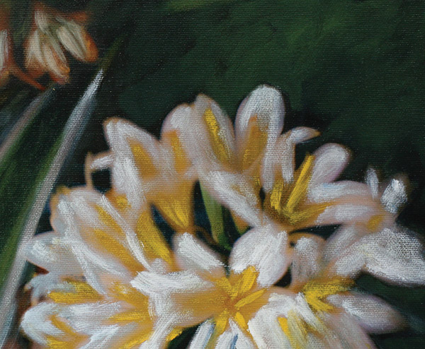
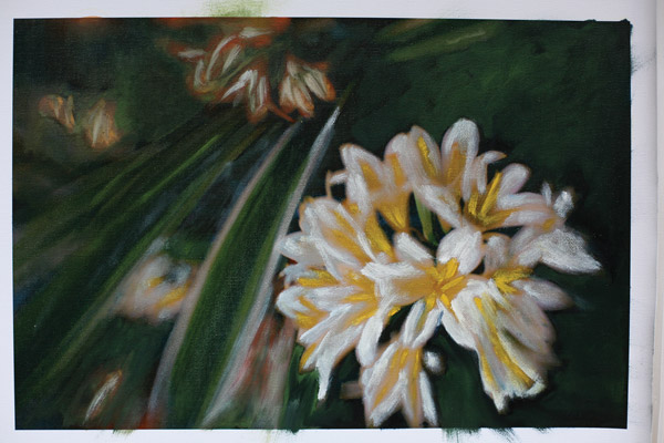
Once off the printer there are some fairly specific procedures for print care. This might vary from maker to maker, but probably not by much. According to Epson, you need to let the print “cure” for at least 48 hours prior to stretching and make sure it maintains flatness by inserting plain paper between the prints and stacking them. It’s also recommended you spray them with an “aqueous based protective spray” (I used Moab’s desert varnish, www.moabpaper.com) for long-term protection.
This does not bother me too much since I generally follow a similar procedure with all prints on all surfaces, minus the interleaving of plain paper sheets and spraying. In short, I believe that all prints need to cure when done on “premium” surfaces, and canvas is not immune from this, but needs more care than usual. I’ll not reiterate all of Epson’s advice here and refer you to their website and PDF’s for more, but I certainly recommend that you read and follow recommendations carefully when it’s a DIY project. In short, like all materials there are specific care guidelines that should be followed.
There are ICC profiles available for these surfaces; I used Epson’s Watercolor Paper-Radiant White (their recommendation) as the media setting. The first prints I made with that profile were quite weak when compared to the screen image until I read that choosing Matte Black instead of Photo Black will “yield a higher D-Max”. That probably holds true for other canvas substrates. I find that because canvas is more for the fine art market, where there’s less continuous tone type imagery, there’s more need to create your own profiles for your own photography. While the first profile I used was weak, the second was a bit stark.
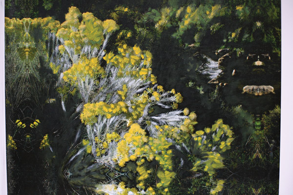
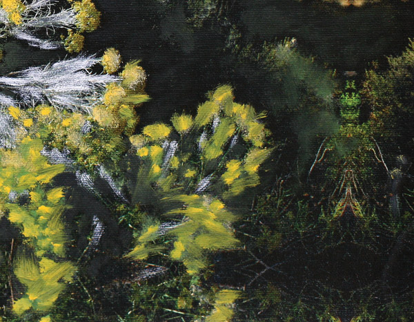
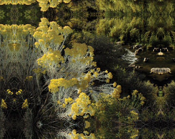
In short, the translation from photo to canvas needs much more tweaking than one might ordinarily get involved with; for example, at first I thought that images that begin as more high key and with less contrast would be more successful. This didn’t always turn out to be the case. I do feel that the canvas surface imparts more contrast to an image and that if you try to fight this too much in processing there’s a danger of falling into weak shadows and dull colors.
This is no different than any paper surface, where certain images work better than others depending on the surface characteristics. In recent tests of metallic, matte and “hard” gloss surfaces, what emerged was the clear message that paper surface and image content and contrast work hand in hand. There’s no dogmatic approach suggested—it’s just that the image and surface definitely work hand in hand. It turns out that the way you print, and the images you choose, lead to a certain way of working with the paint, and that you will have to test to see which approach works best for you.
So that brings me to the question of whether photographic images, other than portraits and bridals where it’s part of a commercial package, make sense on a canvas surface. There are both pluses and minuses. One determinate might be longevity, and while it’s tough to get longevity numbers on canvas surfaces, and while no maker can absolutely guarantee any particular time period on any surface, the consensus (for the Epson surfaces, at least) is that it’s between 50-75 years, with a longer lifespan when sprayed with a UV protectant, which I did with the prints I made. And that’s for the inks on the surface, and not the substrate itself. Compare that to a Wilhelm-claimed lifespan of up to 200 years plus with some non-canvas Epson Exhibition papers and the same ink.
Canvas, perhaps more than any other surface, tempts you to get involved with other art materials to finish the print. Quite a few photographic artists “work” matte surface papers with color pencil, charcoal and even pastels, yet there’s something about canvas that seems conducive to getting even more involved with applying oils and other art media. Is this because canvas seems so apt for this and I am conditioned to always think of it as “something to paint on”, or is it some lack in the look of the image on canvas that makes me feel compelled to add to it? Or is it the fact that this is one medium where there’s less problem adding something to it? With matte papers you have to be so careful not to indent the surface as you work or, if you use an oil or acrylic, not have the medium “pool” on the paper, creating a residue similar to what’s left when eating fries off a paper towel. And when working on a glossy surface applying other media is like running with sneakers on ice. Perhaps we photographers are so tempted to add other media to canvas images simply because we can.
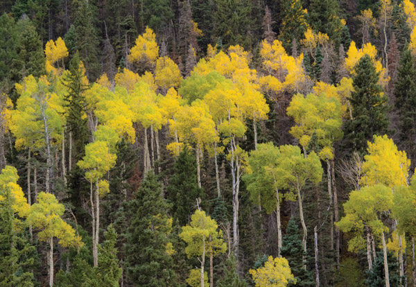
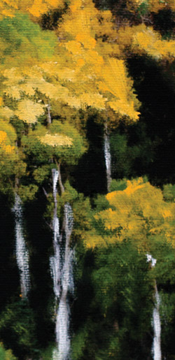
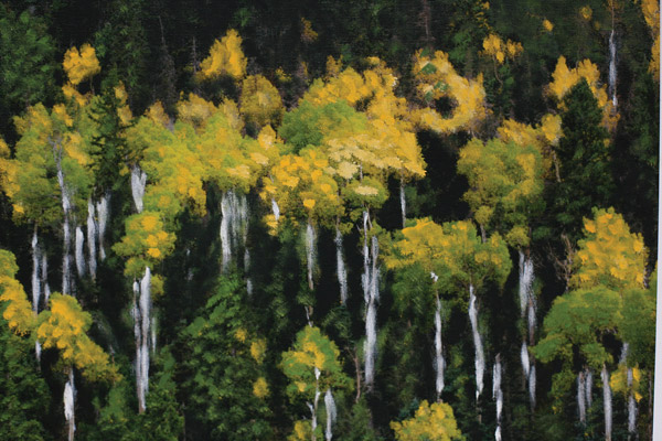
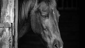
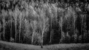
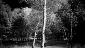
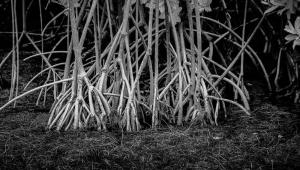
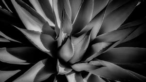
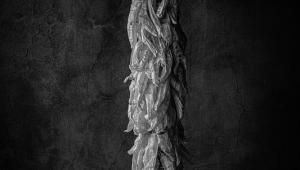
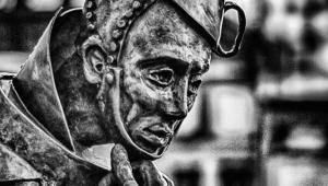
Working with canvas brings a kind of added kick to printmaking, especially when you make and choose images by previsualizing what you might want to work on them with later. This also determines the kind of images you choose to print, knowing that you will be applying other media, transparent or opaque, over the print. It’s not just a coloring book approach either; while the surface can be used as a kind of base for adding color within the lines it also can support thicker applications of paint and other media.
Yes, bridals and studio portraits are classic and tried and true subject matter for this genre, but having worked with scenics, florals and especially abstracts on canvas I can now say that the “canvas plus” approach is the most fruitful of all. Even if you can’t draw, like me, the photograph can serve as a starting point for some rather startling images. Part of the fun is surprising yourself as you go and discovering things about the medium as you work.
So, does canvas work for photographic images outside the traditional subject matter? You bet, but only if you’re willing to dive in and apply the same materials used by handcolorists and oil artists to your own images. Otherwise, stick to a quality matte or satin surface for your photographic prints. To me, canvas is simply not good for “straight” imagery. But if you get the chance, and get into a creative stretch, try out some “canvas plus” prints for yourself.
Materials Used
Marshall’s Oil Colors: (Recovered from the bottom drawer. Note that you can often find Marshall’s sets on eBay, www.ebay.com, but be aware of the condition, as some of these sets have oil that is dried out or has seeped from the tubes. Marshall’s oils are no longer made and the use of Arista Photo Oils is recommended by other handcolorists. They are available from Freestyle Photographic Supplies, www.freestylephoto.biz.)
Oil Brushes: Turpentine for oil and brush cleanup. (Warning: turpentine strips the ink right off the paper.)
Epson Canvas Satin Roll Paper
Epson 4900 Printer
OnOne Software’s Perfect Resize, www.ononesoftware.com. (aka Genuine Fractals)
- Log in or register to post comments

