- REVIEWS
Camera Reviews 
More Reviews Mobile Reviews Photography Reviews - GALLERIES
- VIDEOS
- BUYER'S GUIDES
Special Effects: High Contrast; How-To Add Graphic Appeal To Your Images
If you want to heighten the impact of your black and white or monochrome images, consider taking them higher—to higher contrast, that is. A number of filters and adjustments found in Photoshop CS3, Elements 6, and earlier versions present you with a wide range of options to simulate artistic brush effects, darkroom procedures, and printing techniques. With these, you can transform your image to look like an artwork created in a traditional art medium, or add graphic effects such as those seen on book covers, CD packaging, and movie posters.
To get a black and white photo, you can shoot in Black and White or a Monochrome mode if your camera offers those options. Or, convert any of your color digital files to black and white in Photoshop by choosing Image>Mode>Grayscale. If you have CS3, which I used for these examples, select Image>Adjustments>Black & White. In the Preset menu at the top, try all the drop-down options such as red, green, and yellow filters. Or adjust each color’s conversion using the sliders. If you have CS2, try Image>Adjustments>Channel Mixer.
The Filter Gallery
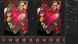
1. I wanted to add a high-contrast graphic look to my photograph of a narcissus.
 |
|
|
2. Choose Filter>Artistic>Poster Edges to bring up this Filter Gallery dialog box. At the bottom of the window in the left panel, you can choose the preview magnification as a percentage or to “fit in view,” shown here. I recommend looking at the preview both at “fit in view,” so you can see the overall look, and at 100 percent to check details. In the center of the dialog box are folders representing about half of Photoshop’s filters grouped in categories such as Artistic, Sketch, Stylize, and Texture.
In the top right-hand panel of the Filter Gallery box, you’ll find sliders to adjust the effect you have chosen. Experiment with these settings and watch as the changes are redrawn in the preview window in the left panel. Drag inside the preview with the hand tool to move to different parts of an enlarged image.
Below the settings you’ll see a sort of stripped down layers palette where you can apply more than one filter. However, I don’t recommend it. You’re better off using the real layers palette where you can change Blend modes, vary the opacity of each layer, add masks, and so on. Once you’ve decided on the filter settings most appropriate to your photo, click the OK button at the top right to apply them.
 |
|
|
Posterization
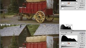
3. Applying the Poster Edges default settings of Edge thickness 5, Edge intensity 1, and Posterization 2, produced the pleasing result seen here. The flower is surrounded by a dark outline and stippled as if it had been hand-drawn with pen and ink.
Sometimes an applied filter effect looks good but is too dark or too light. If this is the case, simply add a curves or levels adjustment layer to lighten or darken the filter rendering.
 |
|
|
Portrait, High-Contrast Style
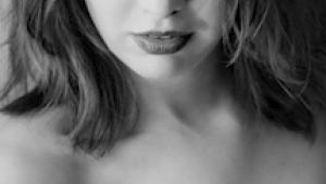
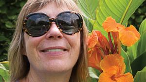
4. Starting with this portrait of Jamie, I wanted to transform it with a posterized look.
 |
|
|
5. Choosing Image>Adjustments> Posterize brings up this Posterize dialog box. The only control is the number of levels which can range from 2 to 255. The 2 levels represents pure black and pure white, usually with too much detail missing. Experiment with setting of 2, 3, 4, 5, and 6 to 10 or 20 for the most effective results.
 |
|
|
6. Here I pumped the default Levels setting of 4 up to 6, for six shades—black, white and four shades of gray. The posterized portrait creates an abstracted interpretation, but still maintains plenty of detail in important areas.
 |
|
|
Graphic Outlines
7. As the starting point for a minimalist outline effect, I chose this shot of the skyline of Central Park West in New York City.
 |
|
|
|
| |||||||||


![]()
Get the Latest Photo Tips, News & Reviews from Shutterbug!
| Camera Reviews Other Reviews | Mobile Reviews Photography Reviews Columns | News | Features | How-To | Resources |
 © 2025 Shutterbug
AVTech Media Americas Inc., USA
All rights reserved