- REVIEWS
Camera Reviews 
More Reviews Mobile Reviews Photography Reviews - GALLERIES
- VIDEOS
- BUYER'S GUIDES
Our Favorite Reader Websites: These Online Portfolios Speak the Universal Language of Great Photography

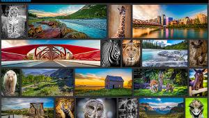
This month’s column features images from the U.S.A., Canada, and Slovakia, and each website and photographer showcases the joy of image making with the ability to share their work with like-minded individuals around the world, which is the main reason why photography is the universal language.
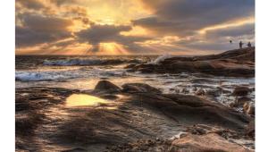
matejmichalik.com
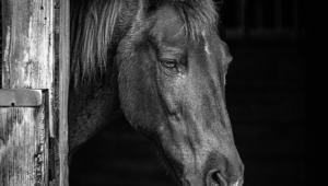
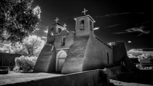
Matej Michalik is a photographer from Bratislava, Slovakia, who specializes in black-and-white fine art photography and whose website (in English) uses a classically styled monochrome interface with touches of color to keep it interesting. What’s far more appealing is his photography, which is gathered into three collections. Michalik says “he specializes in long exposure architecture and seascapes” and there’s also a third portfolio called People, which joins these two subjects. If you were expecting portraits you won’t find traditional ones but instead you’ll see conceptual photographs where people are a design element and serve as the glue to hold the images together while adding a spark of life. Michalik’s Architectural photographs are jaw-droppingly beautiful, and they’re made frequently with wide-angle lenses. When combined with his long exposure techniques, they produce a creamy, almost liquid look that imbues these inanimate objects with, I’ll say it again, a spark of life. This is architectural photography taken to a new level, one of interpretation and introspection, giving a heightened sense of otherworldliness with his use of monochrome tonalities. Michalik’s Seascapes could have been made on any planet and uses the kind of imagery that would be equally at home in an Alain Resnais film. Things are expected yet unexpected at the same time with his soft-edged style adding a touch of unreality. Michalik is clearly a master of the black-and-white idiom, capturing reality while delivering something that’s completely his own.
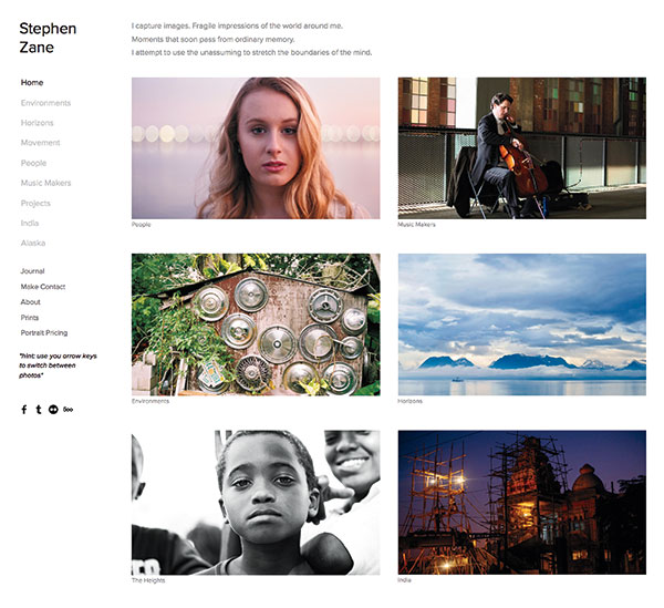
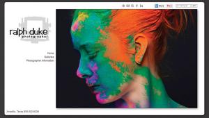
stephenzane.com
Stephen Zane is a young, Tampa-based photographer who, if the images on this cleanly designed site are any indication, has a bright future. With photographs collected in eight different galleries, Zane is omnivorous in his selected genres. Horizons contains monochrome and color landscape images, with an occasional cityscape tossed in to see if you’re paying attention, and he hopscotches styles while retaining his distinctive viewpoint—there are no people in any of these photographs. Yet the People gallery contains several collections, my favorite being We Were Just Kids, which holds portraits (I imagine) of his contemporaries shot in a direct no-nonsense yet affectionate manner. Form contains fashion-inspired images that seem to come from a mature perspective, while We Are Human captures grown-ups with a travel photography focus. Speaking of travel, the India gallery contains wonderful screen-filling images of people and places showing an India far from the travel brochures and TV documentaries I’ve seen. I like Zane’s India better. These often-poignant images show how well Zane connects with the people in his photographs, producing warm photojournalism with huge helpings of soul. The Alaska gallery is the opposite; bleaker and no people, although there’s a bear running around in one shot. Be sure to poke around the other galleries and don’t miss his blog-like Journal for a behind-the-scenes look.
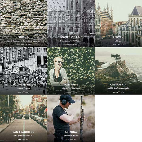
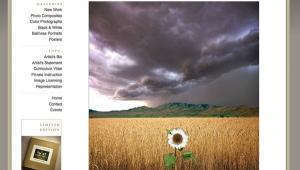
dfg.exposure.co
Daniel Gorman is a Canadian photographer who’s an aspiring Olympian—a 1500m runner—whose crisply designed site (created with Elepath software, www.elepath.com) contains eight mostly geographic titled galleries. The exception is his Portraits collection that, like the others, uses a photo essay format combining text with lots of large images. Gorman’s approach to environmental portraiture is to immerse himself in the lives of his subjects, creating a veritable “day in the life” effect combining monochrome and color images, often soft color, alternating between a photojournalistic approach to one that’s somewhat impressionistic. Bouncing over to the other galleries can be tricky because the site’s navigation may get you lost; if that happens just click Home and go from there. The Ghent essay is subtitled “Twenty four hours in Europe’s best kept secret” and fulfills that objective by filling the space with the soft-color images that are Gorman’s trademark and, in this case, emulates the old-world look of a hand-colored etching. It suits the material. He uses a similar imaging style for his San Francisco essay, subtitled “One Afternoon with Celia,” and it’s so involving for the viewer that I wonder why other photographers don’t use a similar long form for their own sites. This kind of format is relatable for the viewer and more interesting, I think, for the photographer. Look around Gorman’s site not just to admire his insightful photography but also to see a different way of presenting images to the world.
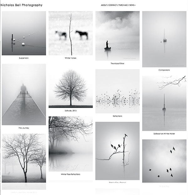
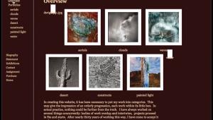
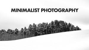
nicholasbellphotography.com
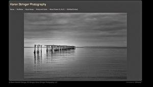
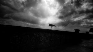
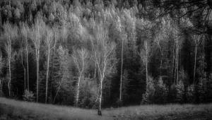
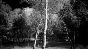
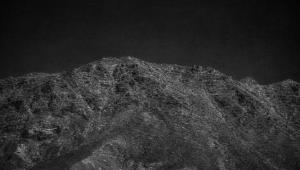
Nicholas Bell’s no-nonsense site hangs it right out there: here are my photographs, the design seems to be saying. There are no galleries, just the photographs themselves. Clicking one enlarges the image which allows you to scroll through others. And what amazing monochromatic images they are. (There’s one softly colored image along with some moodily toned ones.) Bell has perfected the art of the minimalist landscape photograph, first by removing all of the color, allowing him to photograph nature’s own design, and using his own skill set to select and compose images to create their own artful world. And sometimes as in “Suspension” its subject is far from predictable while preserving the photograph’s reality but creating what seems like abstract impressionism. A feat only an artist like Bell could pull off. Yet while images like “The Journey,” showing a ghostly figure on a pier, contain echoes of Duane Michals, others such as the enchanting “Magic Umbrella” could only be called “Tolkienesque.” That’s not to say his photographs are not accessible, far from it. Images such as “Ethereal Lane No. 2” are conventional in structure yet retain that unique Bell touch. He clearly combines many influences while maintaining his own identity to produce unique images that have the power not just to make a viewer see something but to dream.
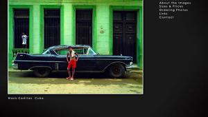
Joe Farace invites Shutterbug readers to visit his personal websites, including www.JoeFarace.com and www.JoeFaraceShootsCars.com, which also includes a blog with tips on photographing automobiles and motorsports.
- Log in or register to post comments


![]()
Get the Latest Photo Tips, News & Reviews from Shutterbug!
| Camera Reviews Other Reviews | Mobile Reviews Photography Reviews Columns | News | Features | How-To | Resources |
 © 2024 Shutterbug
AVTech Media Americas Inc., USA
All rights reserved