Output Options; Optimizing And Displaying On The Web
This month I'm going to focus on optimizing your digital images for display on the web. The biggest challenge most photographers face is creating a good print, but web display can be just as challenging and has its own unique set of needs. Images shown on the web or in e-mail need to find a balance between the size and the quality of the file. Too much compression to reduce the file size results in a poor image that loads really fast. Not enough compression, or too large of an image, and all but the fastest connections will create frustration for those looking at your website or awaiting an e-mail picture attachment to finally display.
Where It All Begins
Before doing anything, create and use a copy of the original image. I never
work on the original version since different steps are involved depending on
how the image will be used.
Last month I covered color management, and why that was an important step in
the digital workflow. By having your monitor calibrated, you have a good starting
point and an accurate representation of what your image looks like. Sadly, if
you've calibrated your monitor, you'll be in the very small minority
of web viewers, most of whom have never heard of color management, and could
care less--they just want to see the images look right. This is where the
sRGB color space comes into play.
 |
|
|
The default color mode for most digital cameras (in fact, for many compact
cameras, the only option) is sRGB. The sRGB was created to have a basic common
ground for Windows computers to display graphics and matches the typical computer
display. While sRGB doesn't display as many colors as other spaces, like
Adobe RGB or ColorMatch RGB, for on screen use it's the best choice and
the one that will present your images in their best light, regardless of the
viewer's setup.
It might seem then that sRGB is the perfect answer. While a good all-around
solution, sRGB is optimized for screen and not for print. If your camera and
your imaging software support it, I recommend using Adobe RGB for all your editing
and then saving a web version of the image with sRGB. If you shoot JPEG with
your camera, by all means leave everything set for sRGB and fire away.
 |
|
 |
|
|
The Mystery Of Resolution
One of the more confusing terms in digital imaging is resolution. Different
devices, such as monitors and printers, have their own definition of resolution,
and I'll be covering print resolution in a future article. Display resolution
is normally 96dpi (dots per inch) on Windows, while the Macintosh standard was
72dpi for years. Newer LCD displays are raising the dpi constantly, so 96 and
72 aren't the only choices. The other common reference to resolution is
screen resolution, or pixel dimensions, which refer to how many pixels are displayed
on the screen. Common setups are 800x600 and 1024x768. The only number we need
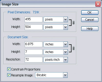
to worry about for web use is the second--pixel dimensions. Changing the
dpi of the image has no effect on the dimensions or size of the image on screen,
or the file size, as shown in the two images above.
- Log in or register to post comments

