- REVIEWS
Camera Reviews 
More Reviews Mobile Reviews Photography Reviews - GALLERIES
- VIDEOS
- BUYER'S GUIDES
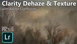
PhotoLesson: The Basics of Image-Optimization
| Digital images—whether shot with digital cameras or scanned from negatives, slides or prints—generally can stand some improving. Here are some tips that will improve many of your images noticeably. Keep in mind, though, that digital image-editing isn't magic: Just as with film, you can't add detail that isn't there, or make a sharp image out of one that's out of focus or blurred due to camera shake. While we are using Adobe Photoshop for these examples, most serious image-editing programs offer similar features.
A couple of tips: First, never work on the original image. Instead, work on an uncompressed TIFF copy. That way you won't alter your original archival image, and you won't lose image quality each time you open, change and save the image. Second, create separate layers for things like Levels, Curves, Color Balance, Hue/Saturation, etc. Doing this offers several advantages, including (1) you're not altering the pixels of the original image, (2) you can go back and change specific corrections later without affecting other changes you've made, and (3) you can look at individual corrections individually.
|
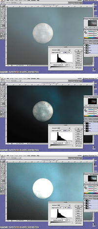 1. Adjusting Contrast 1. Adjusting ContrastA good place to start is with brightness and contrast. Here's a simple way to optimize them. Open the image, go to Layer > New Adjustment Layer > Levels, and name the layer (I generally just go with the default "Levels 1"). In the middle of the Levels window that then appears is a histogram—a graph of the tones in the image. Dark tones are on the left, light tones on the right, and midtones in the middle. Below the histogram are three arrows. If you move the left arrow to the left edge of the histogram, that will make the darkest tone in the image black. If you move the right arrow to the right edge of the histogram, that will make the lightest tone in the image white. You might not want a pure black and/or pure white tone in every image, but that's a good place to start. (If the histogram already goes from one end of the graph to the other, that means the image already contains a pure white and a pure black tone.) Next, use the middle arrow to adjust the midtones to your liking. In Photoshop, moving the middle arrow to the left makes the midtones lighter; moving it to the right makes the midtones darker. (Top) The Levels histogram indicates that this image lacks true black and true white tones. (Middle) Moving the left arrow to the left edge of the histogram makes the darkest tone in the image turn black, while moving the right arrow to the right edge of the histogram makes the brightest tone in the image pure white. (Bottom) Don't move the right arrow into the histogram beyond its right edge. If the histogram starts as just a thin line, that's still part of the histogram; moving the right arrow past the end of the thin line to the main bulk of the histogram will result in blown-out light tones.
|
 2. Adjusting Color 2. Adjusting ColorNext, it's time to sort out the color balance. If the colors look right, leave 'em alone. If they don't, there are several ways to fix that. The easiest is to create a Color Balance Adjustment Layer (go to Layer > New Adjustment Layer > Color Balance), and use the sliders there to adjust the amount of red/cyan, green/magenta, and blue/yellow. Just experiment with the sliders, until the image looks right to you. You can also do color adjustments in Levels. At the top of the Levels window is the Channel pulldown menu. It defaults to RGB—all three image channels, red, green and blue. But you can click on the menu and drag down to the individual channels, too. In each channel, moving the right slider to the left makes the image more the channel's color, while moving the left slider to the right makes the image more the channel's complementary color; and moving the middle slider to the left makes the middle tones more the channel's color (and lighter), while moving it to the right makes the midtones more the channel's complementary color (and darker). A good starting point is to move the outer sliders to the edges of the histogram in each channel. But sometimes this will give you strange color balance and/or blown-out highlights (in sunrise and sunset cloud scenes, for example). So always go by what looks best to your eye. If there's a neutral tone in your image, you can quickly get a ballpark color balance by using the middle eyedropper at the bottom right of the Levels window. Just click the eyedropper icon, then click on the neutral area of the image. This will neutralize that area and thus theoretically adjust all the colors properly too. Once you have the colors they way you want them, click OK to save the color-tweaking Adjustment Layer. Now, create a saturation Adjustment Layer (Layer > New Adjustment Layer > Hue/Saturation). Moving the Saturation slider to the right increases saturation, moving the slider to the left decreases saturation (moving it all the way to the left results in a monochrome image). Moving the saturation slider to the right past around 30 generally produces unrealistic colors, and always results in increased noise ("graininess").
|
 3. Dodging & Burning 3. Dodging & BurningLevels adjustments are applied to the entire image. If just a portion of the image needs to be lightened or darkened, you can use the Dodge tool and the Burn tool. The Dodge tool lightens the area you drag it over, and the Burn tool darkens the area you drag it over. You can adjust the size of the tool, and its "strength." Rather than use an Adjustment Layer for dodging and burning, create a Duplicate Layer (Layer > Duplicate Layer), and name it Dodge/Burn, or whatever you want. This will keep your dodging and burning separate from the previously done corrections. You can even make one Duplicate Layer for dodging and another for burning. The Dodge and Burn tools let you lighten or darken specific areas of the image. Here, we're using he Dodge tool to lighten the lower left area (the Dodge tool cursor is actually a circle of the size you select, but it turned into this icon when we made this screen capture).
|
 4. Spotting & Retouching 4. Spotting & RetouchingTo remove small dust specks, scratches, or unwanted branches and the like, use the Paintbrush tool. Option-click on a nearby area whose color and density you wish to use to cover the offending item, then "paint" it out with the brush. For larger areas, use the Clone Stamp tool (the rubber-stamp icon in the tool palette). The Clone Stamp tool copies the area you click, then pastes it onto the new area. You can adjust the size of the sampled/pasted area via the brush-size palette. Photoshop 7 introduced the Healing Brush, which works like the Clone Stamp tool, but instead of copying the whole area you click, it just copies the texture, then blends it with the color and brightness of the new area—very handy for people-pictures. (Note: It's a good idea to zoom the image to 100% when retouching.) If you have an unwanted object in the image, you can use the Clone Stamp tool to remove it, by copying a nearby background area and pasting it over the offending object. Cloning is very simple to do with plain-background images like this one, but you can deal with just about anything with practice.
|
 5. Sharpening 5. SharpeningOnce you've got the image just the way you want it, the last step is to sharpen it. The best method is the Unsharp Mask filter. Zoom the image to 100%, and open the Unsharp Mask (Filter > Sharpen > Unsharp Mask). There are three sliders in the Unsharp mask window: Amount, Radius, and Threshold. Start with an amount of 100%, a radius of 1.5 and a threshold of 3, and go from there, carefully watching the edges in the image. If they develop a glow or become too grainy, you've overdone the sharpening. It's better to err on the side of too little than too much. These are just the beginning of the things you can do with Photoshop and other image-editing programs. I'd suggest that you check out one or more of the many how-to books available for your image-editing software. Two very good ones for Photoshop users are Photoshop Restoring & Restoration, Second Edition, by Katrin Eismann; and Photoshop 7 Artistry, by Barry Haynes and Wendy Crumpler (both from New Riders Publishing; www.newriders.com). Optimizing Tips If you see a halo around the subject, you've overdone the Unsharp Mask. Back off on the radius, and if necessary the amount. Optimizing Tips |


![]()
Get the Latest Photo Tips, News & Reviews from Shutterbug!
| Camera Reviews Other Reviews | Mobile Reviews Photography Reviews Columns | News | Features | How-To | Resources |
 © 2025 Shutterbug
AVTech Media Americas Inc., USA
All rights reserved