The summer in Bulgaria is the best time of the year. This is the time when students and workholic people take vacations from work and more than half of the country goes to visit places. People are enjoys the sun, the salty sea water and the sand. As far as I know,tourists love to enjoy the clubs, the discos, having a wonderful time at the live music restaurants, casinos, and visiting pubs.In Bulgaria, One of the attractions at the coast are the hotel architectures. Every Hotels in Bulgaria
is unique, interesting and just beautiful to look at. The young architects have the greatest opportunity to express themselves, their ideas and we are more than happy to be able to enjoy that.The typical places where people would like to eat are restaurants, taverns, cafes, grocery stores and grab 'n go. Like every nation, Bulgaria has its own traditional meals.
- REVIEWS
Camera Reviews 
More Reviews Mobile Reviews Photography Reviews - GALLERIES
- VIDEOS
- BUYER'S GUIDES
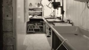
The Darkroom
The Lowdown On VC Papers; A Versatile Choice For A Variety Of Negatives Page 2
Twin-Filter Printing
True split-grade printing is printing one part of an image at one grade, and
another part at a different grade, as described later. Confusingly, many people
use the same term to describe twin-filter printing, where you expose the whole
image twice through two different filters or at two different filter settings.
Twin-filter printing can work very well, but the theory behind it is often misunderstood.
The common misconception is that you can "lay down" the highlights
by printing at one grade, then "lay down" the shadows by printing
at another grade. In reality, you cannot. There will always be a single contrast
grade which will give identical effects with a single exposure, because the
characteristic curves of the two emulsions combine to give you a single, intermediate
contrast grade.
For example, if you expose your print for 5 seconds at Grade 0, and 5 seconds
at Grade 5, the results will be very close to what you would get at Grade 21/2
with a 10-second exposure. They may not be identical--you might need 2.4
or 2.6--but if you could dial in that grade, the results would indeed be
identical. The same would be true with (say) an 8-second exposure at Grade 11/2
and a 2-second exposure at Grade 3. You would need a 10-second exposure at somewhere
around Grade 2, but I wouldn't like to say exactly what grade.
If you get good results via twin-filter printing, then that is the way you should
print. Also, with discrete filters, it allows you to print in-between grades
for which you don't have a filter.
True Split-Grade Printing
There are two reasons for burning locally at another contrast grade. The first
is corrective, the second artistic. As an example of the former, a negative
may have plenty of sky detail, but at the exposure and contrast which makes
the foreground look right the sky comes out "bald." Generally, burning-in
the sky at a softer grade will reveal the lost detail. There are also times
when you have good detail, but you simply want more drama and emphasis: a "looming"
sky is a prime example. Or you might want to darken one particular detail, or
lighten another, either to draw attention to something, or to make it less prominent.
Again a series of test strips will give you a good idea of just how far you
can go.
Do not, incidentally, believe anyone who says that if your prints often look
better with some dodging and burning, you must be overdeveloping them. Dodging
and burning are legitimate methods of control, and the vast majority of fine
printers use one technique or the other, or both, on the vast majority of the
prints they make.
 |
|
 |
|
|
Pre-Flashing
This technique (which works as well with VC as with graded paper) involves giving
the paper a brief exposure to overcome the inertia. As this exposure should
be too brief to build any density, it doesn't matter whether you use filtration
or not. If you want to pre-flash, you should test each paper you use. With no
negative in the carrier, the lens stopped well down and the head high on the
column, make a series of short exposures: for example, 1-2-4-8 seconds.
Let's say there is slight fogging at 4 but none at 2. Make another set
at 2.2, 2.5, 2.8, 3.2, and 3.5 seconds, or if you like at 2.5, 3, and 3.5 seconds:
it's not that precise. The last exposure before the one which gives you
any density is your pre-flash. If there is density, you are fogging, not pre-flashing.
Settings For Color Heads
There are two families of enlarger filtration, Durst and Kodak. The Durst family
includes Dunco, Kaiser, Kienzle, Paterson circa 2000, Leitz, and Lupo. To complicate
matters further there are enlargers in the Durst family with 130 maximum magenta,
and others with 170 maximum magenta.
The Kodak family includes Advena, Beseler, Chromega, De Vere, Fujimoto, IFF,
Jobo, LPL, Omega, old Patersons, Saunders, Simmmard, and Vivitar. Meopta and
Krokus are included in the Kodak family, but need slightly more magenta for
harder grades. The hardest grade available from this family is 41/2 or a little
harder: for Grade 5 use a discrete filter. Make your own tests and alter the
chart values to suit your tastes and your paper choices.
| Grade | Durst 170 | Durst 130 | Kodak |
| 00 | 115Y/0M | 120Y/0M | 162Y/0M |
| 0 | 100Y/5M | 88Y/6M | 90Y/0M |
| 1 | 75Y/10M | 64Y/12M | 68Y/10M |
| 2 | 52Y/20M | 45Y/24M | 41Y/32M |
| 3 | 34Y/45M | 24Y/42M | 23Y/56M |
| 4 | 17Y/76M | 10Y/69M | 6Y/102M |
| 5 | 0Y/170M | 0Y/130M | Not Possible |
A Quick Course In Printing
There are lots of ways to learn to print. You can attend workshops or take a
course at your local college, or learn from a friend. But one of the quickest
ways is to buy a big box of VC, resin-coated paper and set yourself a date to
finish it. Better still, buy two boxes so you don't start getting nervous
when you approach the end of the first box! Yes, two boxes of paper are expensive.
But how expensive is a college course? (And you'd still need to buy the
paper anyway.)
VC paper gives you the flexibility of trying whatever grade of paper you need,
and resin-coated paper washes and dries very quickly, so there are no long waits.
You can always switch to fiber based later, if you want, but many photographers
are perfectly happy to use resin-coated for most or all of their prints.
Don't worry about how much paper you have to throw away. That's
part of the learning curve. Besides you can use those scrap prints for other
experiments with toners or handcoloring materials.
VC Vs. Graded Papers
There are lots of different VC papers available. All paper manufacturers have
them. You can buy resin-coated papers,
fiber-based papers, warmtone papers, cooltone papers, matte, semimatte, or gloss.
Even so, graded papers are still made, partly for technical reasons--some
heavily textured papers are not VC, for example, because the emulsion coats
unevenly--and partly because some photographers prefer them, even though
the quality of VC paper caught up with graded many years ago.
Partly, too, it is for Grade 5. I keep a box of Ilford Ilfospeed Grade 5 for
when I need all the contrast I can get; for example, when I am printing very
old negatives which have not been properly stored. I can gain almost a full
contrast grade by using this instead of my usual Ilford Multigrade Warmtone
paper. If I then develop it in Tetenal Dokumol developer I can get perhaps another
1/4 grade. A box of Grade 5 has a shelf life of years, so if I don't use
it up very fast it is not a problem.
And then there are also those for whom the whip-and-chair approach is the only
way to make prints. Through endless testing they manage to tame all their negatives
so that they print perfectly on Grade 2 every time--except that usually
they don't. Couldn't that sky benefit from a short burn at a lower
contrast? Might not another 1/4 grade of contrast add "sparkle"?
Why limit yourself?
Developing all your images so that they print perfectly on Grade 2 is hard enough
even when using single sheets of cut film: for example, the negative for Ansel
Adam's famous "Moonrise, Hernandez" was water-bath developed
and then locally intensified. It's probably a little easier if you always
shoot in the studio under controlled lighting, but anyone shooting 35mm film
or roll film of different subjects under different lighting conditions cannot
by definition have every single negative print perfectly on a single grade.
At this point, VC paper is the perfect solution.
VC Without Filters
It is generally reckoned that if you print on VC paper without VC filtration
you will get Grade 2. With my Meopta Meograde head, and Ilford Multigrade Warmtone
paper, I would say that it is more like Grade 13/4, though I don't have
the equipment to test it precisely: certainly, a Grade 2 filter gives more contrast
than no filtration, though you have to allow for the difference in exposure.
I found that the print with the filter needed about 3/4 stop more exposure than
the print without; the exact difference depends on which tone (highlight, mid
tone, shadow) you are trying to match. Try it for yourself to see what happens.
|
| |||||||||
- Log in or register to post comments


![]()
Get the Latest Photo Tips, News & Reviews from Shutterbug!
| Camera Reviews Other Reviews | Mobile Reviews Photography Reviews Columns | News | Features | How-To | Resources |
 © 2025 Shutterbug
AVTech Media Americas Inc., USA
All rights reserved