Exploiting Color For B&W Fidelity; Try Your Hand At Duo-, Tri-, And Quadtones Page 2
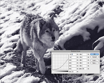
To show how the tonal curve can affect the image take a look at #7. This is the default setting used by the preset I selected. It’s a subtle tone that resembles a platinum print, and one that I find is a good starting point for this type of look.
 |
|
|
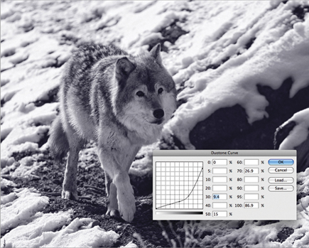
I want to strengthen the blue tint, so I drag the curve points to the locations I think look best (once again, all updates are done as you move the curve points, so it’s easy to experiment to get just the value you want). By mapping a more aggressive curve, the blue tone is intensified and gives more detail to the darker areas of fur on the wolf (#8). To make adjustments to a curve, click on the handle and drag it. To add a new point, just click where you want it and then drag to the location you want. As an alternative, you can type numbers directly into the percentage boxes, but I find that it’s much easier, and more visual, to deal with the curve itself. You can see below the curve the step wedge that shows what part of the tonal range is affected by the curve points.
 |
|
|
Tritone And Quadtone Images
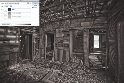
The only real difference between duo-, tri-, and quadtone images is the number of colors being used. It becomes more important with a tritone or quadtone to apply those colors carefully to have a good range of tones throughout your image. In the next example, I’ve created a tritone image using Black and two similar shades from the PANTONE library (#9). If you look at the curves, you’ll see that each color is impacting a different area of the image, with blacks mostly in the shadows, PANTONE 409 CVC in the mid tones, and PANTONE 407 CVC in the highlights (#10).
 |
|
|
 |
|
|
Your goal is to keep any overlap in color to a minimum in order to have the widest tonal range possible. The best way to learn how these colors interact is to start out with the presets and then make adjustments to either a color or the curve for a color and see what the effect is on your image.
Split-Tones In Lightroom
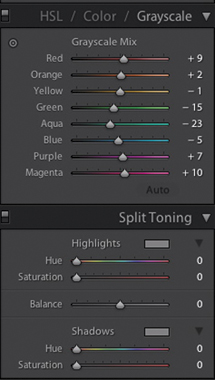
If you’re a Lightroom or Adobe Camera Raw user, you can accomplish something very similar by using the Split Toning controls in each program (#11). Note that I say similar, as it’s impossible to achieve the exact same effect since you’re working with Hue and Saturation for two colors, rather than tonal curves for a specific color.
 |
|
|
 |
|
|
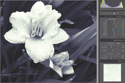
An example of using Split Toning is shown in #12. I’ve adjusted the color balances for each color in the HSL panel to give me the optimal black and white image possible with this shot. In the Split Toning panel, I’ve selected Hue and Saturation values for both the Shadows and Highlights, and by using the Balance control I’ve weighted the color toward the shadow side of the histogram.
- Log in or register to post comments


