- REVIEWS
Camera Reviews 
More Reviews Mobile Reviews Photography Reviews - GALLERIES
- VIDEOS
- BUYER'S GUIDES
Exploiting Color For B&W Fidelity; Try Your Hand At Duo-, Tri-, And Quadtones
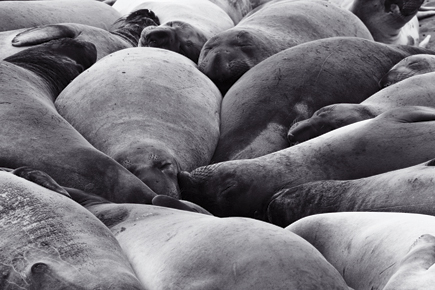
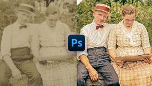
It seems easy to create a black and white from a digital image (#1). At its most basic level all that is required is selecting “Convert to Grayscale,” which is found in almost every image-editing program on the market. But, this simple transformation leaves much to be desired. In reality, you’re just discarding all of the color information and are usually left with a flat gray image that doesn’t do much for you. There are better methods, and, with some basic guidelines, it’s not very complicated. Taking it a step further, you can also create toned images using two, three, or four different color values. This type of print is also known as a duotone (two color), tritone (three color), or quadtone (four color) image.
 |
|
|
What Is A Multi-Tone Print?
A multi-tone print is the result of printing a grayscale image using two, three, or four (or more) ink colors. The result is a richer tonal range than would be possible when using only one color or just black ink. By selecting ink colors, you can create a toned image that mimics the traditional darkroom processing techniques like platinum, selenium toning, and other alternative processes.
True, it’s possible to achieve a similar look by using the Hue and Saturation control, but this tool doesn’t give you as much control over how the color is applied, and you’re still limiting yourself to printing a color image with emphasis on two tones, rather than using the colors as a monochome ink set with its much greater tonal range.
Creating A Duotone Image
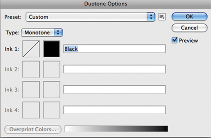
Let’s start off with the simplest of toned images, the duotone. If you’re using Photoshop, with your image open, the first step is to convert to grayscale by selecting Image>Mode>Grayscale. Now, select Image>Mode>Duotone (#2).
 |
|
|
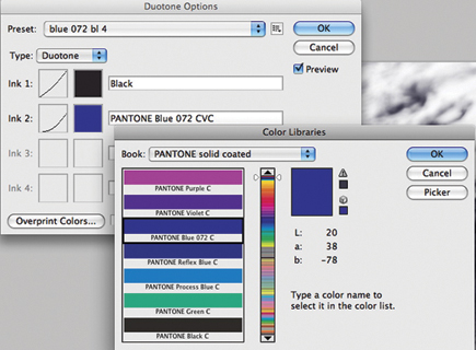
By default, you’ll see that you have a Monotone image since you’re starting with a grayscale. Select Duotone from the pop-up menu to enable a second ink selection. You can click on the color square to select the tones you want to use, either the standard color options (#3) or, by clicking on Color Libraries, you can select from a number of different palettes such as the PANTONE color library (#4).
 |
|
|
 |
|
|
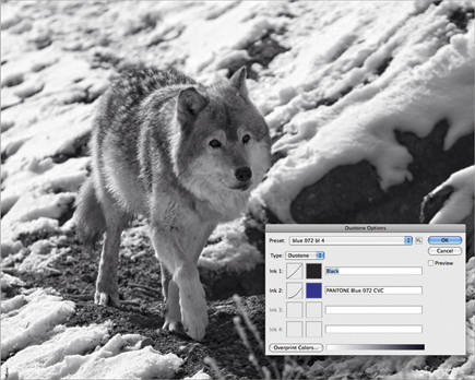
Perhaps the easiest way to understand how tonal options work is to select one of the many presets that are included with Photoshop. In the example shown in #5, I’ve selected the blue 072 bl 4 preset. Obviously not an intuitive name, but as you scroll through the list and try different options, Photoshop will update your image prior to making a commitment to those tones.
 |
|
|
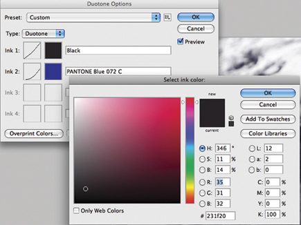
The real power in this dialog box is the Curves control for each color choice. This is where you set how the color is applied to your image. The Duotone Curve works very much like the normal Curves control in Photoshop. As you can see in #6, the Black curve is pretty linear while the PANTONE Blue 072 CVC curve affects the image much less, and mostly in the mid tones.
 |
|
|


![]()
Get the Latest Photo Tips, News & Reviews from Shutterbug!
| Camera Reviews Other Reviews | Mobile Reviews Photography Reviews Columns | News | Features | How-To | Resources |
 © 2025 Shutterbug
AVTech Media Americas Inc., USA
All rights reserved