Winning Digital Photo Contests
The following is a book excerpt from Jeff Wignall’s new book “Winning Digital Photo Contests.” Have you ever daydreamed about having your photo featured in a major publication, or displayed on a giant screen in Times Square? Do you want to compete for top prizes and worldwide recognition? Digital photo competitions are everywhere and this in-depth guide will show you how to find and win the best contests. Illustrated by more than 100 award-winning pictures, Wignall’s inspiring and informative text—plus interviews with grand prize winners and contest judges—reveals the secrets of creating those powerful, emotion-filled images that win every time.
Published in early October 2009 (Lark Books, ISBN: 978-1-60059-475-5), the book can be purchased via www.BN.com, or from your local Barnes & Noble store.
Communicate A Sense Of Scale
Why This Moment?
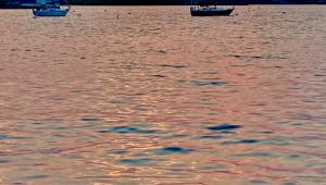
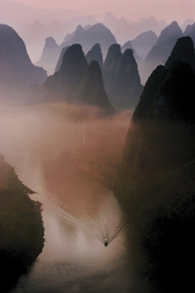
“Several factors attracted my attention: the mountains, the mist, the boat, and the ripples. The movement implied by the ripples was very important; without it the photo would have been too static.”—Ted Lee
 |
|
|
When you photograph a common object—a deck chair, a bicycle, or a basket of apples—it isn’t important to include indicators of relative size, because we’re already familiar with the approximate size of such objects. Landscapes, on the other hand, are rarely so familiar that their huge dimensions are self-evident. Even with familiar views of the Grand Canyon or Grand Tetons, viewers can’t readily grasp the enormity of the subject unless you’ve included a visual measuring stick.
Remote, unpopulated areas like mountain ranges and scenic panoramas particularly need at least one object of modest size in order to communicate a sense of scale. In photographer Ted Lee’s haunting shot of the Li River in the Guang Xi Province in China, it’s the boat that reveals the mountains to be vast, soaring, and imposing. If you doubt the importance of the boat, put your finger over it. What happens? The mountains shrink, the grandeur diminishes. Even though we don’t know the precise size of the boat, its presence reveals the expansiveness of the surroundings. Lee, who photographs this area near Guilin, China about once every six months, says he waited patiently for the boat (and the ripples) to complete the scene.
 |
|
|
To exploit scale and size, choose familiar markers of a known size. Including a saguaro cactus in a desert landscape, for example, is only somewhat useful because not everyone has seen one in person—not to mention that their height can range from 2 to 30 feet (0.6-9 m) or more. But put a person in that same scene and the scale is abundantly clear, as we all know the approximate size of a human being.
When you want to veil the dimensions of a landscape, keep in mind that the reverse of this concept is also true. If you consciously remove all objects of known size, you can eliminate scale from the scene and create a more abstract landscape.
The Minimalist Approach
Why This Moment?
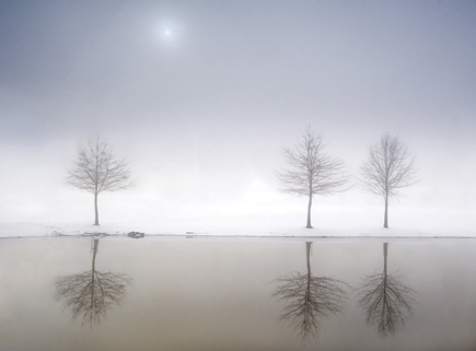
“This scene usually includes apartment buildings in the background, but with fog rolling in, coupled with a recent snowfall, the scene became a tranquil, serene landscape.”—Craig Doros
There is a temptation when photographing landscapes to indulge in everything that appears in front of you. In the same way that some of us grab a smattering of everything at the all-you-can-eat buffet, a gorgeous landscape tempts you to stuff too much into a single frame. When faced with a surplus of exquisite scenery, it’s hard to remember that less is more; so most photographers just pull out the wide-angle lens and embrace everything they see.
But with great landscape photos, as with a healthy diet, less is almost always more. Unless it is supremely well organized, clutter annoys the heck out of judges. Whether you’re entering a contest or a local juried show, judges seek a clean image with a purposeful design that showcases what’s important. The simple fact that you took a risk and built your designs out of fewer components is enough to impress most judges.
Often the most powerful landscape photos feature only a few distinctive elements that are representative of a larger and more complex whole. By including fewer objects, you free the eye to explore while also emphasizing the objects that remain. Craig Doros’ splendid and uncomplicated image reveals only four elements: the water, the trees, the snowy background, and the sky. To add any more elements—a fourth or fifth tree, for example—would diminish the design and detract from its impact. Notice, too, how the still waters emphasize the sky area to reinforce the feelings of tranquility and simplicity.
Try to think of landscape compositions from a Zen perspective: what you leave out is just as important as what you include. As you compose a scene, take a moment to ask yourself what can be eliminated without upsetting the balance or significance of your shot. Do you need the park bench? Is the rock outcropping really necessary? Once you’ve analyzed the scene, either use your zoom lens to tighten the frame and exclude those superfluous elements, or just move around the scene until you find a cleaner design.
 |
|
|
