- REVIEWS
Camera Reviews 
More Reviews Mobile Reviews Photography Reviews - GALLERIES
- VIDEOS
- BUYER'S GUIDES
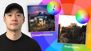
Portrait Tips: How to Use Color as a Seamless Background in Your Outdoor Photos
Most of us are familiar with the use of out-of-focus, seamless backgrounds by studio photographers, especially those who shoot portraits. Often, these backgrounds are a single color, such as white, black, or gray. In other cases, the backgrounds are a muslin material, adding texture to the background. The sole purpose of these backgrounds is to create a cleaner overall composition, giving the viewer no choice but to look at the man, woman, or child.
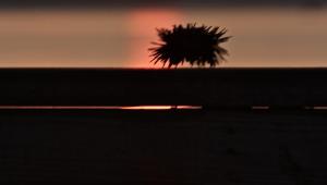
Unlike the often limited and single-colored backgrounds found in portrait studios, however, there is a truly unlimited supply of seamless backgrounds to be found outside of the studio, in all manner of tones, textures, and colors. And the best part is, they are free. Once you begin to realize this, you can expand your vision in an unlimited number of ways.
As you look at the following examples, note how I use out-of-focus color backgrounds to not only create cleaner compositions but to add impact, thanks to the contrast between the color of the background and that of the main subject.
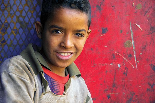
I met this Egyptian boy in Cairo several years ago. He was hard at work making ornamental fencing. I asked his father if he would mind if I posed his son against a nearby background, and he said sure. It was over within thirty seconds, and I moved on to other subjects in the neighborhood.
It wasn’t until several days later, after returning to Dubai, that I sat down to edit these photographs and was absolutely awestruck by how the color and design of the boy’s shirt almost exactly mimics the background. I had never met the child before, nor been to this location, yet together he and I created a very serendipitous moment.
Note my deliberate choice to compose a larger part of the frame with red, thus casting the color blue into a smaller, supporting role. The contrast of the advancing red against the receding blue intensifies the sense of depth and distance.
I met this young man at the fish market in Deira, Dubai, and was immediately struck by the color and intensity of his eyes. Fortunately, he was near a vendor who was selling, among other things, burgundy-colored sacks of onions.
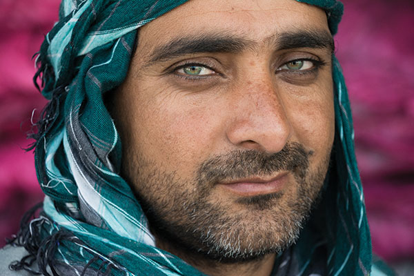

I wondered if I could find a point of view that would allow me to incorporate the burgundy sacks into the background and—with the aid of my telephoto lens, a narrow angle of view, and a relatively large aperture—turn them into an out-of-focus burgundy tone that would contrast with the green in the man’s headscarf and eyes. Once I determined it was possible, I simply asked this young man to walk over to the spot where I needed him to stand.
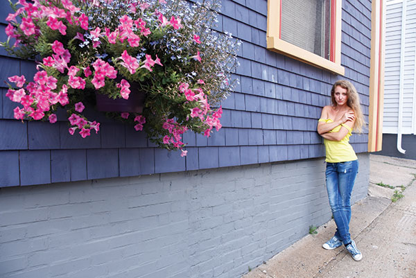
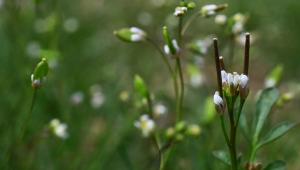
How many times have you walked past a flowering window box or a basket of overhanging flowers, never giving a thought to their potential use as out-of-focus color? When my students and I came upon this large window box of colorful flowers during a workshop in Lunenburg, Nova Scotia, the students were quick to take out their macro lenses and start shooting close-ups of flowers.

When using out-of-focus colors in the foreground this way, be careful not to place tones of color in areas that will overlap awkwardly onto the focused subject, such as on the eyes, thus causing a distraction for the viewer.

(Editor’s Note: This story was adapted with permission from Understanding Color in Photography, by Bryan Peterson, copyright 2017, published by Watson-Guptill Publications, an imprint of the Crown Publishing Group, a division of Penguin Random House LLC.)
- Log in or register to post comments


![]()
Get the Latest Photo Tips, News & Reviews from Shutterbug!
| Camera Reviews Other Reviews | Mobile Reviews Photography Reviews Columns | News | Features | How-To | Resources |
 © 2025 Shutterbug
AVTech Media Americas Inc., USA
All rights reserved