- REVIEWS
Camera Reviews 
More Reviews Mobile Reviews Photography Reviews - GALLERIES
- VIDEOS
- BUYER'S GUIDES
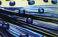
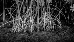
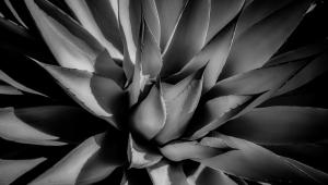
Point & Shoot: Kind of Blue
|
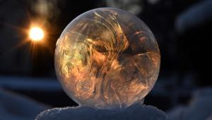
When a photo emphasizes a particular color, it often dictates the mood of the picture—be it warm or cool, bright or muted. Blue is usually associated with soothing, cool and more-somber moods. Conversely, the color red conjures up emotions like passion, heat, love, and even anger.
We often take color for granted when photographing various scenes, but you can take control over the intensity or amount of color when taking pictures. You can isolate one color—like blue—to tell a story or convey a relaxing mood. Learning to do this is mostly a matter of training your eye to recognize compositions in which a color predominates. And, of course, you can choose to avoid color altogether by shooting black-and-white film or adjusting your color settings on your compact digital camera. There are no hard-and-fast rules where color is concerned, but some of the most appealing color photos are ones in which one color or a group of closely related hues dominates the image. For example, you can photograph a blue sky that meets the cool blue-green of the ocean. Other pictures are striking because one colorful subject stands out from a muted or complementary-colored background, like a blue flower against pale foliage. To predict how colors will be rendered on film, it helps to learn to see the same way that film and your camera do. When we look at a subject in different kinds of light, our brain makes adjustments to colors. If we know that a rock is white during the daytime, we tend to see it as white even though it may appear bluish in the fading light of evening shadows. With experience, we can compensate for this by training our eye to see the differences and to anticipate the way the camera will see an object under various lighting conditions. This way, you can deliberately create a particular mood in your photos. Lighting and weather make a great deal of difference in the way colors are rendered in your pictures. This is true at night, early or late in the day, and with certain types of artificial light. Overcast days produce more subtle, cooler tones than do bright, sunny days. Don't put your camera away in overcast weather—instead, take this opportunity to take some interesting monochromatic effects that you can't get in bright light. Remember that great color won't compensate for bad composition. Our eyes tend to overlook distracting elements, but the camera will render a scene just the way it is. With time, you'll learn to compose a pleasing picture. Take time to examine the scene through the viewfinder and find the best way to emphasize your subject. Shoot from different angles and simplify your photos by eliminating distractions. When most people think of the color blue, they usually conjure up visions of water, sky, or the cool tones of open shade. Besides taking pictures of some of these more-familiar subjects, think of some more-challenging, less-photographed concepts, such as zooming in on a small detail to create an abstract, or to emphasize the harmony between shades of blue. Once you shoot a picture, you're not restricted to the realistic colors that nature offered—get creative and have a little fun. You can easily alter the color in your images by using Photoshop or another software program. Depending on the camera you have, you may want to experiment with infrared color film, which will give you unique results. Another idea is to ask your photo lab to "cross-process" your film, which involves developing slide film in print film (C-41) chemistry, or print film that's processed in slide film (E-6) chemistry. When turning slide film into prints, you'll often get reddish-blue tones, and prints will be grainy with some loss of detail. When turning print film into slides, you'll get more intense colors. Both processes render creative and unpredictable colors in your photos. |


- Log in or register to post comments


![]()
Get the Latest Photo Tips, News & Reviews from Shutterbug!
| Camera Reviews Other Reviews | Mobile Reviews Photography Reviews Columns | News | Features | How-To | Resources |
 © 2024 Shutterbug
AVTech Media Americas Inc., USA
All rights reserved