- REVIEWS
Camera Reviews 
More Reviews Mobile Reviews Photography Reviews - GALLERIES
- VIDEOS
- BUYER'S GUIDES
Master Class
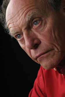
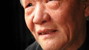
Previsualization And Post-Processing; Enhancing A “Monte Portrait”
I've always said, "See the finished picture before you even snap
the shutter!"
Well, sometimes it doesn't work, especially now that we're able
to do so much postproduction work in Photoshop. Such was the case recently in
Savannah, Georgia, when I photographed sculptor Bob Friedman. I wanted to do
a strong character portrait because of his artistic background, but I had no
idea that I would come up with something like this!
The portrait began here...
 |
|
|
...and ended here!
For the picture I used a Canon EOS 20D and a 24-70mm lens, shooting in large
JPEG format. A Delkin memory card recorded the portrait. Lighting was with two
Westcott Spiderlites and a Westcott silver reflector (Monte's Illuminator).
The lights create a steady fluorescent glow, not a flash. What you see is what
you get. The ISO of the camera was set to 800. I shot using Aperture Priority,
stopping down the lens to f/6.3, so that I would get both eyes in focus.
I used one of the lights in profile position, lighting the right half of his
face. The second light was at approximately a 90Þ angle from my camera,
creating the modified loop-light pattern on his face. The reflector was positioned
to the left side of his face. The far edge of the reflector remained forward
of his face. Had the reflector been placed beside his face it would have brought
light in from another direction. I didn't want to do that. I simply wanted
to help push the light around onto the dark side of his face, retaining detail
in the shadowed areas. The background was the black side of Westcott's
5/6-foot black/white background.
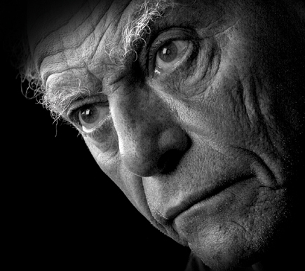 |
While composing the original picture I cropped in close because he didn't have much hair on the top of his head and I didn't want the light area to take your eye out of the picture. After viewing the image on my computer's screen I decided to "go for it" and cropped in even tighter.
 |
The crop allowed me to keep his eyes 1/3 of the way down from the top of the
portrait. I knew that this is the strongest position for eyes in a close-up
of this kind. I also left room in front of him in the direction he was facing.
The crop also allowed me to include his incredible eyebrows and enough of his
hair and head to give the viewer of the portrait a sense of his entire head.
I changed the picture to black and white, because I felt that the color detracted
from the intensity of his face.
 |
The way my Photoshop guru, Eddie Tapp, taught me to change a photograph to
black and white was to go to Channels. Look at each channel--red, blue,
and green--and then select the one that most closely resembles what you
want to capture in the final transformation. For most strong men's portraits
I usually select the green channel. Once I make my selection I need to get rid
of the color that's still residing in the file. To do that I go to Image/Mode/Grayscale.
The computer then asks me if I want to get rid of everything else. Yes. Finally,
I bring the mode back to RGB, because I was taught to do it that way. No questions
asked! After changing it to black and white I usually make refinements in the
tonal range of the picture by adjusting the whites, blacks, and mid tones in
Levels.
The next stage of preparation is one that I really love doing. I go into the
Layers palette and click on the half-dark, half-white circle at the bottom.
This creates an adjustment layer. Then you have a choice of any number of adjustments
you want to make. I select Curves. When Curves comes up on the screen I take
the highlight end of the line (usually top right) and bring it down. If I want
the edges to go completely black, I bring it all the way down to the bottom.
The resulting image on the screen turns completely black. I've basically
covered the image with a layer of the same picture that has been darkened down
to where you see nothing.
 |
Now, here is where the fun begins. I make certain the colors at the bottom
of the Tools palette are black and white, black being the upper (primary) color
selected. Using the paintbrush, painting with black removes the dark overlay.
I usually start at 100 percent opacity to clear the face. Then, I may drop the
opacity of the paintbrush down to as low as 10 percent to soften the edges.
Of course, you can change the opacity of the entire layer in the Layers palette
in order to achieve a lighter, more transparent layer of the same thing.
|
| |||||||||


![]()
Get the Latest Photo Tips, News & Reviews from Shutterbug!
| Camera Reviews Other Reviews | Mobile Reviews Photography Reviews Columns | News | Features | How-To | Resources |
 © 2025 Shutterbug
AVTech Media Americas Inc., USA
All rights reserved