- REVIEWS
Camera Reviews 
More Reviews Mobile Reviews Photography Reviews - GALLERIES
- VIDEOS
- BUYER'S GUIDES
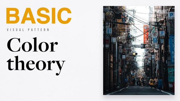
Color Theory Basics to Greatly Improve Your Photos (VIDEO)
Most of the tutorials we post involve techniques for shooting various kinds of photos, image-editing methods for enhancing your work, or a discussion of different types of gear. This post is a bit different, as it quickly explains an important imaging concept that will enable you to make more compelling photographs.
Pat Kay is an Australian travel photographer with a unique series of instructional videos dedicated to “deconstructing visual language.” His goal is to help others improve their work by recognizing and using all sorts of “visual” patterns” when capturing an image.

Today’s episode is devoted to color theory, which can be as simple or complicated as you make it. Here Kay takes the easy approach, providing all the important basics in just 12 minutes. He begins with an explanation of key terms relating to color.
Kay says that, “Color is a fantastic way to elevate your photography if you use it in a methodical, intentional way.” He provides concise descriptions of hue, saturation, luminosity and temperature. There’s also a clear description of various color-space options, and how all of the foregoing impacts your results.
The video gets really interesting when Kay turns to the psychology of color, which he insists involves “objective truths” based upon rigorous study and real-world research. As you’ll see, certain colors elicit specific moods, and used with intention can help your photos convey the specific feeling you intend.

Kay also provides helpful illustrations of “color harmony groups,” and reveals how his approach to using color contributes to a personal style of image making. You can do the same, so take a close look.
There is much more to see and learn on Kay’s YouTube channel, and in an earlier episode of his series devoted to the power of negative space.


![]()
Get the Latest Photo Tips, News & Reviews from Shutterbug!
| Camera Reviews Other Reviews | Mobile Reviews Photography Reviews Columns | News | Features | How-To | Resources |
 © 2025 Shutterbug
AVTech Media Americas Inc., USA
All rights reserved