- REVIEWS
Camera Reviews 
More Reviews Mobile Reviews Photography Reviews - GALLERIES
- VIDEOS
- BUYER'S GUIDES
Printmaking: Completing The Image Circle
The print completes the creative circle you began inscribing when you first viewed the image and snapped the shutter. The beauty of black and white printmaking is that you can share that vision through interpretive techniques that include expressive use of tonality, artful contrast and exposure control. Yes, digital images can be viewed on a screen and shared through the Internet to a worldwide audience. But nothing quite matches the intimate beauty of a carefully produced print, one that can be hung on a wall in your home or a gallery.
It might seem that black and white printmakers are free from what are called color management or calibration concerns, at least as far as neutral gray prints are concerned. Unfortunately that’s not the case, as the goal of color management is creating visual agreement between what you have on the screen with what comes out of the printer. This involves contrast, tonal play and brightness for neutral images (and making sure there is no color bias in the “neutral” image color) and hue, saturation and brightness issues with colorized images, including those that are “toned,” “low saturation” or more elaborately “hand colored.”
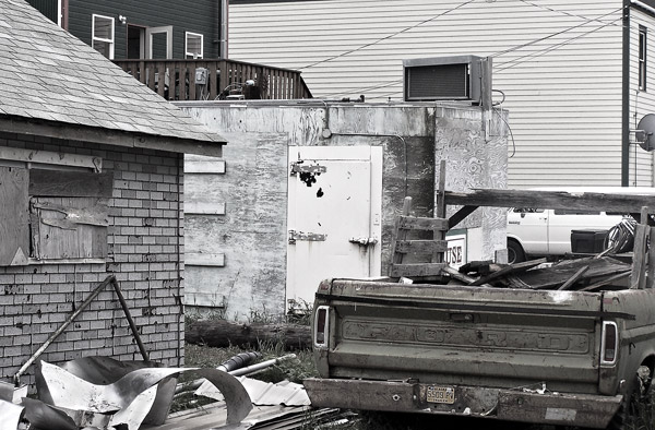
To get the print on the screen to match the print from the printer requires color management. This really comes to the fore when doing toned, colorized, and so-called “low sat” images, such as this 95 percent desaturated image made in Skagwa, Alaska (#1).
All Photos © George Schaub
There are entire books or at least hefty booklets available on color management and I will not attempt to address these issues in this article. I can suggest David Brooks’ Digital Darkroom Resource CD (goofotografx@gmail.com) or the color management product reviews and how-to’s available on our website (www.shutterbug.com). David, in fact, pioneered the discussion on how the switch to LCD computer screens caused dark print results, and how to overcome the problem. (See his “Prints Too Dark” articles by typing “prints too dark” in the search box on the Shutterbug website.)
I would offer some brief advice, however, based on some experience with printing.
The first is to use a monitor that is geared toward graphics work. Simply put, monitors used for home computing are not up to the task, at least not for those quite serious about their work. Many of these monitors are geared toward office work, games or even Internet TV watching. Yes, you can use one of these monitors if you must but with some it’s kind of like trying to do fine printing on a home office printer. At the least the monitor should allow you to change settings dealing with screen brightness, contrast and color (magenta/green and blue/yellow). Check the forums and online resources for current models that other photographers use.
If you print from a laptop (I do) be careful about ambient light and the angle of tilt of the monitor. If you sit in front of your laptop in sunlight, then room light, then change the angle at which you look at the screen, you’ll notice quite different contrast and color effects. Try to keep the tilt and room light as consistent as possible.
Test your equipment before you start making different settings. Some people assume the computer and monitor they take from the box are all set for digital photography and image-editing. They are not. When you look at your display hold up a sheet of the paper on which you will be printing in front of a blank, white document on the display itself. If the display with blank white is much “colder,” “warmer” or very mismatched to the paper white then you have some work to do.
A Simple Monitor Check
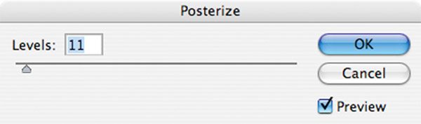
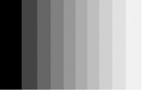
A very basic test I do before working on a computer (in a classroom or workshop setting) is to run a grayscale “step wedge.” I start with a New Blank Document in Photoshop and draw a non-feathered selection with the rectangular Marquee tool. I then choose the Gradient tool and, holding down the Shift key to keep the line straight, I draw a line from one edge of the box to the other (#2). This results in a black to white gradient from one edge to the other. I then choose Image>Adjust>Posterize and in the dialog box I choose 11 (any number from 11 to 21 will do, #3). I then check the spread of values and make sure that the black and white separations do not run into one another and that tonal borders are intact and equal the number of posterization levels I set (#4). If they do run into one another I know that contrast and perhaps brightness has to be checked and reset on the monitor.

Paper Profiles
All the calibration and adjustments in the world will not be much help if you fail to use the paper profile in your print setup. A profile is simply a set of instructions sent from the computer to the printer that informs the printer how to handle the image with the paper and ink you will be using. If you want to see the result of a profile mismatch print on glossy paper with a matte paper profile, or vice versa—it is not a pretty sight.
Profiles cover the printer, the paper and the ink being used—they all work together. If you open your profiles after you download the printer software you’ll notice quite a few are already “loaded.” You’ll also notice the majority of those loaded are those sold under the brand name of the printer company. While these put you in the ballpark, do not count on them being the most current information available. Like all things computer, profiles get tweaked and updated, so check the company website occasionally to see if the profiles have changed.
When you load the printer software some profiles, usually the printer maker’s brand, are loaded for you. Choosing or creating the right profile for your printer is one of the most important steps in getting matched prints—those that look like the image you see on the screen. Here are some profile choices (#5 and #6) and where they are available in a drop-down menu in the Print dialog box in Photoshop (#7).


If you are using a so-called “third-party” paper, and there’s no valid reason why you shouldn’t, then you will have to either create a paper profile yourself with special software/hardware products or go to the website of the company that sells the paper and download it from there. If that company does not offer profiles or equivalents for commonly used papers I frankly recommend that you move along to another paper company. If you wish, you can create a custom profile through software/hardware specifically made for that task. Essentially you make a print of color and grayscale “patches” and then read those patches with a device that creates a “profile” you load into your computer.
Once you find a profile you can right click with Windows to install it or for Mac users follow the trail recommended for your operating system, usually by opening a series of folders down to the Profiles folder. All paper company websites have easily followed instructions for installing in either platform.
Papers
The wide variety of paper available in every price range means that you have more choices than you could imagine. Everyone has thoughts about the best paper for their images, and I am not about to suggest that you go with glossy for architectural work or matte for portraits, nature and landscape work. I will say that a high gloss finish is not something favored by galleries or, in general, collectors and buyers of prints. The prevailing wisdom is that a fairly heavy weight paper with a semi-gloss (pearl or luster) surface is preferable. There are numerous papers that are dubbed “exhibition” quality by their makers, and generally you get what you pay for in this market. I suggest getting sampler packs or going to a dealer or website and getting swatch books with the various surfaces and weights to see which catches your fancy.
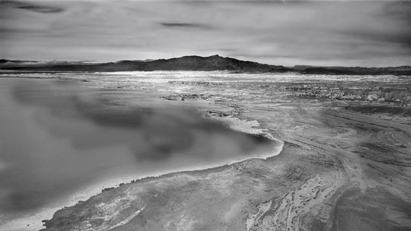
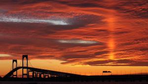
Paper surface is a very subjective issue, but generally glossy papers tend to create more snap in an image and can be a good choice for architectural subjects (#8 and #9) while matte papers tend to “absorb” the ink more and create a less defined edge, though they are by no means unsharp, and are some printer’s favorite for landscape, nature and portraiture. Image (#10) shows a “toned” monochrome infrared shot that always looks best on matte paper, while (#11) is an aerial shot with lots of subtle tones that just feels right on a paper surface that “spreads the tones” like matte.


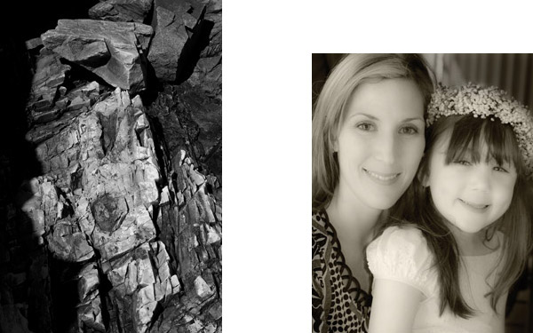
Papers come in “warm” (almost yellow white), neutral (bright but not “hard” white) and “cold” (stark white base) colorations, and all the tints in between. This can have a profound effect on your images. The differences can seem subtle, and if you place different types of paper side by side it begins to look like the “off white” sample display in a designer paint store—there are so many choices. This abstract of a shattered rock face (#12) could be printed either way—here a cold, neutral tone—but I always prefer portraits on a somewhat warmer surface paper (#13). As you print you’ll see which papers match your images. It’s evident that you would not put a sepia toned image on a cold white surface, but beyond that it might be interesting to see the interactions. In all, my suggestion is to choose 2-3 surfaces and image tone papers and stick with them. You will get to know the paper, how it works with different types of images and if it does the job for you in reproducing shadow and highlight values.
Inks And Printers
There are two types of inkjet printers and two types of inks: dye ink and pigment ink. Dye inks are generally thought to be richer in color; pigment inks are said to be more “archival,” at least when used with certain papers. These differences have recently narrowed on both accounts. My preference for black and white work is pigment inks simply because I feel they produce better quality black and white prints. In so-called Pro or fine art pigment ink printers you may have numerous shades of gray, including black, light black and light, light black ink (grays) for creating subtle grayscale values on prints. Yes, some color is used (and of course color ink is used when you make toned prints) but not nearly in the proportion used by dye ink printers. This tends to yield rich black and white prints and does away, for the most part, with bothersome and unwanted color casts on the print.
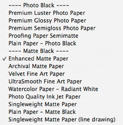
In many pigment ink printers you might have an option to work with Matte Black or Photo Black inks; in some older models you have to swap them out when you choose one or the other. Photo Black ink is used on glossy, semi-gloss and luster surface papers, while matte black inks are used on so-called “art” papers, always flat matte (or watercolor surface) and usually thinner stock. In some cases choosing a certain paper in the profile will result in the printer switching inks for you. My advice is to stick with one paper surface for a print run and not go back and forth, as the ink switch can cause some ink wastage.
When working with pigment inks and matching paper to ink properly you choose between Photo Black and Matte Black. This listing from an Epson printer shows the matches between the ink and paper surface (#14).

So, my choice for a printer is one that uses pigment type inks, allows you to work on various thicknesses of paper (by offering tray and “feed-through” printing), creates grayscale through various shades of black ink, and that swaps inks between matte and photo black without your having to remove the cartridges just because you change papers.
Printing Step By Step
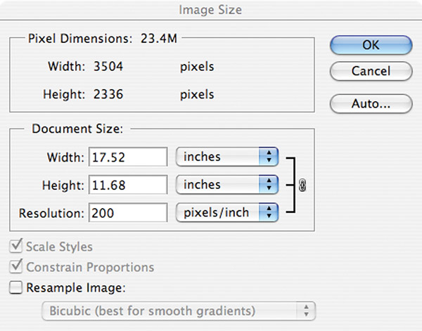
By the time you get to print you might have already set up the image resolution in the camera or Raw converter. In any case you should always check the resolution and image size in whatever software you use. Even though some cameras offer large file size they may record, by default, at 72 pixels per inch. You do want to print at that resolution so you should change it prior to printing. This is done in the initial Raw processing or in the Image Size dialog box. The numbers you will be confronted with are interdependent so if you choose a larger print size than the resolution “allows” you will have to either decrease resolution or “manufacture” the image information using a resampling program.
The image size dialog box is where you get to match resolution with file size and obtain the final image size on the print. If you had not set the resolution in the camera or in the Raw processor you might get a dialog box that begins with 72ppi (#15), which is screen resolution. To determine the size for the print you are about to make, uncheck the “resample image” box and fill in the resolution box with a number between 200 and 300. I usually chose 240, but for illustration have chosen 200 (#16), which yields an 11x17” image size.

My magic number for printing is between 200 and 260 ppi, depending on the total file size, with larger files being able to withstand a bit less resolution (and usually greater viewer to print viewing distance) 240 ppi is ideal for most of the work I do. If you want to print larger you can resample to an extent, using the resampling tools in your program or by using a third-party program such as onOne’s Genuine Fractals (www.ononesoftware.com). Either way you are constructing new information from old, and there is a point beyond which this does not hold up. It tends to be less successful in more detailed images, but I have gone 200-300 percent up with fairly good results at the high end and gotten very good results with more modest increases.
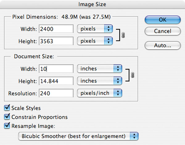
Resampling allows you to make a print larger than the file size usually would allow, and works best when kept within limits. Image (#17) shows a 27.5MB file that at 240ppi (my usual setting) yields a 7.5x11” print. However, to enlarge it to a 10x14” print size I checked off the resample box and chose the Bicubic Smoother resampling method. This almost doubles the file size to 48.8MB, a “manufactured” increase well within the bounds of the program’s ability (#18). Will you see a big difference in print quality? Perhaps, and that’s why you should test to see the limits of particular images and the resampling program you use.

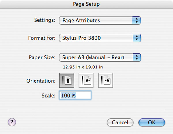
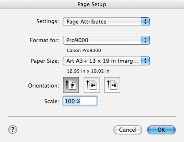
Once you have plugged those numbers in proceed to the Page Setup, where you choose the printer (should you have more than one available) and paper size. When using heavy weight paper you might have to load it from the rear or through a front loading slot rather than via a paper tray. How you load it should be part of the paper selection in Page Setup as well. Failure to properly identify how you are loading the paper will usually get you a blinking light and a “misfeed” signal when you go to print.
The Page Setup dialog lets you choose the printer and then “tells” the printer the size paper you are using. Image (#19) is set up for an Epson Pro Stylus printer using a heavyweight “art” paper that will be fed manually, one sheet at a time (the rear loader for that printer); (#20) is set up for the Canon 9000 and an “art” paper as well. This step is crucial as any conflict between the paper you have loaded and the paper you identify as being loaded will stop any printing and force you to change either the paper or the information before you can proceed. Some printers have “auto” sensing for papers (mostly via the way you have the feeders set up and the paper loaded). You can save Page Setup combinations and then use them each time you use a particular paper and paper size, saving you some of these steps.
The next step is setting up the printer/computer handshake. Each printer and operating system will offer a different dialog box and there’s no way for me to attempt to recreate each here. They all ask for essentially the same information—is the program (here Photoshop) or the printer handling the color management; what paper are you using; how do you want to set the size and margins?
Here’s the print window for a Mac running Photoshop CS4 and an Epson 3800 printer for a colorized monochrome image (#21). You get to this by going to File>Print. This may not look like the print window you have on your setup, but they all ask for essentially the same information. The setup information and the Image Size information is combined to give you a preview of how the print will look on the paper, its borders and so forth. In the center next to Page Setup you can fix the orientation of the print on the paper. This eliminates the need to rotate the image in previous steps. Position allows you to center the image on the paper or move it to the sides, great if you want to add type or use some different matting techniques.
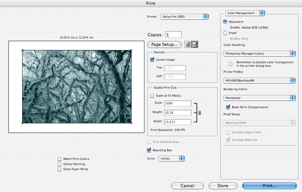
Scaled print size allows you to consider other image sizes in relation paper size. You can use this rather than having to go back and forth from here to Image Size.
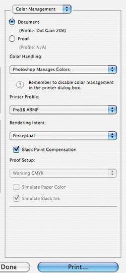
Under Color Handling I have chosen “Photoshop Manages Color.” I do not want the printer handling any of the color management. If I use the printer managed color there is concern about it “cross talking” with Photoshop’s color management.
I then insert the profile (see #5) from the long list I have available. Here I have selected a Hahnemühle “Bamboo” paper that has a matte surface and lovely warm tone. Note that both printer and paper choice are important here. Finally I choose Perceptual and Black Point Compensation. You should experiment with Perceptual and Relative Colormetric to see which you prefer.
The next step is to hit the print button. This does not start the printing yet; another window pops up. You can save yourself some time if you use the same paper by creating a preset of the choices you make here, as I have done with the bamboo name for the paper I have chosen for this work (#22).
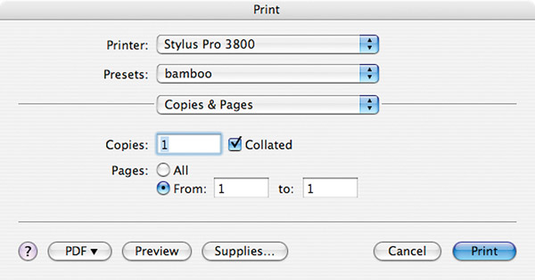
Click on the Copies & Pages bar dropdown menu and you will see a number of choices that can be made (#23). The crucial ones are Print Settings and Print Color Management.

In Print Settings, at least with this Epson 3800, it is crucial that you make sure that you have a paper surface that accepts the same kind of ink—here Matte Black—as the paper you are using, otherwise the printer swaps ink on you (#24 and #25). Newer printers and different brands deal with this in various ways, so check your printer instruction book. Note that I have chosen Advanced Settings and 1440 dpi. Some folks prefer 2880dpi but I have usually found it unnecessary. I also choose High Speed for printing which means the print head prints on both passes, not just one as it goes back and forth. Newer printers all do fine with this bi-directional printing. I then go to the dropdown menu again and choose Printer Color Management.
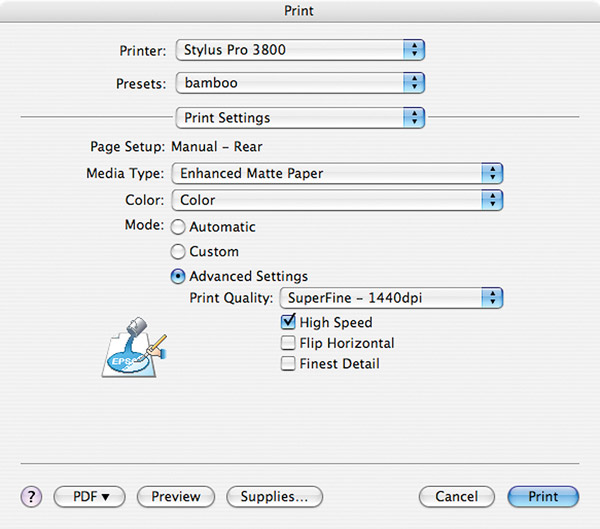
This is a crucial step! You have to inform the system that you are not using any printer color management by going to Printer Color Management on the drop down menu (#26) and choosing Off (no color adjustment). Now you can print away.

If you are using the printer company’s brand paper and you have worked through its foibles you might find it works out fine to use the printer as the main control. I have found that some printers, when using their “own” brand paper, do quite well. For more precise control, in my opinion, it’s always best to work with Photoshop as the control. If you are using a program other than Photoshop you might have to work with printer color management. One exception is Epson’s Advanced Black and White mode, which in my experience can yield excellent results with their brand and similar papers.
Frankly, most of the work in making prints comes in the processing stage of the work. Printing is a fairly mechanical output of that work on paper. There is nothing artful about the actual printing process in itself; in fact, the more automatic you can make it, the better. The work in printing comes in the prep of the gear—its color management—and the proper selection of paper and profile. Once you test and set it up properly you should be able to print easily enough and get prints that match what you see on your screen.
The goal is to be able to spend the time making expressive images in the processing stage and then just push a button to get a print. If you find yourself getting poor quality prints and struggling with the mechanics you should step back and carefully study and review the steps for making prints until it become automatic. Once the image is on the screen the way you want it, the printing should go one, two, three.
- Log in or register to post comments


![]()
Get the Latest Photo Tips, News & Reviews from Shutterbug!
| Camera Reviews Other Reviews | Mobile Reviews Photography Reviews Columns | News | Features | How-To | Resources |
 © 2025 Shutterbug
AVTech Media Americas Inc., USA
All rights reserved