- REVIEWS
Camera Reviews 
More Reviews Mobile Reviews Photography Reviews - GALLERIES
- VIDEOS
- BUYER'S GUIDES
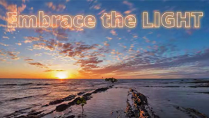
Surprise: Too Much Color Kills Landscape Photos if 3 Elements Are Missing (VIDEO)

Many nature and landscape photographers strive for vibrant, saturated colors when editing their work because they think that this approach makes their images "POP." The truth is, however, is that a heavy-handed approach with improper tonal balance often has the opposite effect.
Instructor Steve Arnold is a professional landscape photographer who is very generous about sharing the shooting and editing secrets to his success. He kicks off today's seven-minute with this rather surprising question. "Did you know that more color actually makes landscape photos more boring unless you include three important elements?"
Arnold says that even the most stunning sunrise or sunset scenes won't save a boring photo, and he illustrates two reasons that these awesome conditions can even make photos worse. He put is like this: "When you're lucky enough to capture one of these rare explosions of color in the sky, the deep, saturated reds and yellows can quickly overwhelm the entire scene to the point that everything looks the same and nothing really stands out.."
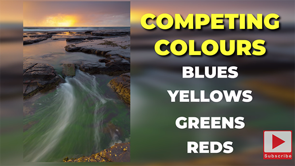
The second way that excessive color can spoil a shot is when there are too many different colors competing with each other and "your eyes gets dragged all the way around the frame because there's so much going on." This problem is particularly acute when various tones clash because they are the opposite of complimentary.
Arnold reveals a quick test you can employ in Photoshop or Lightroom to determine if your photos are missing a trio of key elements that transform images from boring to beautiful, and here it is: "Have a look at how your shot appears in black and white." He says that if an image is boring in b&w it's likely to fail in color for the reasons he explains.
The first example Arnold provides is a seascape scene that's full of color, but when he converts it to monochrome it looks "flat, mushy and uninspiring." But take a look at the processed version to which he's added two of the three secret ingredients. This difference is clear: The b&w version is now much more dynamic and interesting and the color version looks spectacular.
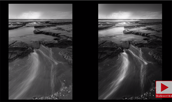
So exactly what was missing, and what are the three key elements that create an impressive transformation like this? One trick is to emphasize the contrast between dark and light areas to achieve a strong range of tones in between. Arnold recommends that you temporarily forget about colors, and instead study what the light is actually doing, the angle it's coming from, which objects are illuminated, and where shadows fall.
This way "you'll understand how to make certain elements in the frame POP and stand out in a dramatic yet realistic manner." Arnold is just getting started and he uses several other photos, captured at different times of day, to illustrate other color concerns and how to get things right. It's all about taking a thoughtful approach to color while avoiding the temptation to go overboard—both with regard to camera settings and during post processing.
There's much more to learn on Arnold's instructional YouTube channel and in the recent tutorial we featured that demonstrates how to use Lightroom's powerful Color Mixer tools to improve Hue, Saturation, and Luminance in every photograph you shoot.


![]()
Get the Latest Photo Tips, News & Reviews from Shutterbug!
| Camera Reviews Other Reviews | Mobile Reviews Photography Reviews Columns | News | Features | How-To | Resources |
 © 2025 Shutterbug
AVTech Media Americas Inc., USA
All rights reserved