- REVIEWS
Camera Reviews 
More Reviews Mobile Reviews Photography Reviews - GALLERIES
- VIDEOS
- BUYER'S GUIDES
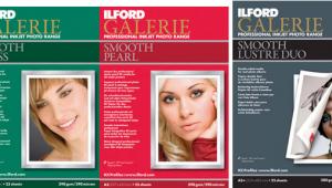
Our Favorite Fine Art Inkjet Papers: These Papers Will Help You Make Gallery-Ready Photo Prints

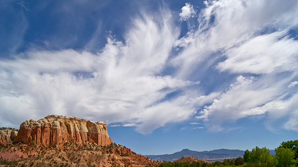
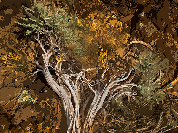
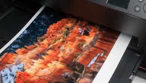
Inkjet printmakers now have a range of printing paper options that go well beyond the wildest dreams of darkroom printers in terms of size, surface, and print “look.” While covering all the offerings would fill all the pages of this issue, and then some, what follows is a sampling of paper options that I have recently tested with some suggestions about how they might best be put to use in your creative endeavors.
In this roundup review, I have included some recent entrants in the fine art field; a consideration of printer company “branded” papers; and an affordable option for those who want to “hand work” their images by adding pastels, charcoals, or other treatments to the print surface.
Fine Art Papers
I surveyed a number of photo gallery owners and dealers who told me that there has been a much wider acceptance of inkjet as of late, at least when prints are made on the best papers using inks that have enhanced archival capabilities. Indeed, a growing number of galleries I have visited now include paper and ink identification in their print prospectus and even on wall labels to enhance print appeal to knowledgeable buyers.
To earn the fine art moniker the paper needs to be “acid-free” and composed of 100 percent rag or cotton fiber (basically not resin coated); it should have a durable “weight” (thickness) above 280 gsm; and the image itself must be printed using stable inks (specifically pigmented, not dye-based inks).
I refer the reader to an excellent resource for more detailed information and specific paper/ink tests: wilhelm-research.com. With that in mind, here, in no particular order, are some of my favorite fine art options.
Monochrome: Canson Infinity Baryta Prestige 340gsm
Canson’s Infinity Baryta Prestige is a 340 gsm (heavyweight) paper composed of acid-free alpha-cellulose and cotton rag with a “true” barium sulfate (“baryta”) coating. The baryta nomenclature tags it as having the look and feel of silver-halide prints. It’s a durable paper that has a feeling of richness and depth in tonal values and hues. Inks seem to blend in with the surface rather than sit on top, a very pleasing look.
It is a “smooth gloss” paper, which means that it has the look and sharpness of traditional glossy paper while lacking the distracting sheen of a “hard” surface gloss. Its weight gives it an impressive “heft,” yet does not prevent use in virtually every enthusiast inkjet printer (not “all-in-ones”) out today.
Canson’s Infinity Baryta Prestige proved to me that it can take its place among the thoroughbred class of fine art papers that have all the best characteristics: weight, surface, optical density, wide color gamut, and excellent archival stability. It is especially suited, in my opinion, to making rich, wide-gamut (grayscale) monochrome prints; using it with Canson’s ICC profile or with Epson’s Advanced B&W mode will yield rich prints that even seasoned silver-halide printers can admire.
For more information, visit canson-infinity.com.
Rich Color with a Satin Surface: Hahnemühle FineArt Baryta Satin
The distinctions in paper surface are a key element in the creative process, and mixing and matching to image content and individual taste allows serious printmakers to hone their work to the finest degree. Hahnemühle’s FineArt Baryta Satin offers a satin-gloss surface on a bright white base. The barium sulfate in the coating works in conjunction with a microporous ink receiving layer to deliver vivid prints from subtle to intense color images: monochrome prints express deep, rich blacks as well as a wide gamut of grayscale values.

Hahnemühle’s FineArt Baryta Satin has excellent archival specs, being a 100 percent alpha-cellulose paper, acid-free, and calcium carbonate buffered, with “instant dry” and high water-resistant characteristics and no optical brighteners. The 300 gsm weight makes it a durable paper for handling and mounting, and also one that can pass smoothly through desktop and roll paper printers.
Some folks might confuse “satin” with “luster”: the difference is that satin surface papers are quite literally like the cloth—smooth and pleasing to the touch without any stipple or texture. Hahnemühle’s FineArt Baryta Satin, while smooth, is certainly not a hard gloss—for those who remember or still work in the darkroom it is more like a double-weight glossy dried matte (non-ferrotyped).
In my tests, I found that the surface, white base, and ink receptivity all lend themselves to excellent reproduction of both monochrome and color images where subtle tonal and/or color differentiation are key. This certainly does not eliminate consideration of this paper when making prints with vibrant colors, and, if you accept the seasonal reference, I would not hesitate to use it for images containing the rich, saturated hues of autumn and those with the subtle blushes of spring.
For more information, visit hahnemuehle.com.
Art Prints and More: Moab Entrada Rag Textured
Moab’s Entrada Rag Textured is an essentially matte surface paper with a slightly raised stipple reminiscent of watercolor papers. It is 100 percent cotton and OBA (Optical Brightening Agents) free with a 300 gsm weight. Some “watercolor” or textured papers are quite thick and pose loading challenges in some printers; in my tests I used the rear tray in a Canon imagePROGRAF PRO-1000 and the front loader in an Epson SureColor P800 and the pass-through was very smooth with both.

One of the knocks on “flat” matte surfaces is that they can impart a certain dullness, especially when it comes to highlights. While Moab’s new paper could be considered a matte surface—it utilizes PM (matte black) ink—the paper elevates the look and feel with a fine textural treatment on an essentially matte surface. This catches the light in a way that gives the benefits of matte with an added “kicker.” The texture is not overt, a subtle distinction that should appeal to many printmakers. The excellent grayscale rendition, including deep and rich blacks, and brilliant color separation are delightfully surprising on a paper with this surface.
This paper will have wide appeal to everyone whose aim is the gallery market. For artists, it is a great choice for affordable repro prints from their paintings, drawings, or pastels; for photographers, it is a wonderful medium for original computer-generated work and composites and, in my opinion, also an excellent choice for monochrome and full-color photo images. Moab’s Entrada Rag Textured offers the best of both worlds and is one of my go-to papers for a wide variety of work.
For more information, visit moabpaper.com.
Color Richness: Epson Legacy Platine
Along with the new breed of pro and enthusiast printers come vibrant ink sets that can deliver true prints of even the most color-saturated images. This capability, aided by eight, 10, or more inks, including various shades of color and numerous grays (known as light and light-light black), aids in the production of prints from images with highly nuanced color where the subtle differentiation of hues and tonal gradation are key.
Epson’s Platine is among the company’s set of Legacy fine art papers. The paper has all the fine art specs: a smooth (satin) surface on 100 percent cotton fiber, acid- and lignin-free, and pH buffered with a weight of 314 gsm. In a recent series of tests on Legacy Platine, I “revived” some images printed in the past. The saturated prints displayed the rendered colors of the image, including those where I pushed saturation even higher; prints with more subtle coloration displayed rich, deep blacks (dMax) as well as very pleasing tonal and color gradations.
The Platine surface is smooth yet not so shiny that it reflects back like “harder” glossy papers are apt to do. On the other hand, it has the print “snap” and contrast edge enhancement we’ve come to associate with a glossy surface. It seems to “welcome” the ink (good absorption) thanks to what is, according to Epson, an “advanced microporous ink receptive layer.” It has gallery weight but passes through enthusiast and pro printers with ease. At the end of the day it will yield great prints from most every color image in your collection.
For more information, visit epson.com.
The “Profiled” Print and the Case for Printer-Branded Papers
The two photo fine art inkjet printer manufacturers, Canon and Epson, also offer a full lineup of printing papers. No, neither one manufactures papers: they rely on various coating mills to produce and package papers to their specs. But these are not generic papers and have a high degree of consistency and quality control. Plus, they can prove a real advantage because they are designed to work closely with the companies’ inkjet printers in terms of specific print and page setup procedures.
When printing through Adobe’s Photoshop or Lightroom you have a choice of Photoshop-managed or printer-managed color. The former requires you to load a paper/printer ICC profile supplied by the paper maker; the latter allows you to choose the paper (thus the profile) from the print dialog itself (under Printer Settings).
If you do not use Photoshop-managed color when working with a third-party paper, then you will work with a general profile that speaks only to the surface and type of paper itself, not to the interaction between the printer, ink, and specific paper you are using. However, when you work with a “branded” (printer maker) paper and go to the print dialog box, the specific profile of that paper is preloaded in that printer’s dialog box (given that you check for and install updates every so often, always a good idea). For me, this pays rich dividends when, for example, using Epson papers and their Advanced B&W mode, often my go-to choice when printing monochrome using Epson printers and papers.
For those working with pro-level printers, like the latest imagePROGRAF Canons, there’s something else to consider. There’s a file within the Media Configuration Tool (software that ships with the company’s imagePROGRAF-series printers) known as an .AM1 configuration file. This sets ink density limits, paper feed vacuum strength, print head height, and paper feed adjustment. This optimizes the setup for all the branded papers and is particularly important when using heavier weights like thick watercolor and canvas stock. In other words, going this route loads all the important parameters for getting the most out of the printer and paper combination.
I should note that some third-party paper manufacturers are now including this embed as part of their ICC profile download. Check the Canson paper website (cited above) ICC download page for an example. Red River Paper also has instructions on how to adapt this requirement when using their papers in those printers.
(As I worked on this story Canon launched their print sampler offer, with images printed by their Explorers of Light on various Canon papers, including Photo Paper Pro Premium Matte, Premium Fine Art Bright White, Premium Fine Art Smooth, Premium Polished Rag, Photo Paper Pro Premium Platinum, and Photo Paper Pro Luster. Visit usa.canon.com/imagePROGRAFprintsample to sign up.)
Multimedia: Red River Paper 88lb. Polar Matte Magna
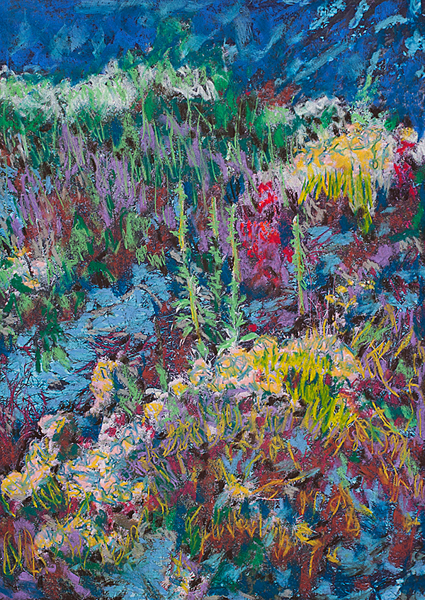
There is a growing movement among photo artists to use prints as the starting point for their expressive work and then add pencil, charcoal, pastel, or ink to alter the image into something entirely new. It is a form of “monoprinting,” meaning that the print is one of a kind, a unique piece of art. Artists realized that using materials readily available in any art supply shop on the right surface paper—specifically matte—opened a new form of expression. Printing on inkjet paper is the start, but actually using your hands to create an original piece of art is quite engaging and, well, fun.
There are numerous “flat matte” inkjet papers available; one of my favorites is Red River Paper’s 88lb. Polar Matte Magna (translated, that’s about 240 gsm). Weight counts in “multimedia” (meaning in this context the combination of ink—the image on the print—with charcoal, pastel, whatever) because you want it to be durable. Matte is the best choice because slicker surfaces have no “tooth” for application. And, for me, price counts, too, as I often go through quite a few tries before I get what I want, and experimentation is part of the trip.
Red River Paper, in my experience, delivers good quality papers that are quite affordable. (I checked the Red River Paper site as I was writing this and a 50-sheet box of 13x19-inch Polar Matte Magna sells for about $82 or as a 20-sheet box for a little under $44.) Polar Matte Magna has a bright white base; if you prefer a warmer base, there’s 64-pound (about 174 gsm) Aurora Art Natural, albeit less thick but quite “toothy” as well.
For more information, visit redriverpaper.com.


![]()
Get the Latest Photo Tips, News & Reviews from Shutterbug!
| Camera Reviews Other Reviews | Mobile Reviews Photography Reviews Columns | News | Features | How-To | Resources |
 © 2025 Shutterbug
AVTech Media Americas Inc., USA
All rights reserved