- REVIEWS
Camera Reviews 
More Reviews Mobile Reviews Photography Reviews - GALLERIES
- VIDEOS
- BUYER'S GUIDES
Narrow Your Focus: How to Use Lines, Patterns, Colors & Textures to Create Eye-Catching Images
As adventurous as it may be, I am not a professional nature or travel photographer circumnavigating the globe in search of new and exotic destinations—maybe in my next lifetime. The nice thing about visiting new destinations is that you’re exposed to new subject matter to keep you thoroughly engaged and fired up from a photographer’s perspective.
While I do go on short annual vacations, which energizes my photographic juices, my vacations are just that, short.
Let’s face it, the vast majority of our lives are contained within a fairly small radius of our homes, which for me is about 20 miles. Consequently, on a daily basis I tend to see the same things over and over.
When time allows, I go to different venues, but this may only be for several hours on a weekend. If you’re lucky enough to live in an area where you have distinct seasons, your possibilities will be expanded.
However, in South Florida where I reside, the seasons consist of warm, hot, and hotter—intermixed with humidity and rain. Hence, throughout the year there is little change in the scenery. That said, it’s not too long before I’m seeing the same subject matter and, if I’m not careful, my photography will go stale if I don’t retrain my eye.
Rather than viewing the larger vista and all that it has to offer, I’ve trained my eye to pare down an area and focus on what it has to offer in regard to lines, patterns, colors, and textures. Having narrowed my focus, I’m amazed at all of the possibilities I continue to see no matter how many times I revisit the same destinations or travel the same roads.

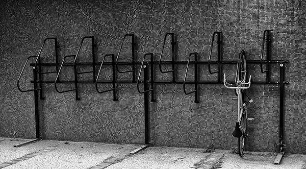
Lines
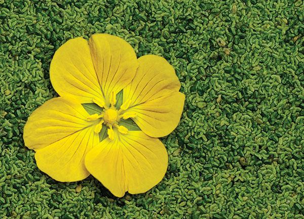
Lines in photography may be an actual subject such as telephone wires, a road, or the stem of a flower. On the other hand, an image may consist of an implied line that is not an actual line, but rather a line that is implied based on how the subject is composed within the image.
Depending on the subject and how you compose it, the main or leading line in your image will lead the viewer through the picture. Ultimately you want a line that leads the viewer straight to the main subject or center of interest.
An unsuccessful leading line will take the viewer into the image, but if there isn’t anything to hold the viewer within the image, the viewer will immediately exit the image. Some of the best leading lines will start at the lower left-hand portion of the image and travel toward the right.
Lines and how they are composed in an image can evoke or reinforce an emotion or mood with the viewer. Vertical lines can be used to imply strength, height, power, and an overall uplifting mood, whereas horizontal lines usually denote tranquility, calmness, and peacefulness.
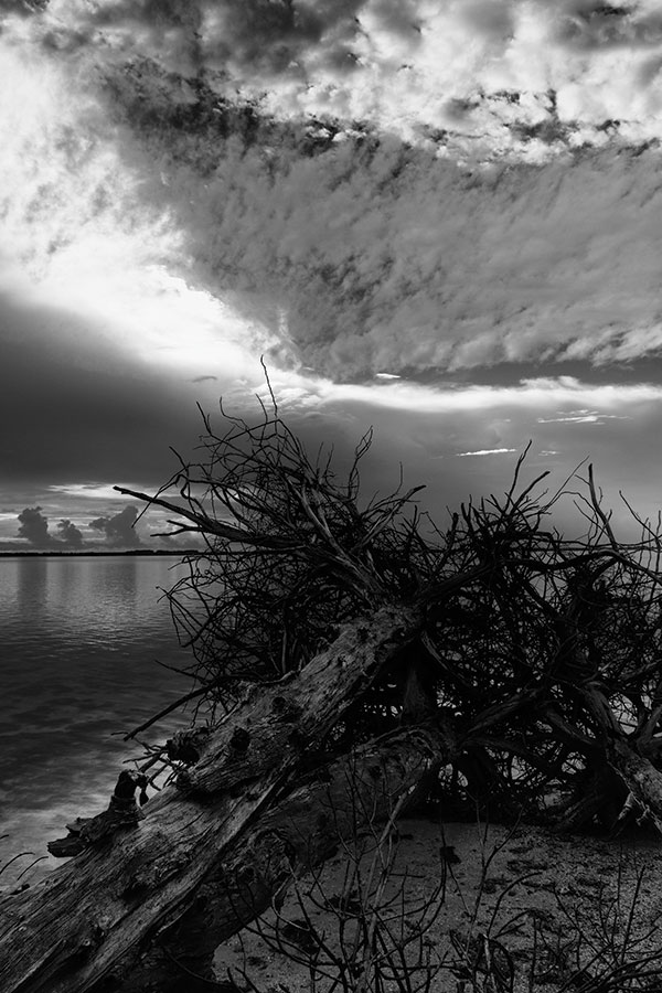
Diagonal lines can imply energy, action, force, or motion, while curved lines take the viewer on a slow and meandering tour of the image. Ideally, you want a line that guides the viewer throughout the image. Consequently, that’s why S-curve lines are so desirable in images because they slowly take the viewer on a visual tour of the entire image.
Patterns
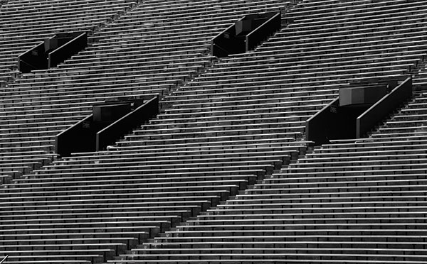
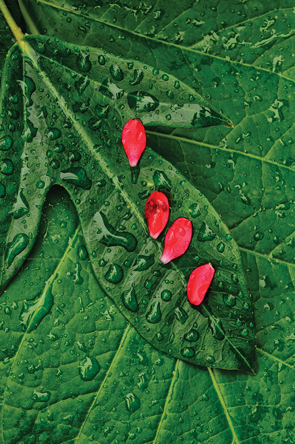
The repetition of lines, shapes, or colors can produce very interesting and powerful images. Although easily overlooked in your day-to-day life, patterns are all around you no matter how ordinary and commonplace the surroundings. When presented with an interesting pattern you want to emphasize or break it.
To emphasize a pattern, you want to zoom in close to fill the frame with the repetitive pattern and eliminate all other conflicting elements. Personally, I find images involving broken patterns more powerful.
These images involve a reoccurring pattern that has been interrupted or broken. Patterns can be broken with a complementary subject or color, or through the elimination of one of the repeating objects. Imagine an image of hundreds of chairs set up for a graduation where all but one is in unison, or a bowl of black marbles with one white one. If you’re working with a still life subject, then you can intentionally manipulate the subject or in your digital workflow depending on your final vision.
Pay close attention to where the break in the pattern is located in the frame in order to create the most powerful image. The rule of thirds may play an important role in this selection. Also, I find that repetitive patterns are best displayed when the depth of field is maximized, which will dictate a high f-stop and the use of a tripod.
Colors
We’re all familiar with the complementary color pairs on the color circle: red and green, blue and orange, and yellow and violet. Obviously, I don’t find these specific color combinations out in the field too often.
I’m attracted to any subject that offers bold, bright colors—something that really grabs the viewer’s attention. Several criteria to keep in mind when creating a successful image with contrasting colors:
1. An image with good color contrast can look great even if it has little or no tonal contrast.
2. Color saturation will affect the overall intensity of the image. The more saturation, the greater the color contrast.
3. Tonal contrast will become more prominent with less color saturation.
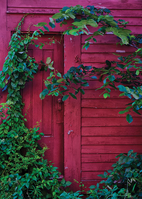
4. Saturation can be adjusted through the use of a polarizer filter, in-camera film simulation, and/or post-processing.
5. Color contrast works best if the area represented by both colors does not equate to a 1:1 ratio. Shoot for around 1:3.
6. Limit your image to two colors. If you introduce other colors, the color contrast will decrease, making the image less engaging and powerful.
Textures
Sometimes a subject doesn’t have lines, patterns, or colors to offer, but instead textures. Something as simple as tree bark, rust, or peeling paint can make for a beautiful abstract image. One of the most effective ways to show detail, and make an image appear three-dimensional, is to emphasize texture. But how do you make the most of the natural texture that exists in the subject?
1. Begin with a subject that has some interesting texture such as an old rusted, weathered vehicle. Don’t attempt to create texture where texture doesn’t exist such as a smooth surface that will have little discernible texture.
2. Use side lighting (artificial or natural) to create shadows that will accentuate the texture. If side lighting is not available or you don’t like the effect of shadows in the image, the contrast in color may aid in revealing the texture. If necessary, color and/or tonal contrast can be adjusted in post-processing to provide additional contrast in the texture.
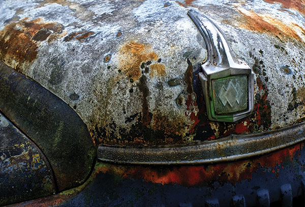
3. Use a filter effect in post-processing (e.g., Google Color Efex 4 Detail Extractor filter) or other technique to bring out some structure associated with your subject, but use it very conservatively.
No matter how mundane or often I frequent a particular area, if I narrow my focus on what the surroundings have to offer in regard to lines, patterns, colors, and textures, I’m rewarded with endless possibilities.
To see more of how Jeff Howe uses lines, patterns, colors, and textures in his photographs, visit jeffreyhowe.zenfolio.com.


![]()
Get the Latest Photo Tips, News & Reviews from Shutterbug!
| Camera Reviews Other Reviews | Mobile Reviews Photography Reviews Columns | News | Features | How-To | Resources |
 © 2025 Shutterbug
AVTech Media Americas Inc., USA
All rights reserved