- REVIEWS
Camera Reviews 
More Reviews Mobile Reviews Photography Reviews - GALLERIES
- VIDEOS
- BUYER'S GUIDES
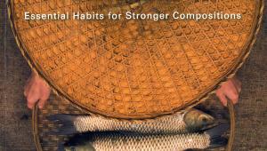
Light It, Shoot It, Retouch It
We are pleased to bring you this excerpt from an excellent book that takes it all in-house, from setup to lighting to retouch and output. Time spent with this book is certainly time well spent, as Kelby is that rare photographer/author/Photoshop teacher who brings it all together under one roof.—Editor
3-Light Sports Setup
Edgy Lighting

The Setup

The idea here is for a very edgy, dramatic-looking lighting setup, and it’s a perfect one to use for shooting athletes. The main lights are actually two strip banks in the back—they provide the main lighting for your subject. The beauty dish in front (without a diffusion sock over it, so the light is punchier) is being used just as a fill light, so we power that light down real low.
Gear Guide

Camera Settings

Front View

Front View

Test Shot

Close-Up View

The Post-Processing
We’re going to do a high-contrast post-processing effect to this image, along with some desaturation. But, once we leave Camera Raw, you have an option to: (a) use the high-contrast technique we learned (in Chapter 2); (b) apply the effect with one click, using Nik Software’s Color Efex Pro 3—the preset you would use is called “Tonal Contrast,” and it works wonders—which I’m mentioning, because it’s what I use most of the time; or (c) try the processing I’m going to teach you here, because it’s pretty cool. Hey, at least you have some options.
Step One
Here’s the RAW image, as shot, opened in Camera Raw. Just looking at it as it is now, it’s a good starting place, but I can already see some things we need to do before we apply the high-contrast stuff. First, the lighting on his chest looks too bright (your eye is drawn to the brightest thing in the image), so we’ll need to tone that down a bit. Also, his face is actually a little darker than I’d like (I should have turned up the power on the beauty dish above his head), and his eye sockets are very dark, which was expected because of the angle of the beauty dish. Okay, let’s get to work.

Step Two
Let’s start by opening up the shadows in the image. Camera Raw’s Fill Light slider is great for this, and if you push it as far as we’re going to, it starts to take on its own look, which is good for this type of high-contrast stuff. So, drag the Fill Light slider over to around 45 (as shown here) to open up those shadow areas on Adam, and on the background behind him.

Step Three
Now, we’re going to add some Clarity to the photo, which basically adds midtone contrast. Adding a lot of Clarity is partially what gives the image a punchy, high-contrast look (it even looks a bit like you’ve sharpened the image), and we’re going to add a lot of it (you can get away with this on guys, but it’s pretty rough on women’s skin, so I avoid using it there). Let’s go ahead and drag the Clarity slider way over to around +65, and while you’re at it, increase the Contrast amount to around +50.

Step Four
Increasing the Clarity and Contrast amounts adds a lot of contrast and punch to the image, but, unfortunately, it also added some clipping on his face. It’s only in the Red channel (you can tell by looking at the histogram in the image in the previous step—the red triangle in the top right tells you it’s the Red channel clipping. You can also see clipping warning areas in red on his nose, the top of his head, and his ears). Luckily, it’s easy enough to fix while we’re here. Just drag the Recovery slider to the right until the red warnings on his nose, head, and ears go away (as seen here).

Step Five
Now, let’s work on darkening the front of his shirt, and then lightening his face. Get the Adjustment Brush (K) from the toolbar up top, and then in the Adjustment Brush panel on the right, click once on the - (minus sign) button to the left of the Brightness slider. This zeros all the other sliders out, and sets the brush so it paints darker. Now, make sure the Auto Mask checkbox is turned on (so you don’t accidentally paint outside the lines), then paint over his chest to darken that area just a bit (as seen here).

Step Six
Next, let’s lighten his face up a bit (and get some more light into his eyes). Click the New radio button at the top of the Adjustment Brush panel (this tells the brush you want to work on a different area), then click the + (plus sign) button to the right of the Brightness slider. This zeros everything out and makes the brush paint a bit brighter. Paint over just the front of his face to brighten that whole area. Once you’ve painted on his face, if you think it needs to be brighter or darker, just drag the Brightness slider where you’d like it. Next, we’re going to cheat, and make our side lighting look stronger than it really was.

Step Seven
Click the New radio button again, then click the + button to the right of the Adjustment Brush’s Exposure slider twice, so it reads +1.00. Now, with Auto Mask still turned on, you’re going to paint over the white highlights on the sides of his face created by the back lights, and it really makes them a lot more intense (as seen here). Auto Mask will pretty much keep you just on that area, but if you stray off and make a mistake, press-and-hold the Option (PC: Alt) key and your brush switches to Erase mode, so you can paint away your mistakes. Once those are fixed, just release the Option key, and you’re back to painting a brighter exposure on the sides of his face. When you’re done, you’ll see three different “pins” on the image, each representing a different area you adjusted. The pins appear where you first start painting. To edit the area represented by any individual pin, just click on it.

Final Image
Editor’s Note: There are nine more steps to processing this image that Kelby shares, with the next stage being Photoshop work, and as you go through each exercise (there are many more setups in the book) you learn how to apply them to your own imagery and gain proficiency in lighting, posing, and retouching using Camera Raw and Photoshop. To see where this all ends up here’s the final image. In all, the book teaches on many levels and going through each of the setups and post-processing steps really makes for a great learning experience.

Author Bio
Scott Kelby is editor, publisher, and co-founder of Photoshop User magazine, host of the top-rated weekly videocast Photoshop User TV, and co-host of D-Town TV (the weekly videocast for D-SLR shooters). He is president of the National Association of Photoshop Professionals (NAPP), the trade association for Adobe Photoshop users, and he’s president of the training, education, and publishing firm Kelby Media Group, Inc.
 Where To Buy
Light It, Shoot It, Retouch It by Scott Kelby ($44.99, softcover, New Riders, 238 pages, ISBN: 978-0-321-78661-6) is available wherever good books are sold as well as online retailers such as Amazon.com. Also check www.newriders.com and http://kelbytraining.com.
Scott is a photographer, designer, and award-winning author of more than 50 books. Scott is training director for the Adobe Photoshop Seminar Tour and conference technical chair for the Photoshop World Conference & Expo. For more information on Scott, visit his daily blog, Photoshop Insider, at www.scottkelby.com.


![]()
Get the Latest Photo Tips, News & Reviews from Shutterbug!
| Camera Reviews Other Reviews | Mobile Reviews Photography Reviews Columns | News | Features | How-To | Resources |
 © 2025 Shutterbug
AVTech Media Americas Inc., USA
All rights reserved