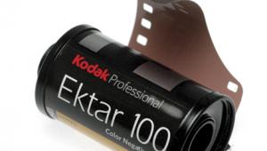
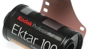
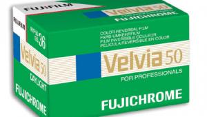
Kodak's 100 And 400 Ultra Color Professional Films
Pro Films With Intense Color Saturation

Until recently, all of Kodak's professional color print films were marketed under the Portra logo, understandable because portrait and wedding photographers make up the primary market for such products. That changed earlier this year, when the company announced the new Ultra Color 100UC; at the same time, Kodak re-branded Portra 400UC as Ultra Color 400UC. Very similar in most respects--including extra high saturation--the two products offer great consistency, producing a nearly identical look that's important in professional applications. I was unable to determine why Kodak dropped the Portra designation for 400UC. Perhaps portrait photographers found that Portra 160VC and 400VC--with a less punchy but still "vivid" color rendition--adequately met their needs for rich hues and tones.

In any event, both new films employ the same advanced technology. They incorporate what Kodak calls Color Precision and human-eye spectral sensitivity for vibrant but accurate colors and attractive flesh tones; advanced T-GRAIN emulsions for fine grain even in large prints; high-performance dye couplers for great sharpness; and "triple-coated blue" emulsions for consistent color and skin reproduction when overexposed or underexposed. As well, they're said to produce optimal results in not only prints, but also in film scans, an important quality in this digital era.

In spite of the very high color saturation, both Ultra Color films produce images with "clean" neutral tones and accurate, pleasing skin tones. Consequently, they're more useful for people pictures than some other "color intensified" films. (Ultra Color 100; Canon EOS-3 with 18-125mm zoom at f/11; electronic flash.)
Photos © 2004, Peter K. Burian, All Rights Reserved

According to Kodak, the Ultra Color films are particularly suitable for fashion, advertising, editorial, commercial, travel, and nature photography. During the test period, I 
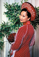
used both products to shoot nature, travel, and action subjects as well as a Vietnamese bride in traditional regalia. My test rolls were processed and printed by a lab using a digital printer, equipment that's b9eing adopted by most photofinishers. Other labs, employing conventional printing systems and different brands of paper, may produce different results, but any high-quality photofinishing should work well with these Kodak films.

Many of my prints are beautiful, exhibiting a stunning color rendition that should appeal to a broad range of photographers, both professionals and hobbyists. Although we can publish only a few of the photos, this review is based on an examination of numerous prints including a broader variety of subject matter, plus feedback from other photographers who viewed all of my 4x6" prints and enlargements. If the illustrations do not seem to exactly match the written analysis of each film's characteristics, rely on the text as the accurate representation of the prints.

Nature photographers who shoot slide films often use Fujichrome Velvia or Ektachrome 100VS for their rich, vibrant color rendition. If you prefer print film, try the Ultra Color products with their intense but accurate rendition of most hues and tones, "clean" whites, high sharpness, impressive resolution, and micro-fine grain. (Ultra Color 400.)

Grain And Color Qualities
While the Kodak GOLD 100 and GOLD 400 MAX films are well-known for punchy color rendition, the Ultra Color pro films offer advantages in color saturation, granularity, and sharpness. In terms of grain structure, these films are impressive and very similar: 8x12" prints appear identical. At a normal viewing distance of 4 ft, grain is invisible in both prints; even under close scrutiny, the pattern is incredibly smooth and tight. According to Kodak's specs, 100UC is slightly superior, with a print grain index number that's about 10 points lower (finer) than the index for 400UC. The difference is minimal and most viewers are unlikely to notice a difference even in an 11x14" print.

Prints from both films exhibit brilliant reproduction of colors, with particularly deep, rich reds and striking yellows and greens. As with any film, use a polarizing filter outdoors (to cut glare) for the deepest color rendition. Although the colors are vibrant and bold, most viewers did not consider them to be artificial or garish. There's only one drawback: reds appear to be oversaturated; that was a problem in only a few of my images of tulips (in those prints, some detail is lost in the deepest reds). In spite of the "ultra" color saturation, skin tones are pleasing and faithful to the subject as expected from emulsions that include some portrait film technology. More importantly, gray and white tones are accurately rendered; even difficult colors--like some blues in the blossoms of flowers--are true to the original. Overall, the ISO 100 and 400 prints offer very high visual appeal, appreciated by most viewers.

Scans of 100UC films exhibit the familiar Ultra Color characteristics as discussed in the text. Even under high magnification, grain is barely visible, making this film ideal for oversized prints from high-resolution scans. (Original image made with Canon EOS-3 and EF 70-200mm f/4L lens at f/8; 2800dpi scan, cropped slightly.)

In order to confirm that Ultra Color films are optimized for scanning, I made some 2800dpi scans of well-exposed ISO 100 and 400 negatives, using only the autoexposure and autofocus feature of a Minolta DiMAGE Scan Elite II. The results are quite pleasing in all respects. Scans from Ultra Color 400 are slightly grainier, but the pattern is very tight and fine. For even better results, I made some additional scans, setting a slightly lower contrast and brightness level in the Minolta software. After applying Auto Levels and Unsharp Mask in Photoshop CS, I was able to make superb 8.5x11" prints at 300dpi, using the HP photosmart 7960, an eight-color printer that generates gorgeous outputs especially on the HP Premium Plus Glossy photo paper. Use a scanner with higher resolution and you should be able to make oversized prints of similar quality with a large format printer such as the Epson Stylus Photo 2200 or Canon i9100.

The 400UC film is more "grainy" 100UC, most noticeable in out of focus mid-tone areas in images viewed at high magnification or in oversized prints. However, the pattern is very fine and tight, so it's not objectionable and the grain does not obliterate intricate detail. (Small portion of an image from a 2800dpi scan enlarged.)

Exposure Latitude And Contrast
In my estimation, these films have a fairly wide exposure latitude. Very good--though contrasty--prints can be made from negatives that were overexposed by almost two stops. For the best results, however, do not overexpose 400UC by more than one stop or 100UC by more than a half stop. Although some color print films benefit from generous exposure, for finer grain and richer colors, Ultra Color 100 film is not typical in this respect. When it comes to underexposure, the slow film can tolerate more than its fast counterpart: at least a full stop vs. about a half stop without adverse effects. Negatives that are underexposed to a much greater extent exhibit obvious grain and low contrast while shadow areas are a bit "smoky" instead of a rich, dark black.

In order to determine the underexposure latitude of 400UC film, I made a series of images at various exposure levels in a dark cathedral. One stop of underexposure produced negatives that made for excellent prints like this one. By two stops under, the results were less impressive (as discussed in the text) but few photographers using pro films are likely to make such a serious error.

Combined with accentuated color effects, moderately high contrast makes these films perfect in the flat lighting of an overcast day for a snappy effect; they're also ideal under soft illumination in studio photography. That same attribute is less desirable on sunny days where a scene includes bright highlight areas and dark shadow areas. In such conditions, avoid overexposure that would exaggerate the contrast or blowout highlight detail. Use flash with nearby subjects to fill in shadows for more even illumination, and your prints should be very pleasing.

Sharpness And Resolution
When it comes to sharpness, the ISO 100 film excels; it reproduced my subjects as if they were etched on the emulsion--the finest details are very well-defined. This characteristic is useful for many subject types, particularly scenes with a great deal of intricate detail: nature close-ups, landscapes, architecture, groups of people, and most travel subjects. The ISO 400 film is certainly sharp as well, and offers high resolution, but for the ultimate in image quality, I would recommend Ultra Color 100.

Do note however, that 100UC may be too sharp for close-up (head and shoulder) portraits except for individuals with perfect complexions. Other subjects will benefit from a "softer" more flattering look to disguise any imperfections, lines, or wrinkles. Switch to 400UC for slightly lower sharpness or use a soft focus filter when appropriate. If you digitize your ISO 100 negatives, consider using a blurring tool or the Healing Brush in Photoshop, for more flattering results in close-up portraits.

In extremely harsh lighting, Kodak's Portra films (with lower contrast) produce more pleasing results than Ultra Color 100 or 400. Reserve these Ultra Color films for use in softer illumination or for subjects that benefit from the higher contrast for a more "punchy" effect. (Ultra Color 400.)

Final Evaluation
There's another professional print film designed for high color saturation, Agfa's Ultra 100; my review of that product ran in our November 2003 issue (page 110) and is available in the archives at: www.shutterbug.com. Billed as "the most color-intensive negative film," Agfa's Ultra 100 produces an even more dramatic effect than Kodak's Ultra Color 100 and 400, but it's different in several respects. The skin tone rendition of the Agfa film is not quite as pleasing; it's also more contrasty than either Kodak Ultra Color film (useful in flat light) and exhibits more noticeable grain, visible in large prints. If you appreciate intense hues and tones, try both brands to determine which you prefer, in both soft and contrasty lighting, with various types of subjects.

To take full advantage of the 100UC film's high sharpness and resolution potential, I used an L-series Canon pro lens, the "best" f/stop (f/11), and a tripod to prevent any blur from camera shake. The resulting 35mm negatives are suitable for making large prints of surprisingly high sharpness, enhanced by snappy contrast. (Canon EOS-3 with EF 70-200mm f/4L USM lens; Manfrotto tripod; cable release.)

Although Kodak's Ultra Color films are "premium priced," it's worth paying extra for these films because Kodak does not make similar products in the more affordable consumer line. If you're a discriminating photographer, keep several rolls handy for serious work with subjects that will benefit from a dramatic color reproduction. To maximize the imaging potential of either Ultra Color film, use a high-quality lens and thoughtful shooting techniques for maximum sharpness; try to make accurate exposures; moderate the contrast level with fill flash, a reflector, or a diffuser screen when appropriate. Finally, patronize a lab with high standards of quality control in processing and in print making. Keep these tips in mind and the Kodak films will reward your professionalism with impressive pro-caliber results.

Ultra Color films are available in 35mm format and in 120 and 220 rolls. For additional information on these and other Kodak products, visit www.kodak.com.

A free-lancer stock photographer and long-time "Shutterbug" and "eDigitalPhoto" contributor, Peter K. Burian is the author of "Mastering Digital Photography and Imaging," a highly-rated 270 page book that contains a great deal of practical advice on all aspects of the topic.

X