Atwitter About Photography; The Good, The Bad, And The Bloggy Page 2
www.rmeadphotography.com
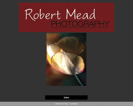
Using a clean but bare-bones website design, Robert Mead showcases his architectural and flower photography. The site’s design provides a group of eight small thumbnails on the left that, when clicked, appear as a larger image on the right, but you can conveniently click forward or back arrows to change either the thumbnail group or the larger photograph. His architectural collection includes color and monochrome images and, interestingly, Mead uses two completely different styles when approaching the different media. The color photographs are of subjects as diverse as the Griffith Observatory, made famous by James Dean’s Rebel Without a Cause, and a Malibu pier. He’s adopted an almost monochromatic palette with subtle lighting for these somewhat abstract images.
When switching to monochrome, especially those made with infrared film, the compositions become grand, sweeping, and lushly romantic, almost as if the spirit of John Ford is informing the photographs. Mead’s flower photographs are similar to others in the genre in that they are made close-up, but after that all bets are off. Mead uses a mixture of high- and low-key lighting techniques to infuse these delicately-colored images with an otherworldly mood and approach that’s different from both types of his architectural photographs. Here, he’s not a cool observer of the plant world and takes you inside these flowers to examine them; not in a scientific way, but as an aesthetic tool to render nature’s designs in a purely emotional manner. These images are as different from his color architecture as possible, being hot, in McLuhan’s terms, compared to the cool shapes and designs of the buildings.
Tip: Be careful when typing this URL; there is a site called “www.meadphotography.com” that features the work of a different photographer.
 |
|
|
www.mwhitehill.com
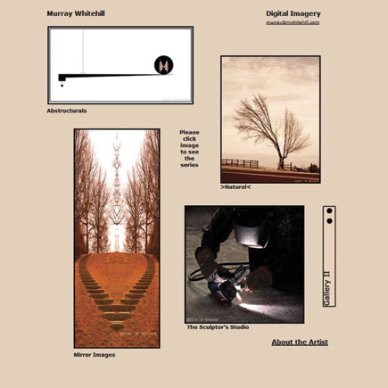
Murray Whitehill’s website is another one that’s focused squarely on the images, eschewing razzmatazz in favor of collecting a series of photographic collections into two sprawling portfolios. Large thumbnails identify the collections and clicking any one of them takes you inside a more customary thumbnail/large image format. You won’t be surprised to see that the “Portraits” collection includes photographs of people, but will be surprised that these are not “portraits” in a traditional sense. The people sometimes appear as tiny specks within a landscape or another context. Some of these images express the banality of everyday life while others, such as “The Summit,” include aspects of Lewis Carroll’s portraits of Alice, while the street photography exhibits the wit of Robert Doisneau.
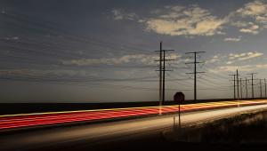
I just don’t get some of the other collections, such as “Compositae,” but the images are never boring. “Highways” contains images of, well, highways combined with words written around the margins à la Duane Michals, although not handwritten. Some, such as “Take Direction” and “Anti Parrish Sky,” are quite powerful and the words add a touch of whimsy. I’ve referred to some other photographers’ work in these descriptions but these are just to help you understand Whitehill’s work, not define it. Whitehill is clearly an American original whose best work is a brave exploration of life in these United States. We should all be as fearless as he in our personal photography.
Note: The last time I visited the site it was slow to load. This could be a problem with Whitehill’s host or just the “traffic shaping” that ISPs are using to prepare us for metered billing that will replace the smorgasbord approach we’ve gotten used to. Either way, Whitehill’s site is worth the wait.
 |
|
|
- Log in or register to post comments

