- REVIEWS
Camera Reviews 
More Reviews Mobile Reviews Photography Reviews - GALLERIES
- VIDEOS
- BUYER'S GUIDES
Getting It Right; Using Hue And Saturation To Correct Skin Tones
All Photos © 2004, Jon Canfield, All Rights Reserved
Accurate skin tones can be one of the most vexing problems facing the digital
portrait photographer. The human eye sees skin tones as memory colors--we
know what to expect, and when we see something different, our brain registers
the fact, making everything else in the image seem off color. The reverse is
also true though--get the skin colors right (or what our mind thinks is
right), and other colors in the image look accurate as well.
If you've spent anytime photographing people with a digital camera, you
probably noticed that skin tones are seldom right. Flash can also throw off
accurate color. Some cameras are better at this than others; for the most part,
point-and-shoot digicams deliver higher color saturation than digital SLRs.
It's not just an issue faced by digital photographers either. Scanning
traditional film will usually introduce some color cast to the process, but
with proper profiling, the amount of post-processing work to be done can be
greatly reduced.
The Hue/Saturation Fix
While a great deal of problems can be corrected with Curves, Color Balance and
other tools such as Variations and Levels, I've found that Hue and Saturation
is the best method of correcting skin tones. In my experience it gives much
finer control over individual color channels, and once you've used this
method, I don't think you'll ever look back.
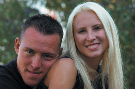
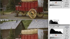
1. The problem image in it's original form. The whole
image is a bit flat in color, but the skin tones have a very obvious red/magenta
tint to them. With just a few clicks, we can get the skin back to normal.
 |
|
|
2. The image of my daughter and son-in-law that I've selected here is typical for a digital camera with too much red/magenta in the skin. This was originally shot with a Nikon D100 with the sRGB color space. If your camera supports multiple color spaces, I suggest using Adobe RGB at capture. The sRGB palette tends toward more saturated colors, which typically mean more editing in the darkroom.
 |
|
|
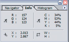
Before starting out, the Info palette shows that we have a strong red tint
and a magenta cast that we'll want to bring down:
The Info palette in Photoshop is a quick way to check color balance. Just move
your mouse pointer over your image to see what value the image has. Here, we
want to see a more even balance between Cyan and Yellow with less Magenta.
3. To get started, choose Select>Color Range. I typically use a range of 20-30 for fuzziness. Much higher and the eye dropper picks up more than I want, lower values usually mean too much clicking to select the colors I need to modify. Click the + eye dropper in the middle, as you'll want each sample to add to the previous selection.
 |
|
|
Using the Select Color Range command in Photoshop, we can build a selection by color much more accurately than possible with the Magic Wand tool. Be sure to set the eye dropper to the + to add to the selection with each click. In this case, the skin tones for my daughter and her husband were too red, so I'll select those areas of the image.
|
| |||||||||
- Log in or register to post comments


![]()
Get the Latest Photo Tips, News & Reviews from Shutterbug!
| Camera Reviews Other Reviews | Mobile Reviews Photography Reviews Columns | News | Features | How-To | Resources |
 © 2025 Shutterbug
AVTech Media Americas Inc., USA
All rights reserved