Digital Files Vs. Scanned Medium Format Film
We Put The Mediums To The Test

Figure 1: Gray scale and color scale from Kodak Portra 160NC.

Very few people would dare to ask this question, "Is digital better than film?" just a few years ago when the only cameras that could produce a digital file with qualities that approached film's capabilities cost in the neighborhood
of $20,000.

But now, with advances in chip sensor technology and camera design arriving at a furious pace, the quality line is far less distinct. For many professional and dedicated amateur photographers the current crop of 6-megapixel cameras provide image quality that equals and sometimes surpasses that of 35mm film. But suppose we raise the bar of comparison one notch and compare the standard-bearer of studio and portrait photography--120 and 220 film--to 6-megapixel camera files? Would film's much wider and forgiving exposure latitude give it the edge in the recording of shadows and highlights? Would the 645 format (6x4.5cm) with an image area nearly three times that of 35mm frames, put film on top in a comparison of apparent sharpness?

Figure 2: Gray scale and color scale from Nikon D100 at ISO 200.

The Test Setup
I enlisted the help of photographer Allan Hiltz who brought his digital Nikon D100 to challenge the images I would make with a Pentax 645N medium format camera. We set out on a bright 18Þ day in Newburyport, Massachusetts, to find a few colorful and contrasty scenes for a side by side comparison. The Nikon would shoot all images at ISO 200 at approximately f/16 with a Nikkor 28-200mm f/3.5-5.6 lens. I equipped the Pentax with a standard 75mm f/2.8 lens and Kodak Portra 160NC, a very fine-grained, fairly neutral daylight film that scans very well. Negative film was chosen for this shootout because it typically has a range of 10-12 stops compared to a 5-7 stop range for transparency film. We bracketed the exposures.

Figure 3: Film and digital capture show similar results but film shows greater difference in extreme high and low values.

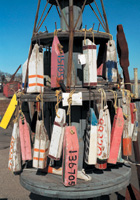
Our first shot was of a standard Kodak Gray Scale card with 20 solid-colored rectangles representing a white to black density range. The same shot included the Kodak Color Control Patch strip with rectangles of blue, cyan, green, yellow, red, magenta, white, and black. Newburyport's maritime culture provided us with intriguing photo opportunities that included colorful, weathered lobster-trap buoys and a range of gray values in aged wooden fishing gear.

Figure 4: Blue and magenta values are very close, Nikon has a strong cyan and green bias, and film has more saturated red and yellow.

My film was processed by a local photofinisher whose Fuji Frontier digital lab I know to be well maintained and clean (Cameras, Inc., Arlington, Massachusetts). Conventional 11x14" C-Prints, printed directly from the negatives, were made by a commercial color lab (Advanced Photographics, Danvers, Massachusetts). With film in hand this was an ideal opportunity to test out the new Epson Perfection 4870 Pro flat-bed scanner. I could have scanned the negs on a high-end drum scanner or pre-press quality flat-bed, but in the interest of equalizing the competition I assumed the Epson to be in the same quality and price class as the Nikon D100.

Figure 5: Kodak Portra 160NC.
Photos © 2003, Paul Mozell, All Rights Reserved

Figure 6: Nikon D100 at ISO 200.

Comparing The Files And Prints
My digital lab included a Macintosh PowerMac G4, Mac OS X, Hitachi RasterOPS Mc6415 monitor calibrated with MonacoOPTIX, Adobe Photoshop CS, and an Epson Photo 1270 printer. The Epson Perfection 4870 Pro has a dynamic range of 3.8 and a maximum optical resolution of 4800 ppi. Using the 120 film holder included with the scanner, I scanned my test film with both the Epson Scanfactory software and the optional SilverFast AI 6.0 that ships with the "Pro" version of the scanner. Although SilverFast is a more powerful package I went with the Epson Scan for simplicity's sake. And, I limited my evaluation to the one photograph of the Kodak Gray Scale and two scenic images.

I ruled that it was fair to make small adjustments to "normalize" each of the files. Photoshop's Levels histogram showed flat-line areas beyond the minimum and maximum points in the graph so I manually closed them up. Next, I used the gray point sampler to click in a fairly neutral gray area in the scanned image. Opening the Nikon NEF files (Nikon's raw file format) using the new Photoshop raw file plug-in, I made no adjustments for color temperature, exposure, or tint with the plug-in's controls, but repeated the same adjustments with the Levels command that I had just made with the film scans.

Figure 7: Kodak Portra 160NC.

Figure 8: Nikon D100 at ISO 200.

Examining side by side screen displays of the three paired files, my first impression was that they were very close in quality and accuracy; although the film showed slightly better highlight and shadow detail. But a more objective analysis was called for. Using Photoshop's eyedropper tools and floating color palette I measured the density of each of the 20 gray scale patches (Figures 1, 2) and plotted them on a graph with a 0-100 percent range (Figure 3). The plotted graph confirmed what I could see with my eye--more density of the film image in the minimum density patches and more differentiation between the darkest patches at the other end of the scale.

I then measured the saturation level of each of the color patches (Figure 4). The Nikon (digital) and film recorded nearly equal blue and magenta saturation, markedly greater saturation in cyan and green for the Nikon, and a greater yellow and red bias for the film. These readings were consistent with film whose parameters are optimized for portraiture.

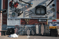
Next, comparing the files of the buoys (Figures 5, 6) and a detailed photo of the outside wall of an antique store (Figures 7, 8), color hue and intensity appeared to be very close. No digital noise was apparent in the blue sky in any file (a frequent problem for me when scanning transparencies) and no obvious noise was seen when examining the separate color channels in Photoshop. I printed all the images on the Epson Photo 1270 using an output profile generated with MonacoEZcolor. As seen on screen, the shadow areas in both photos appeared to have only slightly more detail in the film scans. A mound of crystallized old snow in the foreground of one image did have more detail on film, as expected.

Figure 9: Enlarged section of film test.

Figure 10: Enlarged section of Nikon test.

Figure 11: Enlarged section of optically imaged C-Print from negative.

Enlarged sections of each file also give the edge to the film in apparent sharpness (Figures 9, 10).

Finally, I added the C-Prints to the mix. Lacking a reflection densitometer, an instrument for measuring reflected color values, I relied on my eyes to compare the C-Prints, files displayed on screen, and ink jet prints. At first glance the true continuous tone of the C-Print (from film) seemed to give it more detail and subtle tone than the ink jet or computer monitor images rendered with dots (Figure 11). The print was far less saturated and the yellow buoy appeared more red although the gray weathered wood appeared neutral.

Conclusion
We could have taken a number of "bad" exposures that would have tested the limits of the D100. It's no secret that increasing the ISO beyond 200 also increases the noise levels and limits the dynamic range. In our test that would have forced a greater difference between the two cameras and systems. But shooting in good conditions--decent light, proper exposures--both 645 format negative film scanned on a quality, low-cost scanner and the Nikon D100, produce files that are roughly comparable. The C-Print may have shown slightly greater shadow detail, and its less saturated color appeared more natural. Using the tools in Photoshop CS like Highlight/Shadow I could have made the computer files appear nearly identical. Manipulating a color photographic print is far more difficult, requiring subtle changes in color filtration, dodging and burning, and overall exposure time. Contrast cannot be altered without resorting to complex contrast masking techniques. For my money, film, enlargers, and chemistry still make the most pleasing images, but it's a close call. Today, the choice between film and digital should be based on your personal workflow because the differences in image quality are now very small.

If you are about to make a partial or permanent switch from medium format film to 6-megapixel digital, you may be safe in eliminating image quality as a deciding factor. If you need big files to make 20x30" fine art prints or because your Art Director is bound to crop your files, then stick with 120 film for now. Very high quality, low-cost, desktop flat-bed and dedicated film scanners extend film's range and value. Otherwise, why not make the switch today? It is very clear why so many social/portrait photographers are retiring their medium format cameras and going with 35mm digital. The studio shooters still have more thinking to do and more choices of high-end digital camera backs to reckon with.

Paul Mozell is professional photographer, writer, and consultant. See his work or contact him at: mozellstudios.com.

COMMENTS
LaxRomwe's picture

If you will choose this field for yourself, you will definitely realize that you have to do your best to learn all the necessary things. - Integrity Spas

X