- REVIEWS
Camera Reviews 
More Reviews Mobile Reviews Photography Reviews - GALLERIES
- VIDEOS
- BUYER'S GUIDES
COLOR THEORY: Practical Real-World Tips for Better Photos (VIDEO)
Color theory is a universal language used by artists, filmmakers, designers, and well-informed photographers to imbue creations with their unique vision. The video below from expert Paul Kay explains why this essential concept should be top of mind whenever there's a camera in your hand.
Kay is a successful travel photographer, popular instructor, and Sony Digital Imaging Ambassador based in Tokyo. He describes the topic of today's important episode like this: "Learning how to use color theory in photography is such a great unlock for your compositional abilities." In other words, it's a fundamental consideration.
In barely 10 minutes Kay emphasizes several key color concepts you need to understand, and then he provides helpful graphics and real-word images to illustrate how to put your new-found knowledge to work. Along the way you'll learn how the proper use of color "will help accentuate a subject, divert attention, and (my personal favorite) how to change the mood of a photo."
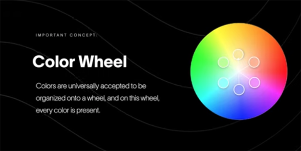
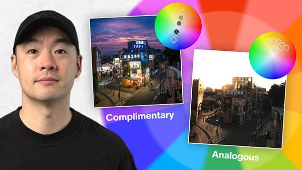
Kay begins with an overview of the Color Wheel within which every color is represented. The trick when using this visual aid is understanding the manner in which colors are arranged. He explains that colors that oppose one another on the wheel are referred to as complimentary colors because "when they sit next to each other in an image they provide the highest amount of visual contrast. Because of that they work."
Conversely, analogous colors sit together on the color wheel and are fanned out to display to display one main hue along with various gradations as you move to the left and the right. With the basics out of the way, Kay pulls up his first example—a stunning landscape scene captured in Kyoto with the sun setting behind a prominent pagoda and fading clouds overhead.
This shot is a perfect example of using color to accentuate a key subject with complimentary colors because if you time things right you can display beautiful blue and orange tones. Kay says, "I'm using orange as a brighter luminosity to pop out the pagoda and show viewers that it's the star of my composition."
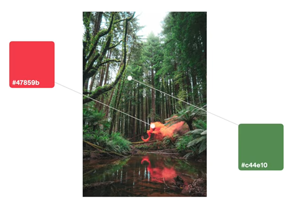
As the lesson proceeds you'll see different types of compelling photographs that rely upon color theory techniques to create magical effects that simply can't be ignored. So pay close attention, change the manner in which you view the world around you, and take advantage of Kay's practical advice the next time you're out in the field.
There's much more to see and learn on Kay's instructional YouTube channel so be sure to pay a visit when you have time to explore.
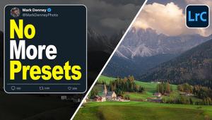
On a related note, don’t miss an earlier tutorial we featured with a post-processing expert who demonstrates a straightforward Lightroom white-balance technique for creating photographs with "color separation" between your subject and the background of a scene.


![]()
Get the Latest Photo Tips, News & Reviews from Shutterbug!
| Camera Reviews Other Reviews | Mobile Reviews Photography Reviews Columns | News | Features | How-To | Resources |
 © 2025 Shutterbug
AVTech Media Americas Inc., USA
All rights reserved