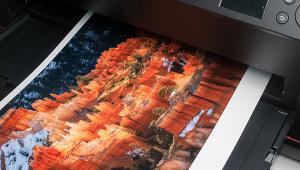
I am a commercial photographer and use inkjet metallic gloss paper to print vibrant and stunning prints of images.
letterpress printing
In Brief; Inkpress Metallic; Printing Paper With An Added Kick
The substrate and the image often go hand in hand, with a natural tendency to choose a matte surface for one type of scene, bucolic landscapes, perhaps, a hard gloss for commercial work, and a luster for deep blacks and a fine art feel. Or, you could turn everything on its head and mix and match as you wish—in short, it’s a subjective decision. Most printers tend to stick to a certain brand and surface for the majority of their work. This is done for both practical and aesthetic reasons, the practical being that the paper just works well with the printer they use, and the aesthetic being that the surface matches their images and how they see.
 |
||
|
||
But there are alternatives to luster (or glossy in the extreme) and matte—canvas, watercolor, and “rice” papers, with their sometimes excessive topography, though rich results. One option is a new breed of “metallics,” which bring back a look from the old Argenta darkroom days, when you could print on “metallic” sheen paper with gold and silver and even matte blue, orange (!), and green under-color. It was mostly for graphic interpretations, at least in my book, and I tended to work from lith negatives and interpositives on them.
 |
||
|
||
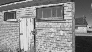
The new breed, like the Inkpress Metallic under test here, don’t require high-contrast images or Threshold Adjustment Layer processing to get an image that holds together on the surface, despite my initial tendency to think that way. When ink is laid down on the surface it is quite different from a silver paper look, so the Inkpress Metallic can be used for many types of images. I worked with low-sat images of foggy mornings, where the fog and running stream, slightly overexposed, picked up an additionally ethereal feel; graphic shots where the whites picked up an “underglow” that was almost like flashing in that they retained texture even when a bit hot; and a portrait where skin tones picked up an inner glow. In short, it can give prints a new edge and “pop.”
 |
||
|
||
Of course, the knock on metallics is the restricted viewing angle needed to avoid getting too much of a sheen, a reflection that can obscure details and block appreciation of the image. But this can occur with “regular” glass framed prints as well, though it must be said that a matte print suffers less from this than a gloss or, even more so, a metallic.
The Inkpress Metallic comes in sheets from 8.5x11” to 17x22” and rolls up to 60”. The Inkpress website offers a host of compatible paper profiles for printing (with Epson printers it’s mostly Premium Luster and with Canon it’s Photo Paper Plus Glossy) although you can download their custom profiles for numerous printers as well. I worked with an Epson 3800 and the Ultra Premium Luster preset and was well satisfied with the results, which invariably matched the screen image.
 |
||
|
||
My aim in testing any paper is first to see if it throws a curve, if you will, in getting what you see on the screen onto the surface, how it dries down (and whether the dry down shifts density or color too much), and how it can be used for added expressiveness with certain types of images. While I certainly would not use this surface for a majority of prints, I have to say I enjoyed the experience of seeing what a new substrate could do with abstracts, scenics, and portraits. At first I was hesitant because of the gimmick factor, but found that the surface can add something extra to an image without making it seem like a novelty approach. Showing this in magazine repro would require a fifth ink, so all I can show here are images that to me got an interesting boost from the paper. Hopefully you’ll get the idea of the kind of image that came up for me when this paper was loaded in the printer. This 10 mil, 255 gsm paper might just inspire you to bring out some images that haven’t visited your monitor in a while as well.
 |
||
|
||
For more information, contact Inkpress at: www.inkpresspaper.com. Be sure to check their website for dealers in your area or on the Internet.
- Log in or register to post comments


