Backgrounds & Montages
Create A Unique, Custom Image For Your Portrait Clients
All Photos © 2004, Woody Walters, All Rights Reserved
Ansel Adams once told me that it is the background that makes or breaks the
image. The background is what will tie all the key elements of a photograph
together. I learned very early in my career that it's true whether you're
shooting large format landscapes or even if you're shooting digital senior
portraits, weddings, commercial, or any other category of photography.
My wife recently wanted to open her own portrait studio. We talked about the
many different directions she could take in order to separate herself from the
run of the mill average studios that were in our market share. She did not just
want to make traditional types of portraits. In my fine art career, I have been
doing montages for sometime now, so I suggested creating montages for her customers
that would tell a story of one or many of their personality traits. I cannot
tell you how quickly and how rapidly her business began to blossom when these
images were created and shown to the public.
First of all, what is a photographic montage? It is an image that combines two
or more elements together that make up an illustration that tells a story. With
all my montages I try to have a visual theme that conveys my vision of how I
see and feel about my subject. So what is an element? An element is a part of
a photograph that is selected in Photoshop and combined into another image.
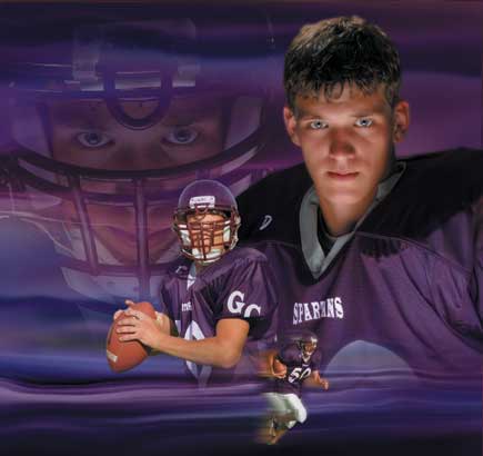
In this article we will work on the image I call "The Quarterback."
In this image we have one element that is the background image. The second element
is the main portrait of Nick shot in the studio using a main light and a reflector.
The third element is a close-up of Nick in full dress and helmet, also taken
in the studio. The fourth and fifth elements of Nick throwing the football and
running with the ball were shot outside in our local ball park. I knew that
my main element would be the portrait of Nick shot in the studio without the
helmet. When I say my main element, this is the element that the viewer's
eyes will see first. The main element is always the predominate element. Then
you will have secondary elements that are more storytelling in nature. The reason
I always have a predominate element is that I need to anchor the viewer's
eye. The viewer needs to be locked into the image; then the rest of the background
image and secondary elements can tell the story.
Figure 1
The background image was created using a sunset photograph that I shot many
years ago and combined with a lightning image which was brought into Photoshop
and liquefied, distorted, smudged, blurred, and finally colorized. It took about
three hours to create, but painting a 9x9 canvas would take as long, if not
longer. I now have hundreds of different background elements, and by blending
them and changing their colors I literally have thousands of backgrounds from
which to choose. By using the Hue and Saturation command in Photoshop, I can
adjust the slider bars that will change the color of my background until it
matches or complements the jersey color of the football uniform. The reason
I chose this particular background was that I really liked the horizontal lines
in the background, which creates motion in the image to add to the theme of
football.
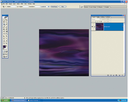
Figure 2
After selecting the background, I added the main element of the portrait of
Nick in his football uniform. In the studio, I photographed Nick using one main
light and a reflector. I used a white paper background set about 3 ft behind
him, which will turn to a neutral gray with the light falloff from the main.
This will allow me to select Nick very rapidly in Photoshop using the Magic
Wand tool.

Once I've selected Nick, I will copy and paste him onto the background
image. You now want to scale the main element (Ctrl+T). This will allow you
to compose the main image, and also allow you to see how much of the background
image you have left to add to the other elements. Hold the (Shift) key down
and drag the anchor point from corner to corner. This will allow you to scale
in perspective. If you cannot precisely decide how large or how small to scale
an element, scale the element on the larger side. You can always go smaller
later if required. If you scale small and then try to scale larger afterward,
you will lose image quality, and you never want to do this.
The next step is to set up a Layers mask on Nick and fade him into the background.
I will start my masking techniques using the Gradient tool. (You might want
to change your Gradient option bar from "Normal" to "Foreground
Color to Transparent." This will allow you to make multiple gradient masks
at one time.)
