Hi,
I have a question to which I have not received a satisfactory answer yet (and I have posted it on several Youtube photo istructor's channels).
It's regarding the video by Tony Northrup - https://www.youtube.com/watch?v=YDbUIfB5YUc.
He insists that the image quality suffers from using full frame lenses on a crop censor body, which contradicts everything I knew before.
Now, I fully understand the crop factor conversion and the issues that smaller sensors have with a shallow DOF/soft background and with noise at high ISO.
I thought these issues are purely due to a smaller size of a sensor and have nothing to do with what glass you attach to the camera.
My understanding was that you actually get a sharper image by using the center "sweet spot" of a FX lens on a DX body.
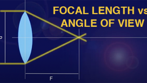
For example, both the 35mm f1.8 DX and the 35mm f1.8 FX will behave as a 52mm f2.7 on a DX body... Only difference is, the censor will use just the centre of the FX glass and the entire DX glass (what difference would it make if the lens barrel is even 2 feet in diameter, the censor is still capturing only the light coming through the center ).
But according to Tony, I would get better results with a cheap 18-55 DX KIT lens than 24-70 2.8 on my D7100 DX body.
Should I replace my 50 1.4D and a 70-300 VR lenses with DX equivalent for my D7100?
I just would like to understand if this is true, how exactly does it work.
Please advise.
Ask A Pro: Scott Kelby Answers Your Photography Questions
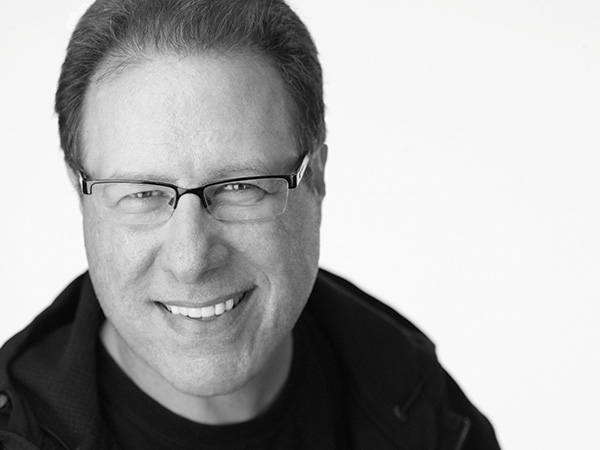
Hi everybody! I’m very excited to be launching a new Q&A column here in Shutterbug—a magazine I’ve been reading, and been a fan of, for so many years—so it’s truly an honor to be here with you. I invite you to send in your questions to editorial@shutterbug.com, and I’ll do my best to answer them in Ask a Pro. OK, let’s jump right to it:
Q. I have to light six people for a group shot, but every time I’ve done small groups like this in the past, I’ve had a problem with the lighting being really uneven. I only have one flash. Should I set up more lights? Are two or three lights the answer?
A. With a small group like that, I would try to stick with just one light (it will make everything easier), and yes, you can light a small group evenly with just one light. The trick is to move the light way back (like literally 15 or so feet back from the group), which of course means you’ll have to turn the power of your flash way up (probably all the way up, depending on which kind of flash you’re using).
What this does is spread the light evenly across everybody in the group. When the light is close to your subject, like it normally would be for lighting a single person, the light “falls off” fast, so if you put a group in front of that light, the person closest to the light is, of course, the brightest. The next person over doesn’t get as much light, so they’re a little darker. The next over is even darker and so on, because they’re farther away from the light and it falls off fast when it’s close. However, when you move the light far away, the light doesn’t “fall off” nearly as fast, so it sends a much more even light across everybody in the group. So, in short, that’s the answer: move your light 15 or so feet back, and you’re good to go with just that one light.
Q. Sometimes an image looks perfectly sharp on my LCD screen, but then later when I open it on my computer, it’s blurry. Why is this happening?
A. It’s because pretty much everything looks in focus on that tiny little screen, and that’s why you have to zoom in and check sharpness while you’re still out on the shoot. If you don’t check it right then, while you still have time to take another shot or two, you’ll wind up with that “bigger screen blurry shot” heartbreak time and time again.
Q. I have my own printer, and I can never get my prints to match what I see on my screen. They’re almost always too dark. Do I need to buy a hardware calibrator?
A. Well, it almost certainly will help but I can’t guarantee you that that alone will do the trick (there’s more to a color-managed workflow than just hardware). However, we can tackle the part about your images being too dark, because that’s an easy fix (and you don’t have to buy anything).
If you have Lightroom (and my guess is, you probably do), there’s a really easy fix—in the Print module, at the bottom of the “Print Job” panel, turn on the checkbox for “Print Adjustment.” Drag the Brightness slider to the right to +10 and do a test print. If it’s still too dark, try +12 or +15 (you don’t have to use big expensive sheets—just use small prints). Within a few minutes, you’ll know the exact amount for your printer and paper and screen setup. The great thing about this is: that brightness amount is only applied at printing—it doesn’t actually change the settings of your image, so your image that looks great on screen will still look great on screen—it’s only brightened when it prints, so now it can match your screen.
If you don’t have Lightroom (but you do have Photoshop), here’s what I used to do in Photoshop to set a similar result: duplicate your background layer and change the Layer Blend mode to Screen. Then I would lower the Opacity to 20 percent and voilà—my prints would match my screen brightness. Lowering to 20 percent might not be the magic number for you (it could be 18 percent opacity; could be 22 percent—you’ll know by making a couple of quick, small-sized test prints).
Q. For organizing large photo libraries, would you suggest Lightroom or Photoshop Elements, or can both be used concurrently? Which of the two has more effective editing tools? Is it possible to store photos in one but use the other or both for editing?
A. I would definitely suggest Lightroom for a few reasons, but mostly because it’s just plain easier to learn. A lot easier in fact. Remember, Elements is just Photoshop with a few features taken out—but it’s still Photoshop, and a pretty complex and powerful program version at that, which comes with a fairly steep learning curve. Lightroom, on the other hand, was built from the ground up for photographers, and its workflow makes a lot more sense, which is why it’s so popular with photographers these days. That being said, you can use them concurrently; taking an image directly from Lightroom over to Elements; doing some editing there, and that edited image automatically comes back to Lightroom. It’s designed to work that way. That said: (1) You probably won’t use Elements all that much—only for those instances when you need to do something that Lightroom can’t do, like creating a multi-photo composite or higher-end portrait retouching or adding lots of text or type effects. And (2) I would absolutely recommend that you do all your photo library organizing in Lightroom instead of Elements. Not only is it much easier, but it is also much better designed. My recommendation is to only use Elements for those “Lightroom can’t do this” moments that you’ll inevitably run across every once in a while.
Scott Kelby is a photographer, Photoshop Guy, award-winning author of more than 50 books, and CEO of KelbyOne, an online training, education, and publishing firm that helps photographers take the kind of images they’ve always dreamed of. You can learn more about Scott at his daily blog (scottkelby.com), or follow him on Twitter: @scottkelby.
(Editor’s Note: Shutterbug is excited to launch a new Q&A column from professional photographer, writer, and educator Scott Kelby. Scott is here to answer all your photography-related questions, so if you have something you’d like to know, e-mail him at editorial@shutterbug.com with "For Scott Kelby" as the subject line, and your query could be featured in the next edition of Ask a Pro.)
- Log in or register to post comments


