The Art Of The Photograph: Essential Habits For Stronger Compositions
This book contains a host of great images and instructive text. Here’s an indication of what’s in store throughout this wonderful book, an excerpt on color and its emotive qualities in the photograph.—Editor
RED
Whenever one thinks of red, one almost immediately thinks of passion and action. Red is a lively color that grabs you; it is not about to sit peacefully in the background. Because of that, red can dominate an image very quickly, even if it isn’t intended to be a major part of the scene.
Red is a color of alarm and warning. Think of stop signs, but also think of ladybird beetles, which use their colors to warn predators that they are not edible. Red is also a color with positive connotations: just consider Santa Claus or Superman. People who wear red are generally seen as positive and energetic. In many Latin American countries, red is a major part of clothing and decoration because of its lively impact.
Red is the color of romance and passion, but it is also the color of blood and violence. It is a color of heat, especially when it tends toward red-orange, such as in the image of the forge, where you can practically feel the heat. When red starts heading toward purple, it gains an almost royal aspect.
Fill a composition with red, and you have a photograph with a lot of impact. Red in any photograph is going to attract attention, so be careful how you use it. Be aware of how strong red can be and use it deliberately.
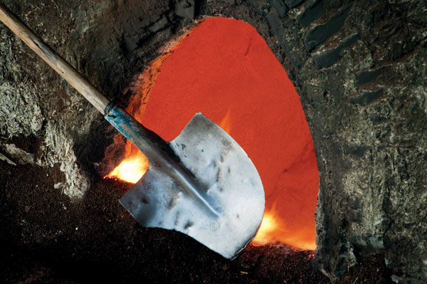
24-70mm lens, f/16 for 0.4 sec., ISO 100
All Photos © Art Wolfe
BLUE
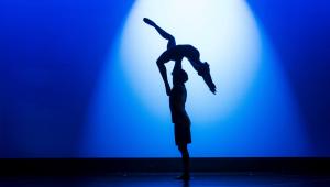
Blue is emotionally almost the opposite of red. Blue is cool and calming. It is passive and peaceful. Rooms painted in blue tend to be restful and relaxing. Some interesting research done many years ago found that when people were in a room with red walls, they felt more energized, but when the walls were blue, they were far more relaxed.
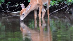
Interestingly, blue is hard to focus on compared to red. Red could be considered a “sharp” color whereas blue is a “soft” one. Our eyes simply don’t focus on blue as well as on other colors. Blue is the color of distance; when you look off to a distant horizon during the day, it will have a bluish cast. This is normal and even creates an impression of depth when blue is behind a warm foreground.
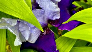
Blue is the color of sky and big vistas, as well as of the ocean. Perhaps that is why blue has long been associated with eternity and the “heavens,” and is often connected to the divine. Blue is also associated with truth, wisdom, and order—a striking contrast to the passion and activity of red—as well as with something a little less positive: depression. We all talk about being blue at times.
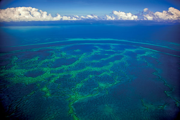
24-105mm F4L IS USM lens, f/5.0 for 1/320 sec., ISO 200
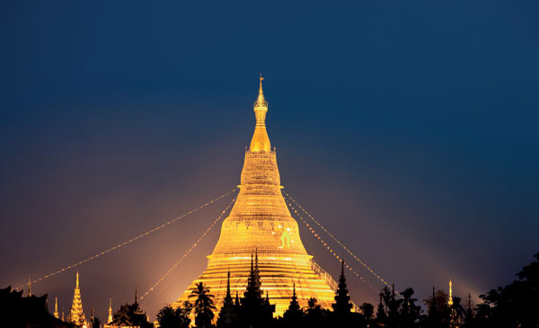
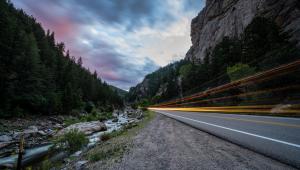
70-200mm F4L IS USM lens, f/10 for 10 seconds, ISO 100
YELLOW
Yellow is the third primary color, along with red and blue. Yellow is often considered one of the purest of the colors. It gets degraded very fast when other colors are added to it; it will quickly look green or orange rather than a pure yellow.
Yellow is the color of the sun, and so is, in a sense, the color of life because the sun gives us life. It is definitely a color of energy and power. It is the color of daytime because that is the time of the sun. It is also the color of gold and is considered a rich and divine color as well.
Yellow is the brightest and lightest of all of the colors. This makes it an extremely visible color, which is why it has long been used when high visibility is needed, such as on warning signs and safety vests. And it is certainly considered a happy color, especially when you consider how many yellow happy faces have been seen over the years. This is not to say that it is only a happy color; just think of people being called yellow because they are cowards.
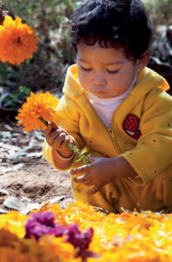
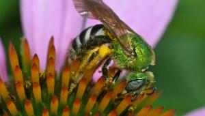
24-105mm F4L IS USM lens, f/8 for 1/125 sec., ISO 400
GREEN
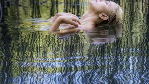
Green is the color of nature and therefore an important part of nature photography. It connotes life and growth. Green is an extremely variable color, too. Green is what is called a secondary color, meaning that it comes from a combination of blue and yellow pigments and it has aspects of both colors. Greens range from almost yellow to almost blue. As green changes in color, it takes on more of the aspects of the color it is being blended with. Green with yellow will be brighter and livelier than green with blue. Green with yellow is a color of spring and fresh life. Green with blue is a relaxing color and the color of mountain lakes and streams.
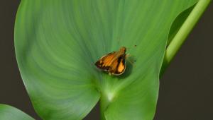
Conversely, green is also seen as a solid color, in part because it is the color of grass and trees, which we think of as solid elements of our environment. Green is a color of renewal and health; think of a plant that is vibrant and strong, but when it starts to turn brown, you know it is unhealthy.
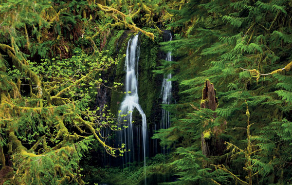
24-105mm F4L IS USM lens, f/14 for 1.6 seconds, ISO 50
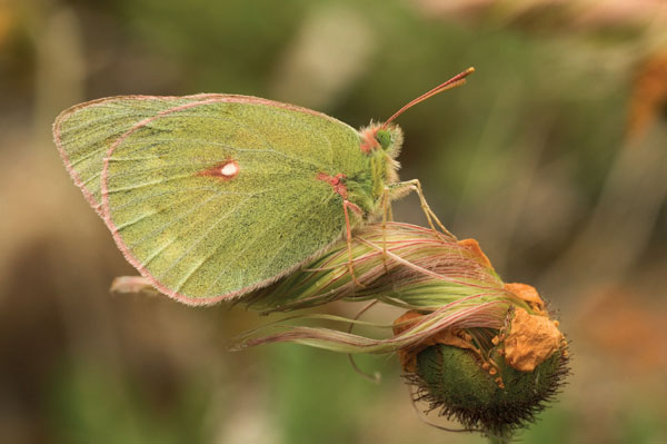
100mm lens, f/13 for 1/25 sec., ISO 200
ORANGE
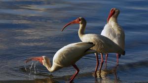
Orange is the warmest color of the group. A secondary color, it combines the passion of red with the brightness of yellow. It definitely radiates heat. It also demands attention, much like red does.
Used for warnings, orange also conveys an element of danger. This is not simply a human aspect of the color—in the insect world, bright orange butterflies, such as the monarch butterfly, are warnings to predators that they are not edible.
Orange varies depending on the ratio of yellow to red. As it tends toward the yellow, it feels purer and brighter. As it tends toward red, it gets richer and more passionate.
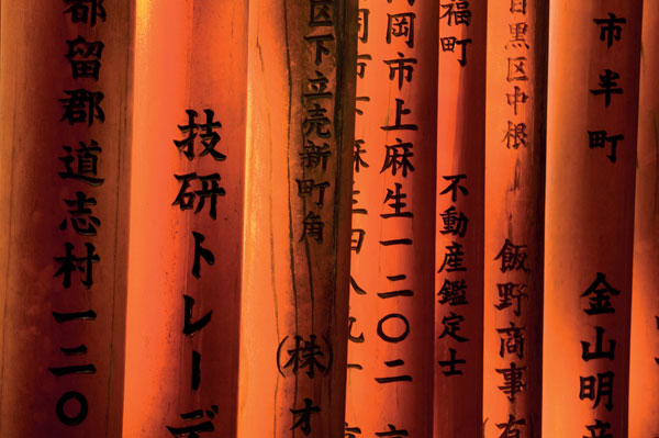
70-200mm lens, f/20 for 2 seconds, ISO 200
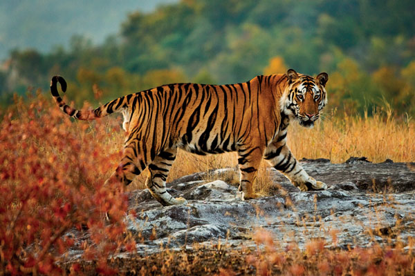
70-200mm lens, f/2.8 for 1/800 sec., ISO 500
About The Authors
Art Wolfe’s television series, Art Wolfe’s Travels to the Edge, airs on PBS stations throughout the country. He is also a popular speaker for such companies as Microsoft, IBM, and Sheraton Hotels. Wolfe has released over 80 books which have sold over 500,000 copies and have been translated into eight languages, including the bestselling The Art of Photographing Nature (Amphoto Books). More of his work can be viewed at www.artwolfe.com.
Rob Sheppard is an author/photographer of more than 30 books and hundreds of articles and is a well-known speaker and workshop leader. He was formerly longtime editor of Outdoor Photography magazine. His work can be viewed at www.robsheppardphoto.com.
Where To Buy
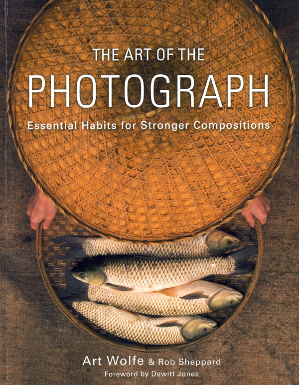
The Art of the Photograph (Amphoto Books, ISBN: 978-0-7704-3316-1, 258 pages, $29.99) is available where fine books are found and online at www.amazon.com and other online booksellers.
