Black & White Conversions; A Powerful New Tool In CS3
Black & White
In previous versions of Photoshop, the most common method for converting a color
image to black & white was to use the Channel Mixer. It was a clunky, counter-intuitive
process that forced you to think like Photoshop instead of allowing your brain
and eyes to naturally digest what was being done to your image. The new Black
& White converter is a truly wonderful tool that makes the conversion process
much more intuitive and user friendly. Because it's so easy to use, it's
got an instant gratification aspect to it that makes it especially fun to play
with.
 |
 |
|
|
||
Creating A Good Mix
When you choose Image>Adjustments> Black & White, all the color will
be taken out of your image and you'll be presented with a dialog box that
has six primary sliders. You can control the brightness of different areas in
your image by dragging the appropriate slider (for instance, the Reds slider
brightens or darkens areas that used to be red in the image). The only problem
with this approach is that you can't see what color different areas used
to be without toggling the Preview checkbox.
You can also click and drag within the main image window to have Photoshop try
to figure out the proper slider to affect that area. When working this way,
click on the image and (while you're still holding down) simply drag to
the left to darken the area, or drag to the right to brighten it. You'll
see the corresponding slider magically move in the Black & White dialog
box. I absolutely love working this way, but find that Photoshop doesn't
always choose the best slider to isolate the area on which I'm clicking.
If you find that it's having trouble isolating an area, toggle the Preview
checkbox off and then back on again and try the sliders in an area similar in
color to the area you want to affect. You might find that one chosen manually
in this fashion works better than the one that Photoshop automatically selects.
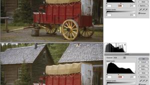
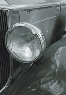
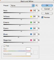
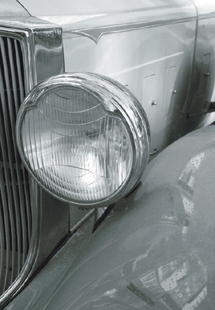
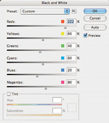
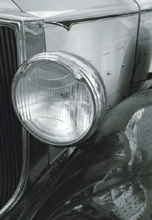
In this example, dragging on either the body of the car or the fender area caused
Photoshop to move the Reds slider, which caused both areas to change in almost
equal amounts. By experimenting, I found that the Yellows slider did a much
better
job of isolating the body of the vehicle, so I used the Yellows slider to brighten
the body and the Reds slider to darken the fender of the car.
 |
 |
|
|
||
 |
 |
|
|
||
Resetting A Slider
If you'd like to get one of the color sliders in the Black & White
dialog box back to its default position, hold Option (Mac), or Alt (Win) and
click on the color swatch associated with the slider.
 |
 |
|
|
||
Watch Out For Clipping
Each of the adjustment sliders in the Black & White dialog box has a very
wide range available, which means that it's very easy to end up with solid
black or white areas in your image (also known as clipping). If you're
concerned about losing detail in the highlight or shadow areas of your image,
consider opening the Info palette (by choosing Window>Info) and passing over
the brightest and darkest areas of the image. If the right side of the RGB readout
in the Info palette ever hits zero, you'll know that the area under your
mouse is solid black and if it hits 255, then the area is white. I find that
turning on the Tint checkbox (which we'll discuss next) can make it easy
to tell if you're losing highlight detail. That's because the white
areas will contrast with the areas that are being tinted, thus making them easier
to see.
