Wedding And Portraiture
Lighting, Whats It All About
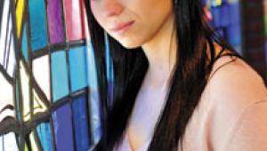
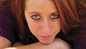
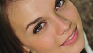
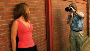
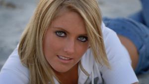
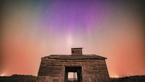
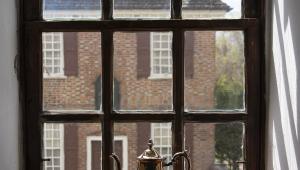
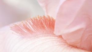
A quick glance at these photographs and you may wonder what they all have in common. In a word: lighting. Much has been written about light and lighting equipment. Yet, I've found very little written about what we're trying to accomplish with lighting. Maybe, with a little more discussion along these lines, lighting will not become such a mystery to so many photographers. Good lighting is all around you all the time. It's now time to notice it and see how it was created. Look around you. See the light on people's faces as you go through your daily routine. Look at faces wherever you are. Notice that when faces look particularly good you're probably experiencing natural lighting that has many of the same properties that I'll be describing. In particular, when you're riding in a car (not driving) look at the other person. See how the window light on their face is creating just about perfect lighting situations all the time. That's because the top is covered and you have light coming from the front and side windows. You're going to be amazed at many of the opportunities for great natural lighting that you've been missing. And to top it all off, now with digital cameras allowing you to change your ISO for each individual picture, you can take advantage of many of these opportunities with no problem at all. Now, it's just up to you. Are you going to be satisfied with the lighting that you've possibly accepted before for many of your photographs, or are you going to go for lighting that does the best job that you can possibly achieve? Yes, that's a challenge! Of course, you can still learn more about all of this at: www.zuga.net, mine and Gary Bernstein's web site. |
|||
|
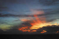
Visual Impact Lots and lots of pictures are taken daily of sunsets all over the world. Some work. Most don't. Have you ever stopped to figure out why some are better than others? It's not always just the sunset itself. It takes more than a pretty sky to make a great photograph. It takes a lot of visual impact and a center of interest. This sunset picture has both. The visual impact here is a combination of both the vivid colors and the sun's rays. The rays of the sun bring your eye to the lower right corner of the photograph and hold you there. That's important. Instead of wandering throughout the picture, your eye continually goes back to where the light comes out from behind the dark clouds. What also makes this picture come alive is the fact that the light is coming toward your point of view. The clouds are backlit and sidelit. Even the clouds all the way at the top of the photograph are backlit. When something to which you want the viewer's eyes drawn is backlit and/or sidelit, the photograph has depth and dimension. Even on the flat surface of the picture, you have a three-dimensional feeling that isn't there when the light comes from the viewpoint of the camera (flat, frontal lighting). |
|||
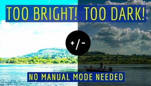
Direction Of Light Once again the light is coming from behind, toward the lens. The mountains, the water, the figures, and the trees are all backlit. Had the picture been taken with the sun high in the sky, the picture would have been very ordinary. With the backlighting, however, your eye is drawn to the three figures walking in unison on the water's edge. The angle of the light on the scene is what makes the people jump out at you. The way the dark figures stand out plainly against the lighter background of the water makes your eye lock in on them. So, were beginning to see a pattern already. Light coming around from behind and to the side of the subject seems to create the most dimensional photogarphs. When the light also draws your attention to the primary subject of the picture it's doing what it's suppose to be doing. Using the light to make the subject of your photograph the center of interest and to make it three dimensional is using the light to best advantage. Now we just have to see how we can either find light that will do those things, or we need to be able to work with the available light and adapt it to fill our needs. |
|||
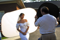
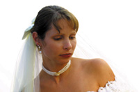
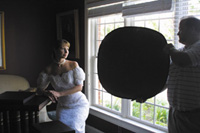
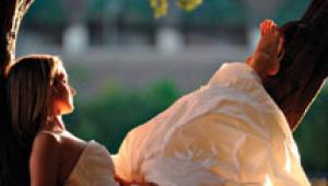
High Key Outdoor Portraits Notice how the late afternoon sun is going directly though the panel and how I have postitioned the bride so that the light highlights the left side of her face and created a beautiful specular highlight down the length of her nose. I used a #1305 Westcott Silver/Black Illuminator/Reflector in front of her to pick up some additional light, postitioning it as if it were my main light source. Many people think that high key lighting is very flat lighting. Not at all. We still need three-dimentional lighting on the subject's face. It's simple a matter of keeping the range of tones fairly small - all in the lighter to medium range. No deep shadows. |
|||
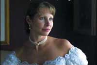
You certainly don't miss the window in that picture, do you? Many photographers might include the window becuase they feel as if they have to pose their subjects so close to the light source that they have no alternative but to include it. Notice here in this picture how far the bride has been posed from the window. With her in that position I was able to easily compose the photograph to include as much of the surroundings as I wanted. Do you miss the window not being in the photograph? I don't think so. While you're looking at the picture, notice how my reflector was positioned. What I did was to light only the left side of her face with the window light. When I postion the reflector as if it were the main light. Instead of having it on the shadowed side, it's actually on the highlighted side of her face. With the reflector turned toward the window I was able to pick up the light. Then I simply angled the reflector back toward her just enough ti bounce the light onto the right side of her face. Finally, see how I've turned her body away from the light source and then turned her head back to the window. By crossing the light over her body, giving us a lot more detail than had I turned her body toward the window. |
|||
By being aware that the subjects needed to be lit in this manner, I was able to get beautiful skin tones with little or no effort at all. Knowledge is power. |
|||
So, What About Studio
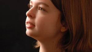
Lighting? On the other hand, when you're working indoors with your own lights you have total control. No matter where you are and no matter when you're working, as long as you carry your lights with you, you always know exactly what to expect and how to handle it all. In this case I€™ve positioned two main lights exactly as I arranged the lighting in the previous portrait. I€™m actually using two lights, both of equal intensity, to create the lighting on her face. The first light is at almost a 90 angle to the front of her face. Actually, it€™s positioned the same as if I were lighting her profile. The second light is placed for my regular facial lighting pattern. My next two lights are on her hair (also, the same f/stop as her face) and the fourth on the background, lighting the background a little brighter on the highlighted side of her face and a little darker on the back side of her head. These four lights are actually coming out of one power pack, a Photogenic 800 WS Photomaster (PM08). I like using this lighting system better than anything else because the lights are all powered from the single pack that rests on the floor. The light heads, themselves, are small and lightweight, allowing me to place two of them into Westcott's Mini Apollos. Nothing could be easier or better. Behind my camera I'm using a fill light bouncing into an umbrella. That light measures two f/stops under the main light at her face. The fill light could be just about anything, but I prefer to use another Photogenic light. That way, I have a back up, just in case anything should happen to my other lights in traveling. Regardless of what you're photographing, good lighting is pretty much the same in every case. When the light comes toward your subjects at an angle, rather than directly from the front, you're going to achieve much more of a three-dimensional effect. As a result, the impact of your photographs will be much, much greater. |
