- REVIEWS
Camera Reviews 
More Reviews Mobile Reviews Photography Reviews - GALLERIES
- VIDEOS
- BUYER'S GUIDES
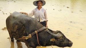
Travel Photography
Pro Tips For Effective Composition
Whenever I judge photo contests including a travel category, one fact quickly becomes apparent: picture-taking during vacation and other trips is not always taken seriously. The photographer who might spend hours making an exceptional landscape or portrait or architectural image tends to shoot quickly while traveling. Frankly, most of us are guilty of snapshooting at times, especially in locations that are entirely new to us. We become so overwhelmed by exotic surroundings that we shoot first and think about it later. With today's sophisticated cameras, lenses, and color print films, almost anyone can produce sharp travel photos with correct exposures. On the other hand, very few of these technically-acceptable photos should satisfy the creative standards of the serious photographer. Granted, photographic excellence, like beauty, is in the eye of the beholder. Still, most of us would agree on certain criteria. Cluttered backgrounds, partially-blurred foreground objects, tiny subjects dead center in the frame and overpowered by irrelevant space do not make for an appealing picture. Primary factors in successful travel photography are thoughtful composition using visual harmony, dynamic tension, and effective image design. Consideration of these elements definitely improves our images. A badly composed photograph will lessen appreciation of any picture, even if the viewer does not recognize the reason. Today's "intelligent" SLR cameras can almost take the picture for you, but they have yet to be programmed to seek out and arrange the visual elements for well-balanced images. Although most photographers already know many of the principles of composition, it's worth refreshing your memory, especially with techniques you have not used recently. |
||||
The Intersection Of Thirds Emphasize dramatic skies by placing the horizon low in the frame, along the lowest line in your imaginary grid. If the sky is dull, but important to the story, place it at the highest line. When the subject is quite large in the frame, as in a close-up portrait, place the most important subject element--the closest eye, perhaps--at an intersecting point. This will be one of the two top points to avoid excessive empty space above the subject. Hint: In many off-center compositions with a small center of interest, there will be some "empty" space in the frame. Try to include a secondary, smaller or more distant object, too. This will offer a resting place for the viewer's eye as it explores the rest of the picture area. |
||||
In most cultures we read from left to right, and tend to scan a picture in this manner as well. Hence, placing the primary subject closer to the left side of the frame is usually appropriate. If it is in the dead center we are less likely to explore the other areas. With a moving subject leave plenty of space for it to "travel into." With a static subject--whether a person or animal--leave space for the subject to look into if it is gazing to the side. Basic Compositional Techniques |
||||
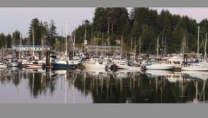
Find a clear center of interest. Instead of forcing the viewer's eye to roam around the picture, searching for something to observe, include some specific object that will achieve this goal. Whether that's a Beefeater in London or a small boat on the Ganges River, make it the focal point of the image to achieve your intended purpose. Frame The Subject |
||||
Unless you notice an obvious framing object, you may need to explore the area to find one; this may call for changing your intended vantage point before taking the picture. Look for a framing object that has some aesthetic value on its own. Pleasing shapes such as archways, interesting brick work, colorful doorways, overhanging branches with brilliant fall colors, or spring blossoms are all effective. The frame should complement the subject. A centuries old mosque for example, is unlikely to benefit from a frame provided by a new concrete structure covered with graffiti, unless you're trying to make a specific point (architectural contrast) in the image. Try to avoid framing devices that are excessively large, stunning, or colorful. After all, you don't want to draw the viewer's eye from the center of interest. If it is much darker than the subject, or in deep shade, it may be rendered as a silhouette; simply take the meter reading from the brighter background. If it is fairly close, fill flash can provide a brighter effect; try shooting the situation with and without flash. A framing subject near the bottom of a picture can be equally useful, filling in empty expanses of grass or clutter. A colorful flower garden, the rocks of an ancient farm fence, a small hill, shrubs, farm implements, etc. are but a few possibilities. Again, make sure they are complementary to the subject. Use care with depth of field to avoid a partially-blurred foreground, which can be extremely distracting. If you include an overhead framing object, plan to render it sharply or completely blurred (defocused). With architecture, it's best to keep the frame sharp. Use a small aperture such as f/22 and a wide angle lens; focus at a point about 1/3 of the way into the image area, to keep both the foreground and more distant background within the depth of field. With natural objects such as foliage, you may wish to completely blur away the frame into a soft wash of color; use a wide aperture, such as f/4 and a telephoto lens. Focus at or near infinity. Decisive tactics of this type make for stronger pictures than the wishy-washy f/8 often selected by a camera's Program mode. |
||||
Effective Visual Design
Experienced photographers will often break the "rules" of composition--to make a point or create a mood. Before doing so, it is worth knowing and practicing proven concepts and guidelines. After they become second nature, begin to experiment. For example, you might try placing a circular subject in the center for formal symmetry, include urban clutter around an ancient monument, or place a medieval character so he is looking out of the frame for a sense of tension. But do so knowingly and intentionally. Finally, edit carefully and show only your most successful travel images to others. That way, your reputation as an accomplished photographer will grow. |


![]()
Get the Latest Photo Tips, News & Reviews from Shutterbug!
| Camera Reviews Other Reviews | Mobile Reviews Photography Reviews Columns | News | Features | How-To | Resources |
 © 2025 Shutterbug
AVTech Media Americas Inc., USA
All rights reserved