Slide Shows That Shine
Slide Shows That Shine
Digital Makes It A Whole New Ball Game
by Jon Canfield
Creating slide shows used to be a time consuming task—getting the slides in the right order, making sure nothing was backwards or upside down in the slide tray (and not dropping the tray!), and setting up the screen and projector. And, let’s not forget the really hard part—getting everyone together to watch the show.
Thanks to digital imaging and a number of programs, most of this is a thing of the past. Yes, you still need to collect and organize the images for your show, but there’s no more setup and gathering required. You can mail your show anywhere in the world, or even post it on a site like YouTube, or your own website if you like.
While it’s easier than ever to share your images, it’s also more important than ever to make them stand out from the crowd. Using transitions and music are great first steps to making a professional quality show, and thoughtful captions can make a big difference in how your viewers are engaged with the show. But, like the slide shows of old, it all starts with the image. With these things in mind, here are some tips and guidelines to creating a slide show that shines.
Start With The Best Image
The best way to keep someone’s attention is to show him or her images that are top quality. I spend more time selecting images for a show than I do with any other phase of the creation process. I’m ruthless when it comes to selecting which image goes into a show and will review the files multiple times to ensure that I’m only presenting the best of what I have. We all have emotional attachments to the images we capture, but try to remember that your viewers may not. Sure, if it’s something like a family through the years show this isn’t as important, but for a show that will be seen by a wider audience you want to go for the wow factor.
 |
|
|
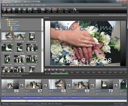
The other consideration when selecting your images is the number of slides to be shown. On average, you’ll use about 12-15 slides per minute of show time. A good guideline for a slide is about 3-5 seconds of viewing time, and about 3 seconds for the transition between slides. If there’s a lot going on in an image, or if it’s a more technically oriented show, you’ll want to use longer durations to give your viewers time to take in everything. You’ll also want to use longer times for slides with captions on them to give your viewers time to read the text and see the image.
Prepare Your Images
Many programs will let you output your show in different formats. ProShow, as an example, lets me build everything from a small show designed to play on YouTube or an iPhone, all the way up to ultra high quality HD for Blu-ray. If you know what your show is going to be seen on in advance, you can prepare your images to look their best at that size. For this work, I use Photoshop. I pre-size my images for output—if I’m making a DVD for someone, I’ll make the images 720x480, which is the resolution of a standard DVD. By doing the sizing in advance I can control how the image is sharpened, and keep the final file size down to a minimum, especially important if your show will be viewed online.
I also do all my image corrections—color balance, clean-up, cropping, etc at this point. While many of the programs have basic image-editing tools, you’ll have the best results by using a dedicated program for these tasks.
Finally, be sure to convert your images to the best color space for viewing online or on TV. In Photoshop, choose Edit>Convert to Profile and select sRGB IEC1966-2.1 from the Destination Space Profile drop-down menu. In Photoshop Elements, you’ll select Edit>Color Settings and choose “Always Optimize Colors for Computer Screens”. Choosing sRGB will ensure that your images look their best on most display devices.
 |
Choose The Right Transition
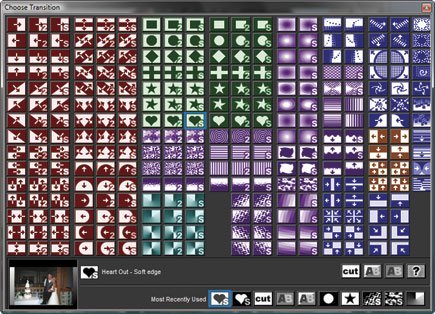
Many of the programs available now have a wide variety of transition effects to use between slides. For example, ProShow has over 280 options. That doesn’t mean you need to use all of them though! A show will be more interesting to watch with a small set of transitions that work well with the images. After all, your goal is to have people view your images, not wonder what the next wiz-bang effect is going to be.
I try to use a set of 4-5 different transitions in my shows. When moving from horizontal to vertical oriented images, I’ll often select an open vertical effect that minimizes the differences between the two image layouts. When switching back, I’ll use the open horizontal effect.
I typically select the more simple transitions for my shows, with wipes and blends working well for almost any image type, although for weddings the heart transitions are very popular options.
 |
A good way to use different transitions is to group them into segments of your show. For example, start out with a set of 2-3 different wipe or fade effects in the first part of your show, and when you reach a point where the subject matter shifts, use a new set of transitions. I will often group them with captions—when I insert a caption into the show, I’ll start using different transitions to re-enforce the fact that we’re now looking at something new. Again, using a wedding show as the example, I’ll use a set of transitions for the ceremony portion of the show, and a different set for the reception, and finally a third set for the formal portraits.
 |
Using Special Effects
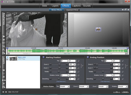
Thanks to the power of these programs, it’s easy to add some amazing special effects to your shows. If you’re a fan of PBS you most likely know the name Ken Burns. Popular for his history documentaries, Burns popularized the notion of still images moving on the screen to give them more life. This is now referred to as “The Ken Burns Effect”. Most of the slide show programs available include motion effects in their feature set, and they can do wonders to add impact to your show. But, like transitions, they should be used wisely to avoid losing your viewer to the effect.
The two most effective motion effects are a simple pan across the screen and the zoom in or out. For the pan across the screen, you simply tell the program where to start your image and where to end it. The program will then take care of moving the view across the image, giving it the appearance of motion. In the zoom effect, you specify the starting and ending sizes and the program handles the scaling of the image. If you’ll be using motion effects on a slide, add a couple of extra seconds to the duration to give the effect time to play through.
 |
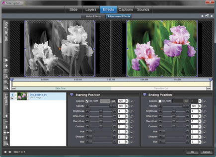
Another popular special effect that works well with a wide variety of image types is the blend from black & white to color adjustment. In ProShow, this is easily done by using the Colorize option in the Slide Effects dialog box. In other programs that don’t have this feature, you can create the same basic effect by creating two versions of your image. The first is a black & white copy, which is followed in the show by a color copy. Use a transition like a fade or wipe between the two slides to give the appearance of changing into color.
 |
Adding Captions
All slide shows benefit from some type of captioning. Whether it’s a simple title slide to start the show, or you use text labels on some of your slides to help the viewer know what they’re seeing, or you have multiple sections in your show, captions are the way to get this across. Like transitions and effects, the best captions are kept simple. After all, you’re trying to get viewers to look at your images, not read about them. So, I recommend keeping the text to a minimum—if you’re using them inside the show, a short caption describing what is coming next, or what a particular image is of is all that is needed.
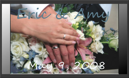
You don’t need a blank slide for your captions. In the example shown here, I’ve placed the name and date of the event on a slide using a background image. With the right image selection, this is all the text that is needed—I don’t need to clutter up the slide with extra text saying it’s a wedding—the image does that for me.
 |
Resources
Along with the slide show creation options available in many image-editing programs like Photoshop and Elements, you may have software included with the operating system. On the Mac, iPhoto and iDVD are included and can create shows. Windows users have PhotoStory available as a free download. When it comes to creating professional level content though, I turn to these two programs:
ProShow Gold and Producer: www.photodex.com (Windows).
FotoMagico:
www.boinx.com (Mac).
These tips and more can also be found in Jon’s new book, “Photodex ProShow Visual QuickStart Guide”. If you’d like to learn more about creating shows with ProShow, be sure to check out his new book and stop by the supporting website www.proshowbook.com for examples.
It’s A Wrap!
Following a few simple rules can help your shows stand out from the crowd and showcase your photography to the best advantage. Here are the simple rules I follow with every show I create:
1. Start with the best image possible. Review your images like a viewer would and only choose the ones that you think are your absolute best.
2. Prepare the image before placing it in the show. This means sizing, any image adjustments, sharpening, and converting to sRGB.
3. Choose the right transitions. A few well-chosen transitions will work much better than using everything the program offers just because you can. Keep your viewers focused on the images, not the effects.
4. Using special effects. A little motion can add some life and impact to your images. The pan and zoom effects work well with most types of images. Don’t use them on every slide, but when you feel it’ll add to the interest, it’s a great addition to your show.
5. Use captions when needed. A few captions placed at the right point in your show helps to organize the images and inform the viewer. Keep the text simple and easy to read.
- Log in or register to post comments

