Seeing Pictures
All Photos © George Schaub, All RIghts Reserved |
This first shot was made on the ferry from Algiers to New Orleans across the mighty Mississippi; and is a very formalistic approach applied to a rather odd subject and setting. The key for me in this framing is the linkage of the yellow rectangle to the topmost part of the frame, made with the yellow pole. The large negative space in the center of the frame is topped by the echoing rectangle of the freighter hull, which mirrors the yellow rectangle at the base. Without the passengers balancing the frame in the lower right I probably would not have been tempted to make the image. The wheels of their transport devices introduce the only round shapes within the frame. Those figures are the lynchpin, and the wheels the fulcrum, of the entire piece. The overall composition is a grid of lines and forms, with thin line accents and larger masses organized within the frame.
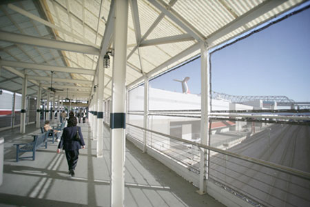 |
The same approach is taken in this shot of an overpass leading from the convention center (made pre-Katrina) to the Riverwalk mall complex. The main grid is offset to the left, but is balanced by the sweep of the vista to the right. The pattern within the frame is made up of polygons of various shapes and angles, with shadows lending triangles as reinforcing forms. Once again the figure is key to the scene, leading the eye down the path. The dark figure also offsets the generally high key exposure, providing contrast and a focal point to lead the eye of the viewer into the frame.
 |
This lift crane, found on a side street also in New Orleans follows the classic rule of thirds, created by the shades and colors of the street, sidewalk and building. The triangular shape of the vehicle offsets the basically horizontal monotony of form behind and in front of it. There's a slight barrel effect to the image, owing to it being made with an ultra wide angle lens fairly close to the subject, which contradicts the expected straight lines of the setting. The grid pattern of the sewer grating is included to create another break from the dominance of the horizontal lines. The flat light also adds to the overall feeling of compressed volume and space throughout the frame.
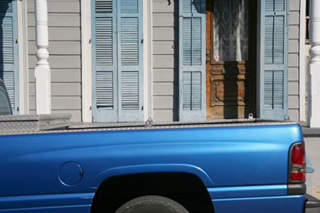 |
While the intrusion of this metallic blue truck bed might seem out of place in this photo, it represents a break from the carefully composed set of shutters and pale gray wall in the background. It is treated as a form rather than a subject, a dash of bright light in a textural background. For this to work it was important to keep the background vertical lines parallel to the edge of the frame, as in the white column on the right hand border. The off angle of the truck bed, with the hint of red in the tail light, is meant to be abrupt. Again, it is a formal study using odd and seemingly intrusive elements.
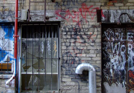 |
While the graffiti and broken windows in this alley in Montreal might appear to be the subject, this is actually another formalistic approach to a scene. The image is composed of a set of rectangles boxed in by a grid of horizontal lines. The pipe is purposely placed off center to the right to help balance the strong vertical and horizontal interplay. Strong dashes of red create a triangle that unifies the shapes and forms within the frame.
These pictures were chosen to show how a sense of balance and form can emerge from images made over a period of time. They are intentional in their composition, and quite studied in their approach, despite the subject matter. In fact, subject matter here just serves the compositional approach, and while perhaps ironic, or mundane, these images serve to inform me about how I see. Give yourself some time to go through your own images and try to detect some of the visual approaches you take to your own work. You might be surprised at what you discover about your own point of view.
- Log in or register to post comments

