Photography In The Real World Page 2
www.carlramsay.com
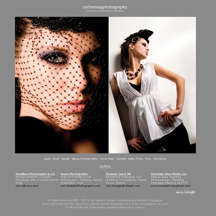
Toronto-based photographer Carl Ramsay's website looks as if it were created
with a template. A darn good-looking template but a template nevertheless, replete
with Google ads. But what sets his site apart from others who may even use this
same design is the strength of his photography. This is in-your-face photography,
made with consummate skill and technical expertise that transcends its humble
site design so much that after a few seconds you forget that it's there
and concentrate on the images. Don't click on the "Fashion, Advertising,
Editorial" text beneath his name; instead click on the "portfolio"
link and you'll see a scrolling page of large thumbnails (thanks Ramsay)
that when clicked enlarge and give you progress arrows, allowing you to navigate
back and forth between many, but for some reason not all, of the large thumbnails.
That may be the fault of my browser--Firefox--or is just a feature
of the site design.
When looking at the images either enlarged or as grande thumbnails, the worlds
of fashion and advertising commingle with black and white and color images that
catch the eye and let you appreciate the raw talent that Ramsay has on display.
At the bottom of the portfolio is information on his services in English and
French, including his price list for headshots.
 |
|
|
www.goclaygo.com/photos/
Clay Lipsky is an art director for Fox Sports and an amateur photographer whose
website shows how his design training infuses his images with style with a capital
"S." The opening page of Lipsky's photo pages is a set of
clever black and white menus that
list collections, including Assorted, Decay, Landscapes, Portraits + Fashion,
City of Angels, and Travel & Nature. When clicked, each collection opens
up with a large image with small thumbnails underneath.
I was fascinated by the first "Decay" collection where Lipsky photographs
old bridges and overpasses as if they were the skeletal remains of long dead
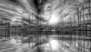
dinosaurs, and maybe they are. The post-apocalyptic images in "Decay 2"
are shot with a style that defies easy description other than it seems to be
monochrome and color at the same time. In "City of Angels" he skips
the glitz and goes for stark black and white images that take you onto the mean
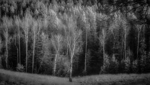
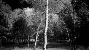
streets of Los Angeles. Similarly, his "Landscape" images have a
Stephen King quality about them and you almost expect Freddy Kruger to make
an appearance.
Lest you think him morose, the images in "Portraits + Fashion" show
a deep appreciation for living beauty. Yet it is in "Assorted" where
you find the quiet beauty of the natural world, kids jumping into water or playing,
people playing golf, all infused with the subtle light that is the hallmark
of Lipsky's work. Thanks and a tip of the Farace chapeau to Shutterbug
reader Anita Curry for introducing me to Lipsky's website.
 |
|
|
- Log in or register to post comments

