- REVIEWS
Camera Reviews 
More Reviews Mobile Reviews Photography Reviews - GALLERIES
- VIDEOS
- BUYER'S GUIDES
Our Favorite Reader Websites: 3 Great Photography Sites That Aren’t a Flash in the Pan

In my July 2016 column I posited several reasons why you shouldn’t use Adobe Flash, including blocking millions of iDevice owners from viewing your photography. Yet Flash remains popular, as I learned from one of the sites I hoped to feature this month but could not because my computer is Flash-free.
An alternative method for including video and animation on your splash page is to embed a Vimeo clip at the top of the page, like one Australian photographer’s site I hoped to feature this month but they refused to grant permission. (This happens more than you might think.)
But their idea is still a good one and Vimeo is a good choice, especially when compared to ad-crowded YouTube, because Vimeo's aimed at filmmakers and video shooters. You can see my personal Vimeo page, which includes quadcopter-flying (and crashing) videos here. A basic account, like mine, is free but $9.95 a month gets you 5GB of uploads per week.

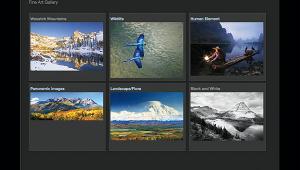
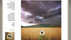
paulelliottphotography.com
Paul Elliott is a British cinematographer and photographer living in Santa Fe, New Mexico whose splash page hits you—POW!—right in the face. Images are collected in 10 mostly geographically categorized collections, all imbued with a cinematic sensibility (no surprise here) that exude a sense of place but there’s lots more too.
His Landscape: Black & White gallery is full of wistful, wide-angle and often-majestic images chock full of mood and mystery. Photographs such as “Utah #6” are explorations of light and texture that are impeccably composed and yet Paul is his own man; there’s no Ansel Adams or even John Ford influence, instead it’s pure Elliott. In Landscape: Colour his images take on an occasional impressionistic touch exploding with color, while giving your eyes space to explore.
His monochrome travel galleries, such as Viet Nam, have too few images but what’s there mixes documentary image making with humanistic elements that you’ll also see in the sepia toned photographs in his China galley. Here Elliott embraces impressionism in many of the images capturing elements of a long lost China experience that’s at once romantic and historical. All of his travel images, even England: Lake District, seem to be a form of visual time travel that when viewed within the context of Elliott’s sensitive yet and remarkable grasp of technique make you want to take the trip with him.
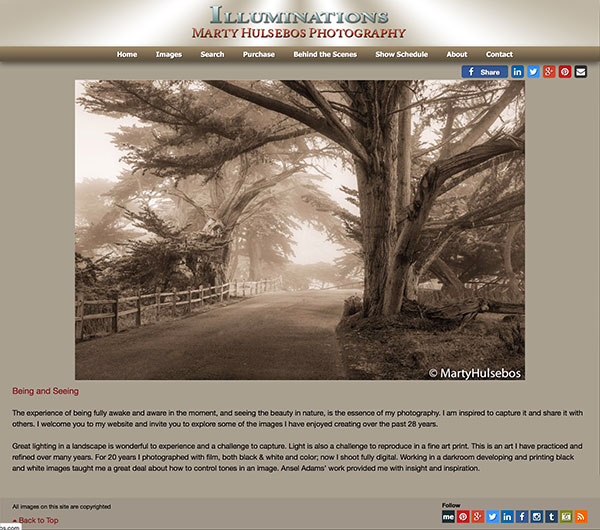
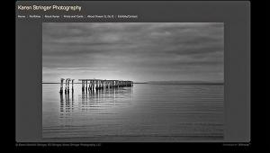
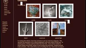
martyhulsebos.com
Marty Hulsebos has a passion for sepia toned images but the color portion of his website contains 17 galleries of color photographs. There are 28 collections in the Warm-Toned Black and White section, so let's go there first: Most images belong to the landscape and nature genre with topic-specific collection, such as Aspens, whose subject matter is well suited to warm toning.
Marty explores Aspen forests using both wide-angle and long focal length lenses so while the subject matter may be the same the impressions made by each image are quite different, with each one more beautiful and poetic in its own way. The Oregon Coast collection of seascapes combines strong composition while showcasing his ability to use natural lighting to produce impact. Sometimes a photographer’s monochrome imagery has a different feel that their color photographs and that’s the case here too. This can be seen in the (color) Aspens gallery with his strong use of the panoramic format producing hard-edged but environmentally respectful images producing a wistful effect.
And while the seascape in Monterey could not be more different that the harsh beauty of the Oregon coast, there’s that same lush, comfortable feeling that pervades Hulsebos’ best color photographs. Marty Hulsebos is a stylist of the first order who has the ability to immerse himself—and you—in a landscape producing feelings of nostalgia, warmth and peace.
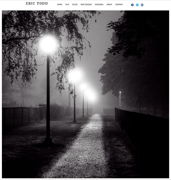
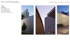
erictoddphotography.com
Eric Todd claims to be an “aspiring photographer” but even a cursory look at the images found on his site shows he’s more inspiring than aspiring. Images are collected in B+W and Color galleries that feature a proof sheet page format and when clicking an image it’s opened full screen, allowing you to walk through the photographs using forward and back arrows. As Eric states in About, he’s interested in “capturing the beauty and diversity of the New England landscape,” which he accomplishes with the serene landscape images found in his Color gallery. There are just a few photographs here, but all are worth a closer look, which their large size permits.
Todd’s use of the square format adds a formality to the images’ presentation that lets your eyes stroll inside the landscape rather than just standing back and staring. There are many more images found in his B+W collection and from the first one, “Owl's Head, Maine” you know you're in for something special. These are beautifully crafted photographs that recall classic landscapes while reverberating with Todd’s own unique vision. And by the time you get to the Dali-esque “Clam Trees, Rock Harbor, Orleans, MA” you know you’re not in Kansas anymore. Similarly the minimalistic long exposure “Scusset Light, Sagamore, Massachusetts” shows that when Eric Todd looks at a landscape he observes things you and I don’t immediately see.
If you want your photography website to be considered for inclusion in an upcoming edition of Web Profiles, click the contact button on my website (www.joefarace.com) and tell me about your site. You could find your online portfolio featured right here in this space!
(Joe Farace invites Shutterbug readers to visit www.JoeFarace.com and www.JoeFaraceShootsCars.com, which has a blog containing tips on photographing automobiles.)
- Log in or register to post comments


![]()
Get the Latest Photo Tips, News & Reviews from Shutterbug!
| Camera Reviews Other Reviews | Mobile Reviews Photography Reviews Columns | News | Features | How-To | Resources |
 © 2025 Shutterbug
AVTech Media Americas Inc., USA
All rights reserved