- REVIEWS
Camera Reviews 
More Reviews Mobile Reviews Photography Reviews - GALLERIES
- VIDEOS
- BUYER'S GUIDES
Mixing Color With Black And White: A Great Combo That’s Easy To Create
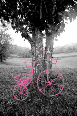
In the photo of the wrought iron bicycle in front of my house (#1), for example, the magenta color stands out in a very dramatic way in the black and white environment. Your eye goes right to the bike, and even though you glance around the frame to see the distant landscape, your attention is pulled back to the subject very quickly.
All Photos © 2010, Jim Zuckerman, All Rights Reserved
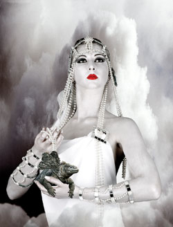
The model in (#2) was originally composited with the background (which is smoke from a fire) and the land iguana from the Galapagos Islands (with the added wings) in color. To keep the lipstick red while altering the rest of the picture, I used Photoshop CS4 to select the lips with the Magic Wand tool, I feathered the edge one pixel, and then I chose Select>Inverse from the pull down menu. This caused the entire photo to be selected except the model’s lips.
Another option in Photoshop CS3 and CS4 is to go to Image>Adjustments>Black and White. Here you can simply move slider bars to alter the contrast until it looks better. This is very fast and easy to do, and I use this method all the time.
In addition to selecting an area of a photo to render black and white, you can also put two or more images together using Photoshop’s cut and paste technique. The 1950 custom Ford in (#3) was composited with the architectural background. I had to first select the car with precision, and then I cut and pasted it against the background, which I converted to black and white. To add a little intrigue, I used the Photoshop plug-in Flood (www.flamingpear.com) for the reflection. The ultra modern Disney Theater in Los Angeles contrasts sharply with the classic lines of the custom car.

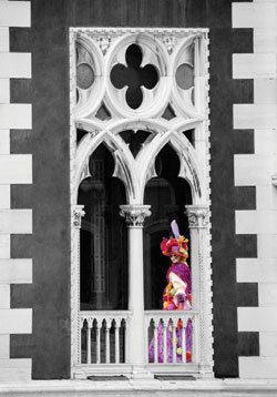
When I travel, I shoot a lot of backgrounds for later use in putting photos together. While on a boat taxi in Venice, Italy, I shot the beautiful and classic Venetian arches on the façade of a medieval palace (#4), and then from the many costumed models I had photographed around San Marco Square, I selected one that was standing in the perfect pose. I selected the person and pasted the image into one of the arches, and then by making the architecture black and white I dramatically forced all of the attention on the subject.
I used a different approach to working in this technique with the flower (#5) juxtaposed with the gray background. This is entirely a color image. I used gray art paper as the background, and I painted the stem of the flower and the leaves with silver paint. I laid the flower and one detached petal on the gray paper and used two White Lightning strobes, one placed on either side of the setup, for the lighting.

For landscape work, an interesting technique is to select just the sky and convert it to black and white while the bottom portion of the picture remains in color. I did this to a photo of an arch in the Alabama Hills of California (#6). The sunrise lighting on the landscape caused the golden yellow color, and the contrast with the black and white sky is quite dramatic. You can see the same effect in (#7), a picture taken in Jordan of Hadrian’s Arch built to celebrate the visit of the Roman emperor in 168 A.D.


The key to making these types of images look good is making precise selections (that is, choosing an area to work on and protecting another part from that work). You don’t want to enlarge the photographs on your monitor or as prints and see imperfections. While the Magic Wand tool is very useful in Photoshop for many applications, I use the Pen tool for most of my selections. I work at 300 percent magnification to make sure the selection is precise at the edges of the subject. Only then can you have the confidence that your images will be able to stand up to scrutiny.
I photographed my wife in (#8) using a photoflood for the warm tungsten lighting, and the original color of the background wall was a dark mustard color. I thought it would look interesting if I converted the wall to black and white, and I liked how the colors seem to pop more than they did when the entire picture was color. This is one of the things that a black and white environment does—it makes the colors somehow more commanding. They hold our attention in a way that is different than if the entire image had remained in color.
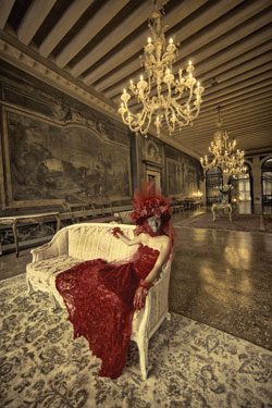
In a different variation on the same theme, I used Nik Silver Efex Pro to convert one of my color shots from a 17th century palace in Venice (#9) into a sepia rendition. This looked good, but I took it one step further. One thing about the Nik filters that’s great is that they alter the original image by creating a layer. Therefore, I had the sepia layer floating above the original color capture, and by altering the opacity in the layers palette I was able to show some of the underlying color through the sepia tone.
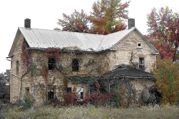
The last two photos (#10 and #11) were done with what can be called hand coloring. When we all shot film, photographers would make black and white prints and apply coloring to the prints with fine brushes or pencils. For many years my favorite color system for doing this was Marshall’s Oils, but now with Photoshop it is easy to apply the color digitally. After the original photo is converted into black and white (or sepia), the Paint Brush in the tools palette can be used to apply any of the 16.7 million colors available from Adobe. I use a lowered opacity in the 10 percent range so I don’t apply too much color at one time and make a mess of things. The creative possibilities are endless—the abandoned home and the portrait of the young Asian girl are two examples, but this only represents the tip of the iceberg.


![]()
Get the Latest Photo Tips, News & Reviews from Shutterbug!
| Camera Reviews Other Reviews | Mobile Reviews Photography Reviews Columns | News | Features | How-To | Resources |
 © 2025 Shutterbug
AVTech Media Americas Inc., USA
All rights reserved