Master Class
Red, Blue, And Green...
My New Approach To Black And White!

It used to be that you bought black and white film, exposed it, took it into the darkroom and spent days upon days selecting the right paper, developer, time, and temperature. Not anymore...at least, not for me! I'm shooting with my Canon EOS 10D and EOS-1Ds cameras and changing color images to black and white on my Mac computer in only minutes. My "film" is a Delkin 640MB CompactFlash card and my "darkroom" is my home office with window shades pulled down. Thanks to my guru Photoshop instructor, Eddie Tapp, I'm enjoying my computers more than I could ever have believed and creating images that years ago I would never have thought possible.

The posing and lighting haven't changed from my color film days. I'm just a little more careful with exposure and white balance. The switchover was exciting, painless, and rewarding. For all of my daylight pictures I had my ISO set for 200. That gave me a little more speed to work with. I've recently begun working with custom white balancing, helping me to get a better color balance right from the get-go. Otherwise, I would have set the white balance for open shade.

Photos © 2003, Monte Zucker, All Right Reserved

All of these photographs were created at my Whitewater, Wisconsin, class at the studio of Michele Gauger, whose open barn door gave us the perfect light source for many of these pictures. Regardless of where the sun appeared, the open side of the building was our light source--covered overhead and wide-open on one side. What more could we ask for?

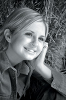
The hay piled up just inside the barn was a natural for casual portraits. This first full-length portrait was created with just the aid of a single Westcott silver reflector placed camera-left to help open up some of the shadows.

The black and white photographs in this story were all created similarly in Photoshop by starting in Channels. I begin by checking out which of the three channels I feel works best for each image. The red channel is usually soft, feminine in its feel, and very forgiving. The blue channel, I find, has more information in it and begins with a little more contrast. I use it for the majority of my black and white images from color beginnings. The green channel I hardly ever use, except when I want my image to have very strong contrast with exceptional strength in the darker areas.

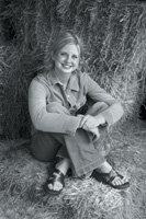
This close-up of the same young lady was created using the red channel.

I chose the red channel because I wanted a soft, flattering image of her face. Once I choose the channel that I feel will be most effective for what I want to achieve, I take the photograph into Image/Adjust/Levels. Working with the three sliders I can adjust the light, middle, and dark tones individually to create the exact contrast I want.

One major problem that I find oftentimes with window light is that the stronger light often is at the bottom part of the subject's body, rather than in the facial area of the portrait. I burned down the lower part of these first two portraits by creating a duplicate layer, darkening that layer by bringing down the lighter end of Curves and then erasing the most important part of the portrait at 100 percent. Finally, at decreasing pressures I erased the areas that I wanted to appear darker in the finished picture. A heck of a lot easier than doing it in the darkroom ever was!

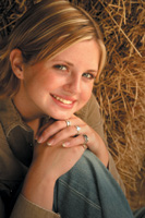
The original color version of this portrait was pretty awesome in itself--just the way it was shot. For some of my close-up portraits I've been bringing the reflector below the subject's face, bringing some fill up from the bottom. See how the light coming up from below her face opens up the color of her eyes. It's similar to when I now put a fill light at the knees of my subjects in a studio environment.

I did burn in her hands, arms, and background slightly to concentrate the viewer's attention on her face.
Here's a shot of the whole setup. I do these with each setup so those attending the class can remember just what the conditions were when each of the portraits was created.

Here you can see just how it all came down. The open side of the barn was a natural choice for a light source. The stacks of hay not only created a great backdrop, but at the same time reflected light back into her shadowed side. You can see the reflector and the white card used for my custom white balance. I can't believe how easy this is and how much fun it is at the same time! Notice that the stronger light is at the lower side of the barn opening. That's why I had to tone down the bottom of each of the portraits.

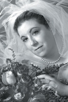
One of the best reasons for taking the color out of portraits is to eliminate distracting color areas that vie for attention with a face.

In this case, for instance, the colored flowers seemed to be too much competition in the photograph when I brought the flowers up so close to her face. It was a natural for a black and white photograph. Again, I selected the red channel, creating a very soft, flattering skin tone for the bride.

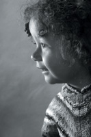
Profile lighting seems to always work well for a black and white conversion from color. The specular highlights, the transition of light to dark, the deep shadows...they all work perfectly. I used the blue channel to change the color to black and white. In this particular case the color of her clothing was also toned down in importance when the color was eliminated, allowing you to concentrate on her face without any distraction.

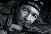
At last, I finally found an image that worked perfectly using the green channel. This biker in his black jacket was the ideal subject for a dramatic transition from color to black and white. All I had to do here to complete the portrait was to tone down the zipper of his sleeve, the mirror in the lower left corner, and his glasses in the upper right corner. I did it the same as before, by darkening the entire picture with Curves and erasing back to the face to retain all the incredible tonal range.

The location for this portrait? The interior of the barn again. Wouldn't you go back to a tried and true location if you knew the light would work for you? I do it all the time.

I also always go back to the original way that Eddie Tapp showed me how to convert color to black and white in Photoshop. I know that there must be countless ways to do everything in Photoshop, but I've found that selecting one of the channels and then converting to gray scale works just fine for me.

So, you see, red, blue, and green are my way to black and white. Try it. You'll like it, too. Black and white photography has never been easier or better--at least for me!

Outdoors, I have found that oftentimes I can easily create a high-key portrait simply by placing Westcott's translucent panel between the light source and the subject. This works best, of course, for a bride in her light gown. I simply turned her profile away from the light source until I created the shadow pattern that I use for all of my portraits. A silver reflector, camera-left, opened up the shadowed side of her face--lightening it beautifully to help with the high-key effect.

What would ordinarily have been splotchy sunlight coming through the tree branches was changed to a beautifully diffused, even light source for this portrait. The sunlight did, however, create incredible shadows on the translucent background. I had seen similar patterns of light and shadow created years ago in studio bridals by holding up tree branches in front of incandescent spotlights.

Again, I selected the red channel--a surprise to me, because I had seldom used the red channel before. Although the bride's flowers were beautifully colored to go with her complexion, the black and white version of this profile also helped to keep the attention on the bride's face.

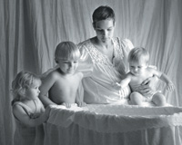
On another day in the Whitewater Experience, Michele, to my dismay, booked an appointment for me to photograph a nine-month pregnant mother of three children (all under 5). The clothing consultation was perfect--they were all wearing white. Michele had a hanging white backdrop near a double glass door. There was no alternative. This is where it all had to happen.

To keep the light coming in from a high angle we blocked the light at the bottom of the doors by standing up some of my sample prints on the floor. I first tried to get a photograph with the kids all seated around their mother on the floor. Ha! What a joke! You try photographing a bunch of kids like that with a ready-to-pop mom and see if you can get all the kids looking at the same place at the same time. It just wasn't going to happen!

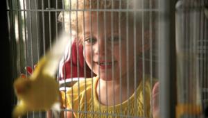
Finally, in desperation Michele brought out a bassinet and threw a stuffed animal into it. The attention was there for only a split second and I caught it. I can't believe it!

I call the photograph "Anticipation." The children's brother was born two days later. Once more I used the red channel to convert the photograph to black and white. Calm, soft, and delicate was the mood I wanted to create in this black and white image. Actually, the color was almost a disruption to the picture.

I did set each of the children in position to be facing toward the light. That much of it was planned. What I hadn't planned, however, was the fact that I caught all three of their faces perfectly--mom's, too. There they all are: profile, 2/3, and full face--and then almost a 2/3 of the baby. Just look at the outline of that profile against the dark background of her brother's arm. Talk about luck.

X