Master Class
Digital Isn't For Everyone
...But It Sure Can Do Wonders

Photos © 2003, Hal Zimmerman, All Rights Reserved

There are still some people who feel that digital will never have the quality of film. They also think that anyone can take a snapshot and make something out of it in digital. They say, "But it's not the real thing! I'll never go that route!" Well, I'm not setting out to prove or disprove anyone's beliefs. I'm just here to tell you that it doesn't take an expert to produce great images digitally. Of course, it sure does help to know what you're doing. It also helps to have the right tools at hand--and a great deal of curiosity!

Instant Review
Seeing is believing. Here, for instance, are a couple of shots that my friend, Hal Zimmerman, made recently for his graduate school portfolio in art class. The only tips that I gave him for his assignment were to isolate and simplify. Use backlighting and sidelighting to create dimension. Stop down the lens when you want depth of field and open up the lens all the way when you want a shallow depth of field.

He used a Canon EOS D60 with a 640MB Delkin eFilm Pro CompactFlash card. A 24-70mm lens wide-open at f/2.8 provided the shallow depth of field for his flower series. As we viewed his images on the back of the camera I pointed out how he could focus in on one section of a flower using the macro aspect of the lens. Then, he simply needed to move the camera in and out until what he wanted to be his focal point was completely sharp. Anything just slightly farther or closer away would go soft. Seeing what he was doing with each snap of the shutter allowed him to come up with these incredible results.


Photos © 2003, Monte Zucker, All Rights Reserved

Enhance The Image
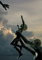
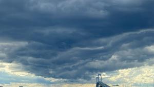
Later at the Holocaust Memorial in Miami Beach, Hal got down on his back and isolated a small section of the bronze statue, photographing the mother's hand reaching out for her baby. The sky, however, was colorless when he exposed for the figures. Remembering the sky that I placed behind the statue a year ago, I pulled the file from my computer and used it again for the background of Hal's picture.

In Photoshop I showed Hal how to eliminate the original sky by making a duplicate layer of the entire photograph in Photoshop. Then, going to Select/Color Range, he selected the entire sky background. Holding down the shift key he was able to add the spaces between the arms and legs. With the entire sky then selected he deleted the sky and simply moved the figures on top of the sky that I had stored away in my computer.
Could these images have been created using a film-based camera? Possibly, but they would have taken a lot more time and work.

Digital Partners
To be sure digital is fun and exciting, but you have to be really careful. For most of us we make the money when we're behind the camera and when we're selling--not when we're behind the computer. Now is the time to get yourself together with a lab that's outputting consistently high quality work. I recently found it when I hooked up with Buckeye Color Lab (www.buckeyecolor.com). They're able to print from images sent to them online or on a CD. They have a couple of different systems with which you can order your prints. With them I can still make all the creative decisions and let them do the printing for me. They'll even make reprints at no charge if they mess up!

I've also joined up with Eventpix.com for online orders from clients. When I combined Eventpix with Buckeye I knew that I had it all together. What a great combination for the digital era!

Digital Control With Family Photos
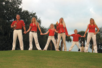
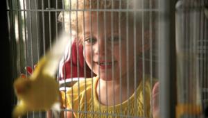
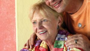
It's not only the digital cameras that are making our lives more exciting than ever before, but it's also the digital peripherals that go along with them. These family photographs, for instance, were lit with the assistance of a Quantum digital flash together with daylight. I used a Quantum digital TTL control in the hot shoe of my Canon EOS 10D and selected exactly how I wanted the flash to output in relation to the ambient light. For this first picture all I had to do was to set the control to one f/stop under the ambient light. It was cloudy-bright. The flash opened up the faces without appearing too obvious.
Later, I got detail in the washed-out sky by selecting it with Select/Color Range in Photoshop and then adjusting the sky in Levels. The standing family group was selected by the Cuza family for this year's holiday card, because it showed how the children had grown. It also showed their oldest and newest dogs along with one of their lovebirds. The family group was the result of another digital control of my Quantum flash.

I posed the Wood family under cover, with daylight coming in from my right, split-lighting their faces. I took the reflector off my flash, placed the bare-bulb flash off-camera with the aid of a Quantum extension cord and set the flash to two f/stops under the ambient light (preserving the look of natural light). I set my 28-135mm image stabilized Canon lens on aperture priority and shot away, knowing that the through the lens metering compatibility of the flash system with my digital Canon camera would do everything for me perfectly--much better than I could have ever done with an exposure meter.

The wraparound lighting of daylight combined with the digital flash simply can't be beat. By the way, I'm using a Quantum battery that powers both my camera and the flash at the same time. Of course, I guess that one could accomplish a similar result with film and flash bulbs, but do you use clear or blue bulbs in an instance like this? And how the heck do you measure that flash to be this accurate?

Digital For Weddings?
Digital and wedding photography is, if you will, a marriage made in heaven! Change the film, the ISO. Change the color balance. You've got the best of everything with only one camera. No need to carry three or four cameras with you on the job--unless you like to carry the extra load.

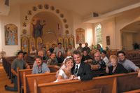
The bride in church was so easy to capture. I set the ISO to 400 and let the camera select the exposure for the church. Then, I set the camera to Manual, using the exact exposure that the camera had figured out by itself. Finally, I added two Quantum flashes. The main light, camera left and slightly above her eye level, was set to equal the f/stop of the lens. With Quantum's extension cord I was able to position the light at a 45Þ angle to the camera to achieve my regular modified loop light on the bride's face. The light was tipped slightly upward to brighten the top part of her body slightly more than the bottom of the dress. Camera height was at her shoulders, so that I could keep the camera perpendicular to the floor and avoid distortion.

With the aid of the Quantum FreeWire accessory a second flash was triggered behind the bride to backlight her veil. The veil light was set at its lowest setting, keeping great detail in the highlighted veil. In Photoshop I eliminated the ceiling lights and air vents. What a difference!
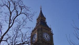
The picture of the bride and groom models, Toby and Charlie, came about as a result of my seeing the window light on them as they were resting between "takes." I simply added my class in behind them, letting the natural falloff of the window light spotlight them in the group.

As a finishing touch when I was preparing this story for publication, I once again removed the ceiling lights and air vents. The final touch was digitally removing the books on the back of the pews.

For both of these pictures in the church I used a Canon 17-35mm wide angle lens. This allowed me to keep the main subjects prominent in the photographs by bringing the camera within 6-8 ft of them. The wide angle lens opened up the width and depth of the background beautifully.

Bride At The Beach
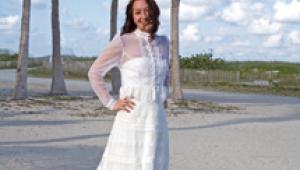
The back profile of Toby at sunset on the beach was the result of still more digital techniques. I used my 28-135mm image stabilized Canon lens for this one to isolate her in the scene and keep the background to just what was behind her. The pose was set up by my favorite local, award-winning photographer, Al Gordon.

One of the photographers in my class held a flash out in the water at profile position. I wasn't sure of exactly how much flash to use or how to expose the photograph. From past experience I had in mind to set the flash to be approximately one f/stop over the ambient light. I did a few test shots and determined on the camera's monitor that two f/stops over the ambient light would give us a more dramatic effect, spotlighting her and intensifying the color of the sky.

Some of the finishing touches were done in Photoshop. I shaped her bust line slightly, and eliminated the birds flying in the background (they looked like dust spots). I also removed the shadow from the flash on the beach behind her. The finishing touch here was to add a clear layer over the final picture, set the mode of the layer to Overlay, pick a warm tone from the sky, and fill the clear layer at 10 percent opacity. It took the blue from the flash and warmed it up to match the tone of the rest of the image.

Get Close
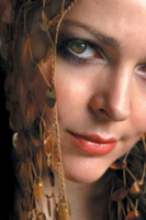
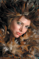
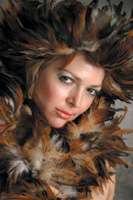
Oftentimes I'm amazed, myself, at the clarity I get with my digital cameras. Take a look at these close-ups. If I didn't do a little Gaussian Blur on her face, you'd be able to see every pore on her face. You can see every single eyelash!

Just for fun I zoomed in close with my 24-70mm Canon lens to photograph only 1/2 of her face. You're seeing the picture just as it was cropped in the camera. I tried a few different crops, but felt that this partial second eye added a little mystery to it all.

When I looked at it on my computer screen I noticed that her brown eyes were so dark, you could hardly see the detail in them. Within seconds I was able to dodge the mid tones for a much more pleasant result. The feathered look was accomplished with an inexpensive feather boa wrapped around her face. I used an Elinchrom wind machine to blow the feathers, so that they would frame her face rather than come onto it.

I loved the results, but didn't like the empty spaces in the lower right corner. It was so simple to clone some feathers to fill the area for my final picture.

But that wasn't enough for my new associate, Gabriel Dumont. He started playing with it in Photoshop, trying several special effects. He began with Filter/Distort/Pinch. The effect was stunning!

Then, I joined him for fun and games in Photoshop. Let the excitement begin! We first added texture to the entire image by going Filter/Texture/Grain and Craquelure. We followed that with Filter/Distort/Glass. The effect was interesting, but the face seemed lost with all the textures added. I then cut the face out from the untouched original picture and moved it on top of the newly-worked image. That looked too "cutout." By changing the opacity of the face to 25 percent some of the original textured face began to show through.

To see where we were I enlarged the image to 100 percent. When I did that the picture cropped in to just a portion of the picture. I loved it. I cropped it just as it was on the screen.

X