Master Class
A Shared Experience; Photo & Digital Arts Go Hand In Hand
Eddie Tapp, my personal Photoshop guru/teacher, and I joined together to teach
portraiture and wedding photography in Hollywood, Florida, for our first annual
class. I've been studying Photoshop with Eddie for years, but had never
taught a class with him. We went from concept to completion. We did it all...created
images, put them through a production routine, and finished by creating wall-sized
portraits. Eddie showed us how to create a profile for printers, so that what
we see on our computer screen is what we get on the finished print.
Although Eddie had lots of his own Photoshop Actions to share with us, he still
showed us lots of the built-ins that are a part of CS2. Eddie had 30-day trial
updates for us to load into our laptops, so we could all be on the same page.
Eddie and I both used the GretagMacbeth Eye-One XT color calibrator on our projectors,
so that what we had on our computers was exactly what people were looking at
on the screen. I saw Eddie using it last year and got one for myself. Now, there
are no more excuses for the screen not showing exactly what's on your
computer screen. What a boon for photographers who are selling from projected
digital files rather than from paper proofs.
All of my portraits were created with my 1, 2, 3 style. That is...
1) A similar light pattern for everyone (light in both eyes--coming from
slightly above the eye level of the subject, a shadow on the side of the nose,
and a small loop shadow coming down slightly to the side of the tip of the nose).
2) Two poses (Basic and Feminine).
3) Three camera positions (Full Face, 2/3, and Profile). We had models throughout
the week. Everyone also photographed each class participant. Every day the photographers
had to create a portrait of a classmate, so that we all could see the improvement
from day to day.
Full Color Or Sepia
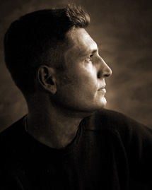
Alex, one of the photographers attending the class, posed for me on the first
day of the class. This profile was created with my Canon EOS 5D using three
Westcott Spiderlites and a 1GB Delkin memory card. I placed one light in Profile
position, the second as a fill light (toward the front of his face), and the
third behind him to light the background. This shot was made in RGB and finished
in sepia.
 |
 |
|
|
||
Color And Glow
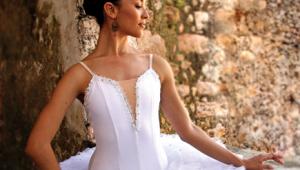
The Profile bridal portrait of Toby, one of my favorite models, was created
with five Photogenic lights. Four of the lights came out of a single power pack,
the light heads are so small and lightweight they fit easily into softboxes
that can be put on boom arm stands. I had a main light, a hairlight (both on
boom arms), a veil light behind her, and a background light. A fifth light came
out of a second power pack that I also use for a backup.
Even though her veil was backlit, it still had a blue cast to it. No problem.
Eddie showed us how we could select the veil and go Image/Adjust/Hue & Saturation.
Instead of desaturating all the color, we changed "Master" (at the
top of the box) to "Blue" and removed the blue totally from her
veil.
Eddie retouched the picture and enhanced it even more by adding his own "glow"
to her portrait. He vignetted the portrait by adding his "cookie-cutter"
lighting around the edges of the picture. To do that he made a Levels adjustment
layer and then darkened the entire image by pulling down the highlight side
of the line.
 |
Lighting Setup
Here's a shot of the picture being taken. Notice the placement of the
reflector--always in front of the subject's face. The reflector is
silver on the front, black on the back. The silver side helps to wrap the light
around onto the shadowed side
of the face. The black side of the reflector blocks the main light from flaring
into my lens. The two lenses that I use primarily for my portraits are Canon's
28-135mm IS lens and Canon's 24-70mm.
 |
Lighting, Natural Or Artificial?
Whether photographing by window light, or using flash or fluorescent, the posing
and lighting were the same. I created a portrait of Judy, another one of the
photographers/ students, by window light. I showed everyone how I could create
the same effect with natural light as I did with two main lights in a studio
environment. I did it by lighting just the left side of her face with the light
from the window and then placing a reflector camera right...directing it
toward the open window and then bouncing it back onto the right side of her
face. Later, I toned down her hands and camera using Eddie's method with
the adjustment layer. Without that subtlety her hands and camera would have
been much too prominent.
Another thing that I learned from Eddie that week that was a major breakthrough
for me was how to lighten or darken a small area of a photograph without affecting
the color. To do this you change the mode of the picture from RGB Color to Lab
Color. Then, go to Channels. You'll see that one of the Channels is called
Lightness. If you click on that Channel you get a black and white image on which
you can burn and dodge to darken or lighten an area without affecting the color
at all. When you're finished working in that Channel you go back to RGB
Color, of course.
- Log in or register to post comments

