Make It Move!
Create Digital Strobe Effects
What is a strobe effect?
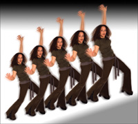
In a true stroboscopic photograph, multiple images of a moving model
are repeated as this special kind of flash fires multiple times, creating
dramatic and dynamic movement. You can add to the impact of this effect
with virtually any subject, if you do it digitally. In the studio with
a real strobe, you have to make lots of tests and proceed by trial and
error. Working on your desktop, on the other hand, with Adobe Elements,
Photoshop, or other image editors, you can see exactly what you're
getting as you create it. |
|||
Open your original photo and duplicate it. Choose Image>Duplicate from the menu bar. Close your original, save it, and work on the duplicate. This way, if you don't like the results at any stage, you can go back to your original, make a new duplicate and start again. Isolate From The
Background |
|||
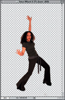
In Photoshop, to select the model rather than the background, I chose Select>Inverse. Then, I pressed Command-J (Control-J for Windows) on the keyboard to place Tanya, now cut out of the background, on her own layer with a transparent background, #2. Increase Canvas Size
|
|||
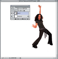
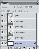
Both this new background and the single image of Tanya on a transparent background are now open on the desktop. Click on the Move tool, go to the image of Tanya, and click and drag it onto the new large white background. In the Layers palette of the new bigger background, the single image of Tanya will appear as Layer 1, above the white background on the bottom, #3. Go back to the original image of Tanya and close it. Now the fun begins. Copy Tanya by going to the Layers palette and dragging Layer 1 to the New Layer icon at the bottom of the palette, immediately to the left of the palette trash can. A new layer, a copy of Tanya on the transparent background, will be generated. Named Layer 1 copy, it appears above Layer 1 in the Layers palette. In the image window, you can't see the two layers because they're exactly on top of each other. Move the new layer behind the first image of Tanya by dragging it (Layer 1 copy) below Layer 1 in the palette. |
|||
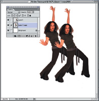
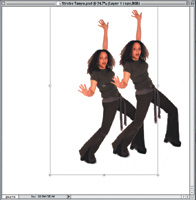
Next, click on the Move tool and then take the cursor over the image of the model in the window. Click on Tanya and drag to the left. Voila! The second Tanya (Layer 1 copy) emerges behind the first, #4. Create A Dynamic Effect
|
|||
Now, using the Layer 1 copy (the second image of Tanya) as a starting point, drag it to the New Layer icon in the Layers palette, and repeat the steps above, making it slightly smaller still with the Transform tool. This third image of the model will be labeled Layer 1 copy 2. Remember that in the Layers palette, you have to drag it below the Layer 1 copy so that it will appear behind the other Tanyas. Again, click on the Move tool and pull this new layer out from behind the others, and then apply the Transform tool. You can repeat these steps to create as many multiple images as you like. Play With The Background
|
|||
I tweaked the final composite
even further by adding motion blur to each image of the model. This is
optional, but it does enhance the illusion that this is a real strobe-blur
photograph. To add the blur, I started with the top layer, duplicated
it, dragged the copy behind the original (all as described earlier). Then
I chose Filter>Blur> Motion Blur to blur the copy and adjusted the
angle and distance to suit my taste. I repeated this with each of the
sharp images of the model. When you're ready to print, make a copy
and flatten it. This will drastically reduce the file size. eContact |
- Log in or register to post comments

