- REVIEWS
Camera Reviews 
More Reviews Mobile Reviews Photography Reviews - GALLERIES
- VIDEOS
- BUYER'S GUIDES
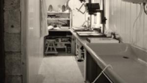
The Darkroom
Making Prints From Slides
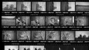
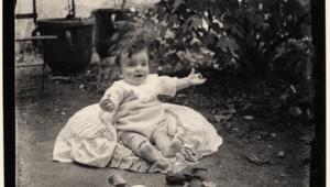
| There are two methods of making prints from slides. One uses the paper and chemicals manufactured only by Ilford and known as Ilfochrome. The other uses paper and chemicals made by many different companies and referred to as Type R color positive paper and R-3000 chemistry. Due to space limitations, this article will deal only with the latter method. Window Of Performance. All chemical systems have a window of performance in which time and temperature can be traded-off for near equal performance. The R-3000 Process (used for all brands of Type R color positive papers) has a large window of performance. This allows you to select from a broad range of processing temperatures and times. Calibration Slides. They are used to calibrate positive emulsions such as slide duping film and slide printing papers. If you learn how to use a calibration slide it will save you time and materials. You can purchase one, or make one of your own. A calibration slide should have several elements to its image: 1. A good shade of delicate, highlight, neutral gray. This should be considerably lighter in tone than a conventional 18 percent gray. If you are looking for the presence of a slight off-color condition in a print made from the slide it will be easiest to see it in such a light color. A darker shade, such as 18 percent gray, would mask a delicate color error. 2. Some delicate highlight detail that can just barely be seen. If the contrast of a print made from such a slide is excessively high, these highlights will be washed out. This will confirm the overly high contrast of the print. 3. Some rich, dark shadow detail that can just barely be seen. If the contrast of a print made from such a slide is too high these dark shadows will be blocked up to a solid black, confirming the excessively high contrast of the print. 4. A human face or figure with normal skin tones. This element of the image will help you to judge the overall correct density level that the print should have. Establishing this is very important, and difficult to do. If the human face or figure appears to have the correct overall density level in the print, then, proceed at that density and evaluate the rich shadow tones and the delicate highlight tones mentioned earlier. 5. Color patches, and other things commonly seen in calibration images are of very little use. Color balance should always be set based on establishing neutral gray. Once that has been accomplished, then all the other colors simply fall into place. It is not possible to accurately establish the color balance of a print by looking at one specific area, such as skin tone, the sky or the color of the grass. These are all nice things to look at but, they should be used only as a last resort when a neutral gray does not exist. When using them to judge the image's color balance, you will only be able to establish a subjective, pleasing, look in the image that may or may not be the correct color balance. Type R Chemicals. There are two general types of chemicals for making prints from slides. One is referred to as Type R, and the other is Type R-3000. Both are Kodak terms, but all manufacturers make one version or the other. Type R chemicals are generally aimed at the large professional lab market, and are only sold in relatively large volumes. It requires a white-light reversal after the first developer. Type R-3000 is generally
aimed at the amateur market. It is packaged in smaller volumes than
Type R. Type R-3000 chemicals produce its reversal action through the
use of a special additive in the color developer, thus not requiring
a white-light reversal. Many different companies make chemicals that
can be used for processing prints made from slides onto Type R paper.
The first developer and color developer time and temperature are always different for each other. Thus, if a roller transport processor is used, the chemical tanks must have the capability of holding different temperatures, since the processing time in each tank will have to be constant in any roller transport processor. With slot or rotary drum processors, you can use a common temperature for all the chemical steps and simply select different times for the various chemical steps. Using A Dichroic Enlarger. When printing with a dichroic color head, it will be easy for you to keep the exposure time constant and make all of your density changes with the lens f/stop. This will eliminate the reciprocity problems. However, you may sometimes have to make density changes by adjusting the exposure time. Under those circumstances, remember that as the exposure time increases, you will need to increase the yellow filtration and the total exposure (time or f/stop) to deal with reciprocity failure. Positive Printing And Color Analyzers. When printing slides, I rarely use a color analyzer. The problem is that each slide tends to have a slightly different overall density level. A color analyzer will want to make the density of your print look exactly like the density for which the program was written. This may or may not be the correct level for the particular slide that you are trying to print. Therefore, a program created with a given slide, may or may not work with another one. Techniques Of Printing Slides. When I open a new box of positive paper, I use a calibration slide and perform a series of color balance ring-around tests until I have identified the correct color balance and density settings for the calibration slide. I then mark those settings on the box of paper. After that, whenever I want to print a slide, I evaluate it, by asking myself if it is darker or lighter than the calibration slide. I then make a series of four density step tests (wallet-size) along one side of an 8x10 sheet. On the other edge of the sheet, I can make four density tests of another slide. I make the density steps in 1/2 f/stop increments, bracketed around the settings that I know work for the calibration slide, and biased by whether or not I think it is darker or lighter than the calibration slide. Thus, I can test two slides on one sheet of 8x10 paper. The density tests provide me with two things. First, they allow me to zero in on the correct density level. Even if one of the four test images isn't correct, the chances are good that the next step (that I didn't make) would have been correct. Thus, I can extrapolate from the four test images. Second, the density test images allow me to re-evaluate the color balance settings. Frequently, a given slide will differ from the calibration slide just a little. This is due to: 1) a different brand of slide film, 2) slight aging, resulting in a touch of fading, 3) slight reciprocity failure causing a color shift, etc. I rarely find that the color balance differences are more then 4-6cc of color. I can easily look at the density tests and guess how much to tweak the color balance settings without the need for further ring-around testing. However, if you are printing a very critical image, it is sometimes necessary to do another ring-around test for that particular slide. Reciprocity Failure. This is a term given to the condition in which the production print has a shift in color balance and/or density level from that of the test print. Reciprocity failure is highly noticeable, and seems to cause the most problems, when printing slides as opposed to color negatives. Noticeable reciprocity failure occurs whenever there is more than about a 25 percent change in the exposure time for a print. Color Balancing. This is the act of modifying and selecting the correct color of light used to make an exposure onto a photographic emulsion. In the case of printing color transparencies onto color positive paper, the exact color of light that is needed depends on several variables. Each different emulsion batch of color printing paper has its own unique personality and will require its own special color of light. In recent years, paper manufacturers have been able to produce paper batches that are much more consistent than they used to be. Today, most emulsion batches will vary only about 3-6ccs of color. Another variable in color printing is the original image itself. In the case of slide film, different brands all have their unique personality. While slides from several different brands of film might all look very nice, each brand will need slightly different enlarger settings in order to be printed with an optimum color balance. That is because each brand of slide film passes or absorbs slightly different wavelengths of color that the paper is more sensitive to than our eyes are. I have always found color balancing prints from slides is much more difficult than prints from color negatives. I suggest that people learn how to print color negatives first, then move on to the more difficult task of printing slides. When color balancing a color negative, the visual appearance of the image responds fairly consistently to a given increment of filtration change as you approach the point of balance. However, when working with a slide, the visual appearance of the image does not respond consistently to a given increment of filtration change as you approach the point of balance. The lack of consistent response is largely responsible for the difficulty in learning and performing color balance when printing slides. This same condition exists with regards to making density changes in a printed image. With color positive papers, you will need to make fairly large increments of density change--1/2 to 1 f/stop--when you are establishing the correct density level at which to make a given print. When attempting to establish the proper color filtration settings, you should concern yourself only with the appearance of something in the image that should be neutral (gray) in color. It is a totally useless exercise to try to establish color balance--positive or negative--by attempting to judge the quality of an object in the image such as a skin tone, the sky, the grass, etc. At the very best, you'll only be able to get within 15-20cc of being correct. The 18 percent gray card is used as a color balancing standard because gray is simply a darker (denser) version of white which is a near equal mixture of all the colors. If an object in the image that is supposed to be gray is correctly set and is indeed, gray, then all the other colors in the image will be rendered to their optimum levels. That is referred to as color balancing on 18 percent gray, which is the official way to do things. In actual practice, I find that a neutral 18 percent gray object is a tad too dark to allow me to accurately judge precise color balance. I much prefer to identify a lighter shade. Since most of you already know what an 18 percent gray card looks like, try to imagine a shade that is about half-way between that and actual white--a light shade of gray. Such a color might occur in the wrinkles of a white shirt. Since white appears in many of the pictures that we take, it is a good color to use for your visual judgments. However, because things that are white--like shirts--sometimes appear with very little gray wrinkles for use in judging color, it might be necessary to temporarily increase the density of the image in order to darken the white object and make it a little easier to see a subtle shade of gray. By intentionally adjusting the density of the image to a darker than normal level, it might make it easier to visualize a subtle amount of erroneous color. Such subtle amounts of color (2-3cc) would be hard to detect in something as light as white, or as dark as 18 percent gray. Of course, once the correct color filtration is established, then the density of the image can be adjusted back to its correct level. Conversely, if the entire image is low-key, and filled with lots of dark, shadow tones, then it might be necessary to intentionally print the image 2-3 f/stops lighter than normal in order to create a shade of gray that will be light enough to allow you to see the presence of a subtle amount of erroneous color. Again, once the correct filtration is determined, the density of the image can be adjusted to its correct level. If you'd like more help with making prints from slides, or if you'd like information on working with the new, digital imaging, darkroom tools, you can send your questions via e-mail to me at: editorial@shutterbug.net or write to me care of Shutterbug. Tips For Printing |


![]()
Get the Latest Photo Tips, News & Reviews from Shutterbug!
| Camera Reviews Other Reviews | Mobile Reviews Photography Reviews Columns | News | Features | How-To | Resources |
 © 2025 Shutterbug
AVTech Media Americas Inc., USA
All rights reserved