- REVIEWS
Camera Reviews 
More Reviews Mobile Reviews Photography Reviews - GALLERIES
- VIDEOS
- BUYER'S GUIDES
Color Play
Image editing programs have near limitless color controls, with changes that can be as subtle as altering the red of a rose to contain a touch more yellow to completely changing the color red in that rose to yellow, orange or any other color in the spectrum. In this lesson we'll look at a few basic color correction and altering processes that are available in nearly every image editing program. Here we'll use Adobe Photoshop and Adobe Elements.
Boosting Saturation
Saturation is a description of the vividness of a certain color. Think of high
saturation as being what a freshly painted wall would look like and low saturation
being that same wall after years of being exposed to sunlight. Some might call
the difference similar to the effect of acrylic and oil paint, or between "wet
paint" and how that paint looks when dry. Saturation is usually a matter
of color contrast, with high saturation showing more contrast, rather than a
change in hue.
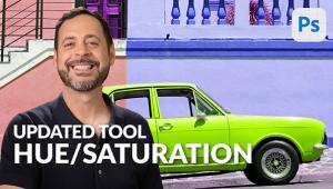
This boot is "very red" in and of itself, but, as with much of digital imaging, I can't leave well enough alone. We could raise the saturation by adjusting brightness and contrast, but that would elevate the saturation of the entire image, not our aim. Instead we want to just boost the red.

We can do this because color images are composed of three "channels"--red, green and blue. We can select one of the channels and work on it individually. Here we do it by choosing a tool called "Hue/Saturation" and selecting just the red channel for adjustment. Note that we have selected "red" in the upper slot of the toolbar, with the default being "Master."

To enhance the red I just slid over the Hue slider to taste.

Desaturation
Sometimes you might want to lower the color saturation of an image. This can
come in handy for color shots where you want to alter the mood or when you want
just a touch of color within a scene. Here is a shot of some skeins of wool
made in an outdoor market. The colors are quite rich and usually I'd make
this a final right out of the camera.

For our purposes here, however, let's back the color vividness off a bit using the same Hue/Saturation tool. As you can see, it's just a matter of sliding the saturation slider to the left.

Notice also that because I wanted to desaturate the entire scene I left the top panel on the default "Master."

Color Variations
If you're not sure just how you want the color to look and want to experiment
you could play with the Hue/Saturation sliders all day long. An easier way is
to use a tool called Variations (in Photoshop) or Color Variations (in Elements.)
This may go under other names in other image editing programs. Variations can
be used to look at different hue, saturation and even contrast possibilities
in an image. The tool has so many options that just about any interpretation
of an image is possible.
Here's a photograph at sunset made in Glacier National Park in Montana. The sky is fairly dramatic, but I wanted to look at some other options.

To do so I opened the Color Variations tool in Elements. This tool displays a number of variants as well as a handy before and after split screen of the image. All you need do is click on the variation that interests you and the program applies the necessary changes. It's fast, quick and easy.

Here's the final image, or should I say one option that seemed to work.

Color Cast
A color cast can result from a number of factors--not setting the white
balance correctly, the dominance of a light source or the inability of the film
or sensor to "see" the color as your eye saw them when you made
the picture. This shot was made on a bright sunny day, but the subject sat in
the shade of an overhanging cliff. The digital camera was set on auto white
balance and failed to counterbalance the strong influence of the shade.

There are a number of ways to correct this, but out method here will be working with channels to overcome the predominance of blue. We could do this using the Hue/Saturation tool and working in the blue channel, but let's try another tool here, Curves. Some programs do not offer this option; that's why I mention the Hue/Saturation option.
When you open the Curve on an image you can change the contrast in the scene by manipulating the shape of the curve. You can also do some control play as well. Here, with the Curve tool open I have selected the blue channel. To "drop" some of the blue all I need to do is pull down the curve until I get as much blue out of the picture as I want.

The result, while not entirely rid of the blue cast, does give a much truer representation of the scene as I saw it when I made the picture. I did not want to completely eliminate the blue light, as that is part of the character of the scene; rather I wanted to get rid of the overwhelming blue cast, which this technique does handily.

As you can see, there are many ways to play with color. As you delve deeper into your image editing program you'll find your own favorite tools and techniques. There are so many options that each of us can find our personal way of working and still get it right.
- Log in or register to post comments


![]()
Get the Latest Photo Tips, News & Reviews from Shutterbug!
| Camera Reviews Other Reviews | Mobile Reviews Photography Reviews Columns | News | Features | How-To | Resources |
 © 2025 Shutterbug
AVTech Media Americas Inc., USA
All rights reserved