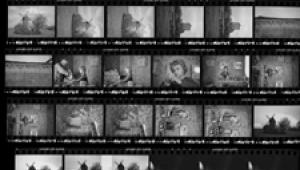
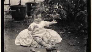
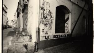
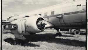
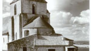
These are an amazing example of a good work on the black-and-whites. The pics look really fascinating and beautiful.
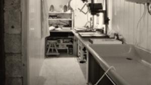
The Darkroom
Working With Imperfection
The easy way to make a great print is to start out with a great negative. In theory, it's not that difficult to learn to make great negatives. Each film you shoot and process, you learn a little more about how to get closer to the perfect negative. But there are two large, active flies in this particular ointment. One is that you don't want to throw away all your old negatives and wait for the perfect one, and the other is that you don't always get it right. The result is that there are always plenty of less-than-perfect negatives that need printing.
 |
|
|
This is not entirely bad news, because the best way to learn to print is from
a mixture of good and bad negatives. Even a novice printer should be able to
get a good print from a good negative, but it takes experience (or luck) to
get a good print from a bad negative. Given the unpredictable nature of luck,
it's probably easier to concentrate on gaining experience as a printer,
rather than going out looking for four-leaf clovers.
In other words, you don't want to learn to print only from good negatives;
on the other hand, you want at least some good negatives to keep you encouraged.
The first thing to realize is that the examples of good and bad negatives and
printing that you see in books and magazines are always exaggerated. They have
to be. Photomechanical reproduction is very much less subtle than silver halide
printing, with a shorter tonal range and less differentiation in both the highlights
and the shadows. This is why there is no substitute for making your own prints,
and then remaking them, until they are as good as they can possibly be.
 |
|
|
The prints that reproduce best are fortunately the ones that are also easiest
to make: all the detail and subtlety is in the mid tones, without subtle highlights
and shadows. You can soon learn to recognize this in negatives, once you realize
that this is what you are looking for. The best idea, therefore, is to select
a few of these as your "good" negatives.
Your "bad" negatives needn't be all bad. Some may be negatives
that you have had problems printing in the past, but others may simply be negatives
that look attractive but rely heavily on highlight or shadow detail: you like
the subject matter and the composition, but you aren't necessarily sure
about how easy they will be to print.
Good Blacks And Whites
The first thing you want in your print, usually, is good blacks and good whites.
Neither need occupy a very large part of the picture area. Some successful pictures,
for that matter, may lack one or the other or both, but it is always easy to
tell when this is deliberate and when it is a failure of technique. At least,
you can tell in your own prints what you wanted, though other photographers
may prefer to make prints that look muddy to you, and your prints may look muddy
or overly contrasty to someone else. It's all a matter of taste. Don't
try to fool yourself, though, that you wanted a particular effect when in your
heart of hearts you know it doesn't work.
Good Mid Tones
Getting both a good black and a good white in a print is almost always easy
if you use the right contrast grade of paper. Too little contrast and you lose
good blacks or whites or both; too much contrast and you have only blacks and
whites, with little or no subtlety in either, and harsh, contrasty mid tones.
Usually, therefore, you want the softest grade of paper that will give you both
pure whites and deep blacks, but no softer. Any softer will give you a muddy
print; any harder will give you "soot and whitewash." A muddy print
is not just one that has no good blacks or whites: it is also one where the
mid tones are inadequately differentiated and blur into cigarette-ash gray,
just as an overly contrasty print differentiates the mid tones too harshly.
- Log in or register to post comments

