I am confused about your image selections of #9 & 10. Neither of these look to be what I consider monochromes since they both have "colors" in them. #9- Blue, red & green and #10- just looks to me like a color image. an I NOT understanding the idea of monochrome?
Monochrome Color: Seeing And Creating
All Photos © 2010, Jim Zuckerman, All Rights Reserved
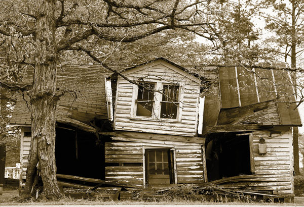
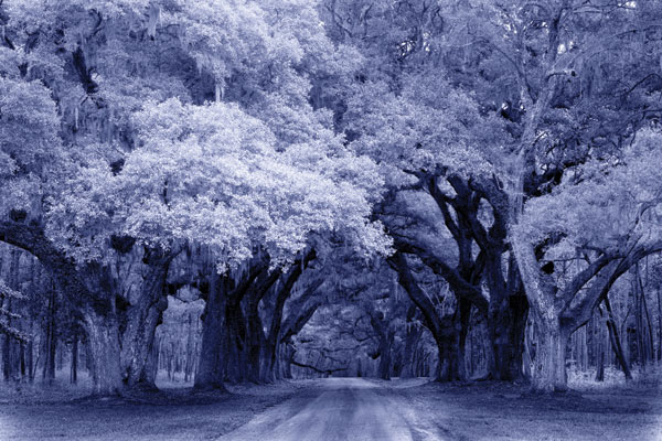
One of the first techniques I learned was sepia toning. When working with paper and chemistry, the number of colors you can get are limited. In Photoshop, there is no limit to the number of colors you have available (well, if you call 16.7 million a limit, then technically there is a ceiling). For example, in the photograph of the mature oaks in South Carolina (#2) I used a blue tone, and then I made the ancient ruins of Angkor Wat in Cambodia a greenish tone (#3).

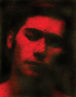
What chemical toning did to a print was combine with the silver and create a new compound that took on the desired color of the toning effect, replacing the neutral silver grayscale. This is different than tinting where the new color replaces the white areas of the image leaving the blacks intact. I used to tint prints with food coloring as you can see in (#4). This is a self-portrait taken in 1968 (I borrowed a friend’s camera and he had to show me how to use it). I used Tri-X black and white film and printed it on matte paper. I accidentally damaged the negative in the darkroom, but I ended up liking the resulting scratches that crisscrossed my face. I printed it on matte paper and then, after fixing it, I soaked the wet print in water and food coloring. You can see that the dark shadow areas are still essentially black while the highlights are red. Compare this effect to (#5), President Andrew Jackson’s home near Nashville, Tennessee, in which the black tones have been replaced with the sepia tones.

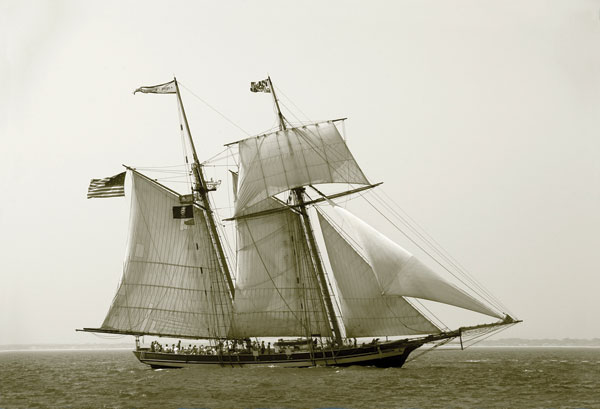
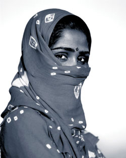
When you “tone” a digital image file in an image-editing program the image remains an RGB file. Another more advanced method is to use Photoshop to create a duotone file, a method that allows you to essentially mix your own toning color. If you convert it to a duotone, it becomes a grayscale image. If the effect you introduce is too saturated for your taste, convert the file back into RGB (Image>Mode>RGB) and then use Image>Adjustments>Hue/Saturation to desaturate the colors. That’s what I did with the shot of the tall ship (#6) and the portrait in India (#7).
Monochrome colors can also be found without any kind of digital manipulation. For example, the old plow I saw in Morocco (#8) was taken with film, and although I added some color saturation to enhance the earth-toned colors of the farm house, there is no other change to what I saw. By contrast, in deep shade the tones are often monochromatically blue. Again with some additional saturation added to exaggerate the color, the weathered wheelbarrow I found in Missouri Town near Kansas City (#9) makes a very simple and artistic image.

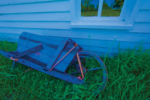
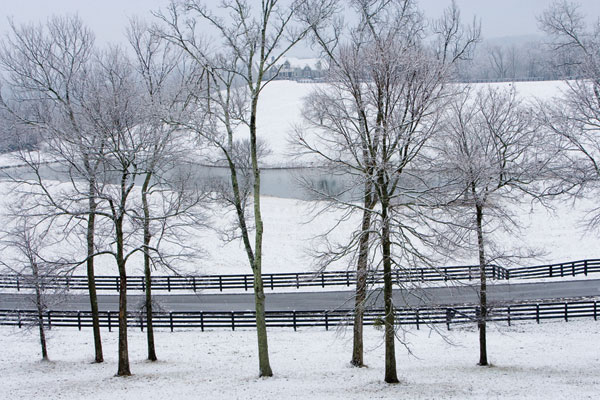
I think the success of both of these images rests on two things—the monochromatic color scheme and the simplicity of design. The same is true for the table and chairs (#10) I shot from a balcony in a restaurant in Mexico. The brown tones and the graphic design of the wrought iron set made this work. When I shoot landscapes in winter (#11), I essentially do something using the same principles. I look for a nice graphic composition, and the monochromatic wintry colors of white and gray are a beautiful backdrop.

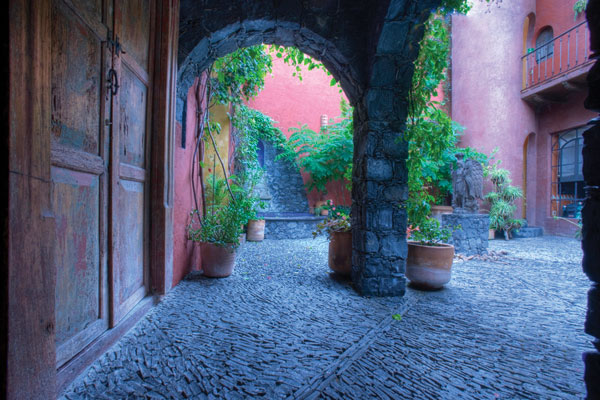
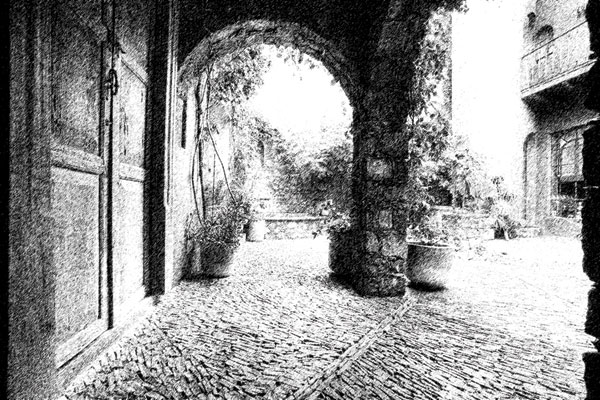
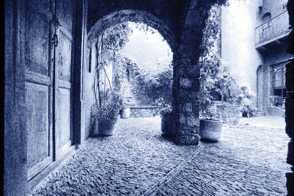
A shot that I took at my niece’s wedding (#12) wasn’t originally monochromatic, but I thought it would look good with only one predominant tone. I used one of the Nik Color Efex Pro filters to do that. Plug-in filters and filters native to Photoshop can artistically embellish many of your images in the same fashion, and when you combine the filter effects back with the original, and then experiment with the Blend modes in the Layers palette, you can produce beautiful images. The Mexican architecture I photographed in San Miguel de Allende is an example. I first opened the original (#13) and then applied Filter>Sketch>Graphic Pen. A textured black and white image resulted (#14), and then I laid the original on top of the black and white version by dragging one photo onto another. This created a layer, and then in the Layers palette I pulled down the submenu (the Blend modes) to Luminosity. I then lowered the opacity of the layer to 50 percent and applied a color tone (#15). In this way, I created a unique texture as well as an artistic monochromatic color.

- Log in or register to post comments


Polarpup, I’m far from a photo expert like Jim, but here’s my feeble effort in trying to address your confusion.
Mono is a prefix which can mean “one”, “alone” or “single”. Monochrome (or monochromatic) can be confusing. Here’s one definition: “A picture, especially a painting, done in different shades of a single color.” Another says: “using only black, white and grey, or using only one color”. The word monochrome in photography, covers a lot of different facets. I would say, that Jim’s use of the word monochrome was to set a theme for his article.
With that in mind, a monochrome photograph can be a straight black and white photo (no toning), or a photo with a single color. Notice the first definition says “…different shades of a single color”. This would somewhat describe picture #10. Jim’s refers to it as “…the monochromatic color scheme.” However, when we get to picture #9 we get into what the word monochrome has been allowed to mean. That is, a photograph with a dominate or predominate color. I guess you could describe picture #9 as having a dominate color of blue, with a green accent color. Jim describes picture #9 as an artistic image. This falls under “creative license” and allows more variation on the “theme”.
I think that one lesson from Jim’s article is the photograph can be a pre-biased monochrome picture (shot as is), or, with the help of programs like Photoshop, it can become a post-biased monochrome picture. To me, photo #10 is a pre-biased “monochrome” picture.
Along with monochrome, you can also have “split toning” where typically you bias the shadows to one color tone, and the highlights to another color tone, and leave the mid-tones alone. Another type is duotone, tri-tone and quad-tone toning. In Photoshop, you can set different shades of gray to a dominate color. With duotone you can pick two shades to color, and of course tri-color three, and quad-color four. You can also “colorize” a monochrome image (in RGB mode). This allows things like a “sepia” tone, blue tone, etc.. Jim covers some of this in his article.
So, I guess one could say that Jim’s article was written in the spirit of monochromaticity.

Thanks for the write up. Ii've been shooting for over 35 years and your first definition is the one I am familiar with. I belong to several camera clubs and they are beginning to take the second meaning as a way of entering images into monochrome competition.
I wish this would have better explained in the article. Thanks for taking the time to explain this new meaning of monochrome.


