- REVIEWS
Camera Reviews 
More Reviews Mobile Reviews Photography Reviews - GALLERIES
- VIDEOS
- BUYER'S GUIDES


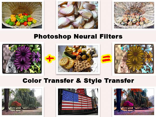
How To Use Your Own Images Instead of Presets With PS Neural Filters Style Transfer & Color Transfer
|
Jan 27, 2023 |
0 comments


Pages
PHOTO OF THE DAY

Today’s photo is Breakaway by Jeff Van Scoyk
eNEWSLETTER SIGNUP
![]()
Get the Latest Photo Tips, News & Reviews from Shutterbug!
| Camera Reviews Other Reviews | Mobile Reviews Photography Reviews Columns | News | Features | How-To | Resources |
 © 2024 Shutterbug
AVTech Media Americas Inc., USA
All rights reserved