- REVIEWS
Camera Reviews 
More Reviews Mobile Reviews Photography Reviews - GALLERIES
- VIDEOS
- BUYER'S GUIDES
A Basic Set Of Color Controls: A Short List Of Options To Help You Quickly And Easily Improve Your Images
All Photos © Anthony Celeste, All Rights Reserved
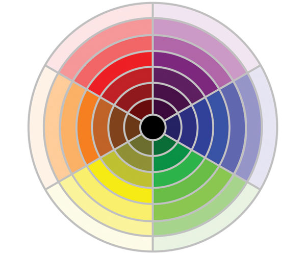
HSL: Hue/Saturation/Lightness
Hue: Hue is the color of an object, be it red, blue, magenta or orange. The Hue slider in your photo-editor, usually part of the HSL (Hue/Saturation/Lightness control), works by rotating colors on the color wheel. If you move the Hue slider a few points in one direction, reds will become orange. If you move the Hue slider a few points in the other direction, reds will become purple. (#2)

Photos (#3) and (#4) provide an example as to how a typical Hue slider works. By moving the Hue slider 15 points to the right, the red gumballs change to orange, and the orange gumballs change to yellow. Moving the Hue slider further would cause even more dramatic changes in the gumball colors. This is what can be called a “global” change in that all the colors in the image are affected.

An example of a practical use of the Hue slider can be found in photos (#5) and (#6). Photo (#5) features a child with a somewhat ruddy (or overly red) face. In this case you just want to affect the red color in the image, not the entire image or the background. Here you would select “red” as the color you want to change and then use the Hue slider to bias the excessive red tones toward yellow tones, which will produce more accurate flesh tones. Of course, the Hue slider must be used in small increments in an example such as this. A certain amount of redness in the face is natural, and further, you don’t want to add so much yellow that this otherwise very healthy face takes on a jaundiced appearance. So, adjustments are best made in small (usually single digit or slow movement) increments (#6).


Saturation
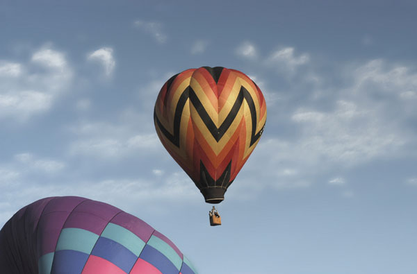
Saturation may be thought of as the purity of any given color. When colors look dull or uninteresting, the Saturation slider can be the perfect tool for restoring richness. Image (#7) presents an example of a photo shot on a somewhat dull day.
The Hues in this image are correct. The blue sky is blue, and the balloons show their original oranges, yellows, blues, purples and pinks. However, the photo is somewhat lifeless. By increasing the Saturation in this image I was able to restore the vibrancy that the camera would have captured if the photo were shot in better lighting conditions (#8).

Lightness
Most Hue/Saturation controls also contain a Lightness slider. The Lightness slider can be useful for making minor changes, such as adding small amounts of brightness to an image, a way of modifying the hue and saturation changes you’ve made.
The Variations Control
Many image-editors have a Variations control, which allows you to see a thumbnail of your image with various color changes applied (typical categories include more red, more yellow, more green, more cyan, more blue and more magenta). Note that the filter varies slightly from one image-editor to another. For example, in Elements, it’s called “Color Variations”; in PhotoImpact, it’s called “Color Balance” (PhotoImpact also has “more cyan”, and “more orange” options).
Since the filter provides multiple thumbnail previews, it can be useful when you’re not sure of exactly what changes your photo needs. It can also be useful when you want to apply a color change across an entire image.
I feel that the photo in (#9) did not quite capture the orange color normally present in a sunrise.

The results of clicking thumbnails in the Variations filter are cumulative, so you don’t have to close and reopen the filter to apply multiple changes. (#10)

The outcome is an image with the exact color changes that I had in mind. The results are achieved very efficiently, thanks to the ability to preview multiple changes from within a single filter. (#11)

The Color Balance Control
The Color Balance control (sometimes called the Color Adjustment control) is similar to the White Balance controls in your camera in the way it can be used to correct (or exaggerate) the effect of a light source on the color cast of an image. In (#12), you’ll see a photo which has taken on a yellow color cast. The home’s beige walls have turned yellow, and even the white trim and hardwood floor have taken on a yellowish tone. Color casts are a common problem which occurs when the white balance is not set correctly while taking a photo. Fortunately, the Color Balance control can provide an efficient solution.

Since the color cast in this photo is yellow, the cast is corrected by moving the yellow/blue slider away from yellow and toward blue (#13).

It may take a few moments of fine tuning to get the exact result that you have in mind. But, by carefully moving the yellow/blue slider toward blue (or away from yellow), the color cast can be completely removed from the photo. The image in (#14) shows a properly corrected image, with the yellow color cast completely removed. The walls are now beige, the trim white, and the hardwood floors have been restored to their natural wood color. This is perhaps the easiest control to overlook but one that can have the most profound quality impact on images.

- Log in or register to post comments


![]()
Get the Latest Photo Tips, News & Reviews from Shutterbug!
| Camera Reviews Other Reviews | Mobile Reviews Photography Reviews Columns | News | Features | How-To | Resources |
 © 2024 Shutterbug
AVTech Media Americas Inc., USA
All rights reserved